Wednesday, June 27, 2007
"Political activism is being used as the latest way to
market products to young consumers ..." in The Guardian
the article from the Guardian is linked
market products to young consumers ..." in The Guardian
the article from the Guardian is linked
Tuesday, June 26, 2007
elisabeth smolarz | "freund hein"
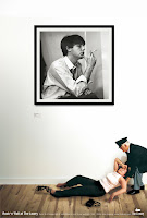
Freund Hein is an anachronistic German vernacular expression, ‘Hein’ being the impersonation of Death as an unwelcome ‘friend’ knocking on one's door. In Elisabeth Smolarz's latest video installation she conceptualizes a performance based film project as an exploration of the question of death.
Since the human death is typically hidden from everyday life, what is the source of our death-image? She asked people of different ages and backgrounds to ‘to die’ in front of the camera. The participants were free to improvise in whatever way they wanted to pretend the act of dying. Some choose to be ‘shot’, some were ‘stabbed’, some ‘chocked', others said ‘good bye’, laid down and ‘died’. The sequences of these performances were mostly short, not more than a few minutes, most show that most people imagine the act of dying as an abrupt event, a kind of crass and unexpected rupture in the experience of an everyday life.
click the image to see the video
Friday, June 22, 2007
William Drenttel
Dangerous Beauty:
The Art of the Shiv
A shiv is a weapon crafted from the limited resources of a prisoner’s closed world. Crudely constructed from such things as spoons, shoelaces and upholstery tacks, shivs lie somewhere between the graceful and the grotesque. They’re primitive, too — like outsider art, but produced deep on the inside. The individual parts that make up a shiv tend to be everyday objects, innocent things furtively reconstituted as lethal weapons. Each design choice is essential, but what’s particularly notable is that shivs, at their core, are not so much evocations of minimalism as they are symbols of survivalism. A shiv is all about masked utility: it’s an innocuous object with improbably toxic intent (whether used to attack others or to protect oneself...). The shivs shown here, from the collection of designers Chris Kasabach and Vanessa Sica, were confiscated more than twenty years ago from New Jersey’s Rahway Prison (now East Jersey State Penitentiary), a maximum-security facility that houses more than 1,500 inmates serving sentences of twenty-five years to life. The designers saw each shiv in their collection as a piece of evidence, and over time, came to identify a kind of unique design pathology. Their observations are fascinating, as are the artifacts that inspired them and the circumstances surrounding each object's unique method of manufacture. You’ll never look at a typewriter the same way again.
to see more
http://www.designobserver.com/archives/016492.html#
2X4
An Apple video portrait on 2x4.org, a NYC based design studio.
The partners, Susan, Michael and Georgianna, are really innovative, without wildly rejecting traditional ways of working and they have developed a very gifted crew of associates. Originally print based, they have now branched out to include - interactive and other synergistic design solutions. Check out the video portrait it's short, and really interesting. It will give you a good idea of how it really works and what it looks like, on the other side of the fence.
http://www.apple.com/pro/profiles/2x4/
Tuesday, June 19, 2007
RIP - a great designer, gifted with a rare fluency with materials. He expressed his ideas through the subtle textural effect of line and pattern. Unlike many of his contemporaries, he was largely indifferent to trends and avoided the limelight, he worked hard in his studio and had a long productive and creative career.
Sunday, June 17, 2007
Trouble in Toronto
two former troublemakers graduated from OCA , then went on to form Amoeba Corp. - a very creative, attitude riven, all services design company. Check out their site, innovative, accessible and cheeky.
Monday, June 11, 2007
the 2006 Epica WINNERS in the area of MEDIA & ENTERTAINMENT - click on them -
Copywriter: Lisa Nichols
Art Director : Gary Fawcett
Photographer : Paul Moffat
the client was - the lowry rock photo exhibition
Saturday, June 09, 2007
Stefan Sagmeister - Graphic design god - talks - at the TED 2004 conference
Analyzing a list of things that have made him happy, graphic designer Stefan Sagmeister realized that almost half of the items were in some way related to design.
In this intensely personal talk, he shares the details of some of those moments, and gives props to three artists whose work has had a positive impact on his world.
Concluding with some examples of his own work, Sagmeister offers a real insight into his aesthetic and philosophy of work -- and life.
http://www.ted.com/index.php/talks/view/id/50
TED stands for Technology, Entertainment, Design. It started out (in 1984) as a
conference bringing together people from those three worlds. Since then its scope
has become ever broader. The annual conference now brings together the world's
most fascinating thinkers and doers, who are challenged to give the talk of their
lives (in 18 minutes).
http://www.ted.com/index.php/themes
Friday, June 08, 2007
Helmut Krone, Period.
Print advertisement for Polaroid.
A strange gulf exists today between the worlds of design and
advertising. That makes it easy to forget that one of the greatest
designers that ever lived was an advertising art director:
Doyle Dane Bernbach's Helmut Krone.
Long before branding became a buzzword, Krone intuitively
understood how graphic design could define an institution's
personality. "The page, "he once said, "ought to be a package
for the product. It should look like the product, smell like the
product... Every company, every product, needs its own package.
" Without ever designing a logo — often without even using a
logo — he created corporate images that endure to this day.
How many companies can be said to "own" a typeface the way
that Volkswagen does Futura Bold ?
They have Helmut Krone to thank for that.
Print advertisement for Polaroid.
photograph by Bert Stern, art direction
by Helmut Krone
by Helmut Krone
A strange gulf exists today between the worlds of design and
advertising. That makes it easy to forget that one of the greatest
designers that ever lived was an advertising art director:
Doyle Dane Bernbach's Helmut Krone.
Long before branding became a buzzword, Krone intuitively
understood how graphic design could define an institution's
personality. "The page, "he once said, "ought to be a package
for the product. It should look like the product, smell like the
product... Every company, every product, needs its own package.
" Without ever designing a logo — often without even using a
logo — he created corporate images that endure to this day.
How many companies can be said to "own" a typeface the way
that Volkswagen does Futura Bold ?
They have Helmut Krone to thank for that.
The 2012 Olympic Logo Ate My Hamster
Cover from The Sun, Wednesday June 6, 2007.
Three days after the launch of the logo for the 2012 London
Olympics, Britain’s biggest selling tabloid newspaper still
regards the furor surrounding the new symbol as front-page
news. Not only is it widely regarded as a badly designed logo,
but nearly 30,000 people have signed an online petition
demanding its withdrawal. And now, in its animated form,
it is said to cause epileptic attacks.
Designers often bemoan the lack of coverage given to graphic
design in mainstream media. Yet when design catches the
attention of journalists and commentators it usually results
in a vicious mugging rather than hearty praise. Since the
organisers of the 2012 London Olympics unveiled their new
logo (or ‘brand’ as they call it), we Brits have been treated to
our national press in fixed-bayonets assault mode. This is
normally an unappetising sight, but on this occasion —
although it wounds me to say it — the self-righteous indignation
of the British press is justified. The London 2012 logo is a solid
gold stinker.
to continue reading this article click this
Thursday, June 07, 2007
The LCW (Lounge Chair Wood) was hailed by Time Magazine as
the Best Design of the 20th Century. The Eames Molded Plywood
Lounge Chair (1946) has been referred to as the "most famous chair
of the century," with a form that relates directly to the human body
and holds no secrets as to how it succeeds technically.
Low-slung, with an expertly crafted molded plywood seat and back,
this chair cradles the user and features hardwood inner ply for durability.
The molded plywood legs provide superior strength and rubber shock
mounts buffer against jarring movement. Self-leveling pod glides
level on uneven surfaces. If you guys work really hard, and do all sorts
of fantastic independent work over the summer break, I'll personally
buy one for myself. That's fair, right ?
Wednesday, June 06, 2007
The African-themed July issue of Vanity Fair is being guest edited by U2 frontman Bono — the biggest July issue ever. 20 covers, all shot by Annie Leibovitz reflect Africa and its supporters — Bono, Brad Pitt, Oprah Winfrey, George Clooney, Jay-Z, Djimon Hounsou, Chris Rock, Alicia Keys, Warren Buffett, Desmond Tutu, Muhammad Ali, Bill and Melinda Gates, Iman, Don Cheadle, Barack Obama, Madonna, Maya Angelou, Queen Rania of Jordan, US President George W. Bush and Secretary of State Condoleezza Rice. Graphically it's a clever idea, but, I hope it raises money for the actual causes and not just Vanity Fair.
for an enlarged version please click
Sunday, June 03, 2007
the 13th. Inaugural Disco Fire Dance and Naked Military Parade Picnic Sing Along for select young designers and any available local crazy people who are allowed early release. If you get a 90 + , you get to go next year.
Winners all get the brand new Volvo S 65-c (donated by the guy in the suspcious pink hat) and a marvy brand new pair of flippers - plus all the barbecue you can steal. Work hard over the summer and we'll set you a place.
Subscribe to:
Posts (Atom)