

Tuesday, April 23, 2019
Monday, March 04, 2019


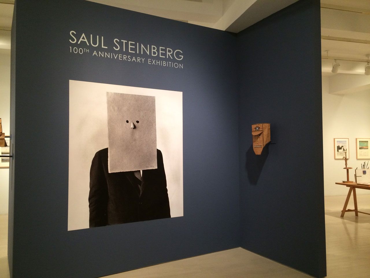
Friday, February 22, 2019

Tuesday, February 19, 2019


Tuesday, February 12, 2019

Monday, February 11, 2019


Monday, February 04, 2019


some print shops
* Rubiks - very near Concordia U 2148 Mackay, 514 845 8444, or other branch
Provisia - 4420 Cote de liesse 102,
east of decree - 736 0000
Point Numerique - Laval 2092 Monterey
Laval … 450-687-8866
Lozeau - 6229 Rue St-Hubert, Montréal,
514-274-6577
* Digi Press - Orange Julip - Namur metro -
5341 Ferrier 514 739 0588
Copie 2000 on Pork, close to Villeneuve
mean people
CC Copie Next Cote de Neige Metro
City Graphics Mtl. North
Bureau en Gros - Laval
* most recommended
Monday, January 28, 2019
apostrophe9apostrophe9AIGA Design Archivesanaria in HONYVille Noireimage blogAIGA archivesAIGA Design Archives - CD coversPage Christman - Krop Creative DatabaseEXQUISITE - Luxury CollectionsCurious NonsenseRAW COLORFFFFOUND! | mai 2006 - Etienne Mineur archivesPinterest: Discover and save creative ideasGraphic on Pinterest | Graphic design, Typography and GraphicsOmar Z. Robles (@omarzrobles) • Instagram photos and videosParis TravelerInky Stories on Tumblrpretty things from here and there44paristraveler.tumblr.comFFFFOUND! | mai 2006 - Etienne Mineur archivesGraphic on Pinterest | Graphic design, Typography and GraphicsGraphic on Pinthefrenchsampler.blogspot.caterest | Graphic design, Typography and Graphicspretty things from here and there44pearlsandblackcoffee.tumblr.comfiercefeistyfemale.tumblr.comwww.bluetramontana.comwww.valentineuhovski.comhuntersandgatherersathome.blogspot.cacafeblossoms.tumblr.comthegroundedkidsclub.tumblr.comsuffocating-smoke.tumblr.commemories-of--the--future.tumblr.comyoursummerdreamz.tumblr.comitsnashthings.tumblr.commemberpage.php?uc=E19T9V8N36G66U74QU6U?og=1apostrophe9.tumblr.com31625877804Spud Groshongtiny sparkMirror, mirrorif only you knew my dear
https://helpx.adobe.com/photoshop/using/layer-basics.html
https://helpx.adobe.com/photoshop/using/layer-basics.html
Monday, January 21, 2019
Wednesday, January 17, 2018

Wednesday, January 10, 2018
Design Studio 2 - Presentation Topics Spring 2019
Design Studio 2
the ... " IT'S NOT WHAT YOU KNOW ... BUT, WHO YOU KNOW" assignment
Spring 2019 - Assignment One - is a research/design history in-class presentation assignment, which will be assigned, and discussed during our first class.
From the list below, you will need to choose one name or group during our first class.
It's first come first served, so to speak. You'll be giving a Keynote or Powerpoint presentation in class, live, on your choice.
Walter Gropius
Edgar Brandt
Harley Earl
Alexey Brodovitch
David Carson
The Eames
Art Nouveau
Norman BelGeddes
U&Lc
Lucian Bernard
Vienna Secession
Bau Magazine
Vienna Secession
Bau Magazine
the Arts and Crafts Movement
Weiner Werkstatte
Arne Jacobson
Marcello Nizzoli
Wesley and Sean
Early Bugatti, Daimler and Benz
Tangerine Studio
Joseph Hofmann
Gerrit Reitveld
Erik Speikermann
Erik Speikermann
Saul Bass
Deutscher Werkbund
Deutscher Werkbund
Rudy Van derLans
George Jensen
George Nelson
Peter Behrens
Dieter Ram
Adbusters
Georg Kleeman
Richard Sapper
Louis Comfort Tiffany
Peter Saville
GTF
William Morris
the Bauhaus
Hoefler & Frere Jones
Micheal Graves
Marian Bantjes
Victor Horta
Frank Lloyd Wright
Phillipe Starck
Chermayeff & Geismar
Norman Foster
Adrian Frutiger
Alvar Alto
Milton Glaser
Louis Fili
R. Buckminster Fuller
Ed Fella
Eric Gill
A.M. Cassandre
Brad Holland
Henri de Toulouse-Lautrec
Herb Lubalin
The Arts and Crafts Movement
Memphis Group
Herbert Mayer
William Van Allen
Marrianne Brandt
Jonathan Ive
Alvin Lustig
Chip Kidd
Tangerine
Paul Rand
Winterhouse
Neville Brody
Henry Van deVelde
Charles Rennie Macintosh
April Greiman
Welles Coates
Kurt Schwitters
Michael Beruit
Mid Century Modern design
Raymond Lowey
Gerorge-Eugene Haussmann
Gerorge-Eugene Haussmann
Peter Saville
Robin and Lucienne Day
Wally Olins
Antoni Gaudi
Frank Gehry
Jules Cheret
Mies van der Rohe
Emigre
Paul Rand
Ray Gun
Ellen Lupton
Tobias Freres
Winterhouse
Joseph Muller Brockmann
LeCorbusier
Tibor Kalman
Barbara Kruger
Hector Guimard
Isambard Kingdom Brunel
Isambard Kingdom Brunel
Seymour Chwast
Pentagram & Push Pin Studios
Aubrey Beardsley
the Dadaists
John Heartfield
Ettore Stottas
Zaha Hadid
the Constructivists
The Streamlined Decade
The Streamlined Decade
Hector Guimard
Firmin Didot
Jasper Morrison
herbert matter
sustainable design
sustainable design
Christopher Wren
Massimo Vignelli
Bruno Matheson
Victor Horta
Renzo Piano
Alexey Brodovitch
Alphonse Mucha
Fredric Law Olmstead
Alessi Co.
Rene Lalique
Johannis Itten
Richard Neutra


Design Studio 1 Spring 2019 - a first assignment
design studio one - assignment one !
it's a design scavenger hunt !
it's a design scavenger hunt !
~ introduce yourselves to each of these graphic designers/typographers listed below - look carefully at their work, learn to recognize their styles, and read about their lives and influences. Many have their own web sites ..
One of the names, is intentionally quite jumbled up, others are a little miss-spelled, mixed up a little, all on purpose.
If you can decode/deduce who they all are .. extra marks ..... ( hint ) She's part of a renowned design couple, and the creative force behind an influential design company and magazine specializing one might say, in all type of types, or types of type .....
If you can decode/deduce who they all are .. extra marks ..... ( hint ) She's part of a renowned design couple, and the creative force behind an influential design company and magazine specializing one might say, in all type of types, or types of type .....
this assignment is due for the second class. Current Design Studio One students only !, we'll discuss it during our first class, and not before... you'll see

Friday, December 15, 2017

If you have a moment, this McCord Museum show is fantastic, you really should see it ... ends Jan 7
Currently running, but just till Jan 7 th. - there's a very fascinating and beautifully designed exhibit at the McCord Museum on Sherbrooke street, just facing the McGill commons.
This comprehensive show exhibits the huge strange advertising, announcement broad bill posters, trade bills handouts, and other ephemera of the then world Famous Magicians during the late 19th and early 20 th centuries, masters like the Great Thurston, Houdini, Kellar et al. The posters' themselves are quite magnificent, full of mystery, illusion and executed with a top drawer skill. The exhibit is beautifully and elegantly designed, all of it is really first class work.
Put down your Xbox controller, and get off at the McGill metro station ....


Tuesday, November 14, 2017

Thursday, April 20, 2017
this is it, Robert Rauschenberg's erasure

By the time Robert Rauschenberg died in 2014 at the age of 82, he was considered one of the great American artists of the 20th century. He was known for his radical experimentation, his work across materials and mediums, and his effort to explore the boundaries of what constitutes art.
But in 1953, he was just a 28-year-old budding art world player in New York with lots of big, unconventional ideas. And one of those ideas was about to rile up the establishment and quite literally enact what would become his reputation—an overthrowing of the old ideas as he ushered in the new. It would also earn him the moniker that would grace his biography for the rest of his life—he became the enfant terrible of the New York art world.
In 1949, Rauschenberg arrived in New York City after a roundabout journey that took him from his childhood home in Port Arthur, Texas, to conscription in the military during WWII, to attending art school at programs around the world.
His love of reinvention was established early and very personally when he decided his rebirth as an artist required a new name. Milton Ernest Rauschenberg became Robert.
From his start in New York, Rauschenberg was playing around with some big, original ideas. At the time, the city was in the thrall of the abstract expressionists led by luminaries like Jackson Pollock, Willem de Kooning, and Mark Rothko. Against this backdrop, Rauschenberg began creating one of his first series called the “White Paintings.”
The five works he created for this series were titled quite literally. To create them, Rauschenberg took ordinary white paint and rolled it onto the canvases, each containing a different number of panels ranging from one to seven, in an even, unblemished layer.
In addition to leaving no trace of color or expression, he was also attempting to erase all signs of the artist’s hand, minimizing the appearance of brushstrokes.
You can imagine the uproar. Here was a young artist who was clearly scamming the art world by presenting such a simple, seemingly empty canvas as art, right?
The paintings were passed over by at least one gallery and, when several were shown in an exhibition in 1952, the most kind reviews decided to ignore their inclusion altogether.
But Rauschenberg was serious about this exploration. He described them as “having one white, as in one god.” And they were much more expressive than they may have seemed at first glance.
The artist and composer John Cage noted that the “White Paintings” were a reflection of the viewer in a sense, with the shadow of the onlooker dancing across the canvas. Rauschenberg liked to think of them as clocks. “If one were sensitive enough that you could read it, that you would know how many people were in the room, what time it was, and what the weather was like outside,” the artist said.
In an interview with the San Francisco Museum of Modern Art, Rauschenberg explained that he “did them to see how far you could push an object and yet it still means something.” But, he also “didn’t want to spend the rest of my life doing something that was this easy.”
As he got bored painting solid white, he turned his exploration to the effects of erasure as a form of creation.
He wanted to discover whether erasing a work could create a new piece that would be considered art in its own right. In this mission, no half measures were allowed; Rauschenberg was interested not just in the effect of “deleting certain lines, you understand, but by erasing the whole thing,” as Calvin Tomkins quoted the artist in a 1964 profile in The New Yorker.
But erasing his own, unknown works wasn’t cutting it. Rauschenberg decided that to really achieve the effect he was hoping for, he had to erase a work by a well-known artist, one that was considered “a real work of art.”
He set his sights on Willem de Kooning.
The older artist was well established on the New York scene and he was rapidly gaining more widespread fame. Plus, Rauschenberg was a fan of his work. “Bill de Kooning was the best known acceptable American artist that could be indisputably considered art,” Rauschenberg said of his decision to approach de Kooning.
Armed with a bottle of Jack Daniels, Rauschenberg knocked on de Kooning’s studio door and “hoped he wouldn’t be home,” as he remembers.
But de Kooning was home and, over a tipple, the request was made. The older artist was not thrilled with the idea of giving up one of his drawings, but Rauschenberg remembers that he said he understood the idea behind the project and agreed to sacrifice one of them for the cause. But he wasn’t going to make things easy for the young artist.
“He went to one portfolio and he said, ‘No, it’ll have to be something that I’ll miss.’ I’m thinking, ‘It doesn’t have to be something that you’re going to miss,’” Rauschenberg remembers, laughing. “He said, ‘I’m going to make it so hard for you to erase this.’ And he had a third portfolio that had crayon, pencil, charcoal, and it took me about a month and I don’t know how many erasers to do it.”
But using up countless erasers wasn’t the only difficult aspect of the creative process of erasure. Once completed, Rauschenberg struggled with what to call a piece that was once—and still is the shadow of—an untitled drawing by de Kooning, but that is now technically a new work by a new artist.
Stumped, he turned to his upstairs neighbor, Jasper Johns, who landed on the simple wording: “Erased de Kooning Drawing.”
When the finished drawing was complete, Rauschenberg was pleased with the result. He decided that it was possible to create a new work through the erasure of an old one, and he saw the creative process as one that was “not a negation, it’s a celebration.”
But not everyone was so happy. Rauschenberg would display the piece in his studio for anyone who was interested in taking a look, but he didn’t formally exhibit it until 1963.
Despite the lack of publicity, word got around and the results were mixed. Many were indignant at the loss of a de Kooning drawing that wasn’t documented in any other space, and they threw around words like vandalism and destruction.
Others were concerned by how profound this act really was—a new generation of artists literally erasing the work of the old as they began to take over with their own ideas.
But over time, the reputation of the “Erased de Kooning Drawing” and that of Rauschenberg himself skyrocketed. He would continue to shake up the art world and his work would help bridge the transition from the abstract expressionism of artists like de Kooning to the rise of pop art that would usher in Andy Warhol. Despite what the early critics and established artists initially thought, he worked with as much good humor and deference towards what came before as he did with disruption.
As Michael Kimmelman wrote in The New York Times obituary for the artist, “His work was likened to a St. Bernard: uninhibited and mostly good-natured. He could be the same way in person.”
Plus, all was not completely lost. In 2009, the San Francisco Museum of Art used infrared imaging to recreate part of the original drawing.
And for those who still look at “Erased de Kooning Drawing” and mourn the original artist, Rauschenberg delightedly pointed out that they could just flip the drawing over. On the backside is another “gorgeous drawing of Bill’s” that Rauschenberg left completely untouched.


Friday, April 07, 2017


Subscribe to:
Posts (Atom)

