this is a private blog for my design students and assorted other survivors. Tro blemakers all
this is a private blog for my design students and assorted other survivors. Tro blemakers all.

Monday, August 23, 2010

a wonderfully funny *- motion typography video - click on the X
for the link - courtesy of the divine Miss Z - warning *xrated language !

Wednesday, August 18, 2010

my new schedule and here's the
link to my class outlines should
you need it - and like everything
else in nature, click to enlarge


Tuesday, August 17, 2010

Pulse of the Nation: U.S. Mood throughout the Day Inferred from Twitter


The scientific study "Pulse of the Nation: U.S. Mood throughout the Day Inferred from Twitter" [ccs.neu.edu] illustrates the varying mood in the U.S., as inferred after analyzing over 300 million tweets that were created over the course of the day.

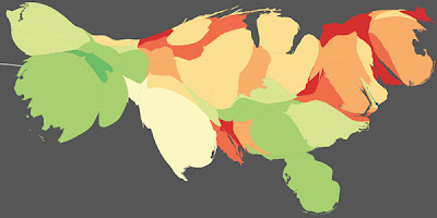
Various density-preserving cartograms and a time-animated video were produced to capture important large-scale trends.

The researchers analyzed all public tweets posted between September 2006 and August 2009, and filtered those whom orginated from a US location and those that contained words included in the psychological word-rating system called Affective Norms for English Words, resulting in a collection of 300 million tweets.

Through a natural language processing algorithm called Sentiment Analysis, each tweet was assigned a mood score based on the number of positive or negative words it contained. Out of the resulting data, they then calculated the average mood score of all the users living in a state hour by hour which formed the basis of a series of time-varying mood maps.

One of the interesting patterns shows how the West Coast mood follows the same pattern as the East, with a 3-hour time-zone delay, indicating that Each Coast experiences the same time-dependent swings. Weekends were observed to be happier than weekdays.

The peak in the overall tweet mood score is observed on Sunday mornings, and the trough occurs on Thursday evenings.

This is the nexus where informatics flourishes - where graphic design and statistical information collide. On a more philosophical note - is
there something here that is rather unsettling about all of this, something which is setting my radar off ? hmmmn ....


Wednesday, August 11, 2010

clique aux muy enlargo los imagio


Charles Joseph Minard’s famed carte figurative of Napoleon’s march to Moscow is considered by most to be one of the finest maps ever produced. It’s elegant, it’s clever, and it’s clear. Edward Tufte said that it “may well be the best statistical graphic ever drawn.” It's also a sad terrible glimpse of Napoleon's vanity and the indifferent, featureless cruelty of War if you can see inside the lines. Have a look, it's all there .....

Monday, August 09, 2010

Pencil sculptures: miniature masterpieces carved into graphite by Dalton Ghetti


There’s a boot. And a church. And a bust of Elvis. And “Chain,” in which the middle of a pencil has been transformed into a 23-link chain. He has about a dozen works that have been framed and almost as many waiting to be mounted for display. Last year, after two and half years, he finished a line of 26 pencils, with each letter of the alphabet carved into the tip. His current projects include a handsaw and a single rice-grain-sized teardrop for every victim of the Sept. 11 terrorist attacks.