this is a private blog for my design students and assorted other survivors. Tro blemakers all
this is a private blog for my design students and assorted other survivors. Tro blemakers all.

Wednesday, January 31, 2007

Things most remarkable No.4

Well before the advent of radio & TV, before the romance of the drive-in midnight movie, even before Medialabs,three day raves, X-box's, videostreaming and even Woodstock, people somehow managed to amuse themselves, and to reach out beyond the merely obvious ..For extra marks - who, what , when, and where ?


click to enlarge

Tuesday, January 30, 2007

Lucas with the Lid Off , by Micheal Gondry


The typical MTV video is a barrage of quick cuts and off-kilter camera anglesdesigned to disorient channel surfers with itchy zapper fingers into lingering
a little longer.

The video for Lucas' "Lucas With the Lid Off," directed by Michel Gondry
(Björk's "Human Behaviour"), takes a different tack. It has plenty of striking
images and strange angles but not a single cut. "I wanted to play with the
idea of editing physically," says Gondry, 41. "Instead of shooting a room from
several angles, we built several rooms and moved the camera." In one
continuous shot that lasts the duration of the four­minute video, we see the
backs of sets, lighting stands and even crew members milling about In front
of each tableau are numbered wooden frames that mark the "real" frames of
the video, the shots that would be cut together if it were edited. "The idea was
to see all the rubbish around the set and in between see the good angle," Gondry
explains. Shot with a Steadycam in black and white on a Paris set, the video
for the 23­-year-old rapper is a disorienting roller-coaster ride where the viewer
is never sure which way is up. A staircase seems normal at one moment, then
the camera turns, and we see it's really horizontal. Legs that seem to be lying
on a bed horizontally turn out to be hanging vertically off a 90-degree bend.

Because there are no cuts and Lucas pops up throughout the video, he had to
run from set to set, staying one step ahead of the hyperventilating cameraman.
One mistake would mean starting all over again from the beginning. At one point,
Lucas crashed into a bed frame and cut his knee but finished the take, wiping blood
away as he ran. It took 18 takes in a full day of shooting to get one that had no mistakes. "It was basically an exercise in stamina," Lucas says.

Like the song, an infectious (albeit somewhat precious) mix of modern rap and ragga with jazz samples, the video includes modern elements, and projected in the background are snippets from what seem like jazz-era films, which were actually shot by Gondry in London and sped up to make them look old. The re­current image of a piano being toted about is an hommage to Fats Waller, who used to travel around to friends' apartments and play at rent parties.

"My dad knew Benny Goodman, and there are samples of him in the song,"says Lucas, whose father, an American of Russian-Jewish extraction, founded Pottery Barn and wrote lyrics for such Tin Pan Alley hits as the Mills Brothers'"You Never Miss the Water (Till the Well Runs Dry)."

Lucas, who was born in Copenhagen, Denmark, but now lives in London,grew up in Europe and New York and says his music "reflects all the different cultures I grew up with."

Gondry started out by making videos for the band he drummed for in art school, Oui Oui. "We had some friends who liked us but not that much," he says. He grew up in a small town outside Paris, where the first film he ever saw was Stowaway in the Sky by Albert Lamorisse (The Red Balloon). Lamorisse pioneered the use of helicopter shots and actually died when his
helicopter crashed during a shoot.

Gondry also pushes state-of-the-art technology to the limit, though not quite to the point of dying for his art. "I think this was probably the most difficult video I have ever done,

" he says. "In fact, it was really a nightmare."


Thursday, January 25, 2007

that brilliant Honda commercial,inspired in part no doubt by Rube Goldberg


click to enlarge


Monday, January 22, 2007

click to enlargski


Poland continues to be one of the most prolific and innovative
centers of Graphic Design worldwide. Continuing a long
tradition of
political satire, and polemical dissent, the Polish poster
, has a unique,
rather visceral style. In particular poster design
and illustrations for
films and theatre, which tend to be the most popular
forms of this
occasionally
brutal, yet often brilliant imagery.


for more, visit the RIT collection http://www.wally.rit.edu/special/PolishPoster.htm

the work is by

Franciszek Starowieyski: Franz Kafka - Zamek, 1967.
Stasys Eidrigevicius: Hommage a Vincent, 1990
Wiktor Sadowski: My Fair Lady, 1986.
Roman Cielewicz: Dziady, 1967
Stasys Eidrigevicius: XV Midzynarodowe Biennale Ekslibrisu, 1994
BronisLaw Zelek: Glód, 1955.
Franciszek Starowieyski: Anatomia Czasu, 1978
Franciszek Starowieyski: Panna mloda w ?alobie, 1969.
Krzysztof Bialowicz, "Olenek", 2004
Stasys Eidrigevicius, "Mewa", 2005 (niedostepny)
Wieslaw Walkuski, Duze zwierze
Franciszek Starowieyski, "Marat", 2001 (niedostpny
Stasys Eidrigevicus
Franciszek Starowieyski: Sanatorium Pod Klepsydre, 1973
Wieslaw Walkuski: Danton, 1982.

Saturday, January 13, 2007


a video/dance by Pilobolus

notice how the choreographer and the film designer both, have utilized the dramatic qualities of silhouttes, and consider how the dance and the video alike, are built or are reliant upon, the visual structure of the line of the silhoutte.

Line is a powerful visual element, whether delineating the form of a building, the cut of a dress, or the constant beat of a 12 bar tune.

WHAT IS PILOBOLUS?

Pilobolus (crystallinus) is a phototropic zygomycete - a sun-loving fungus that grows in barnyards and pastures. It grows on a stalk as a small bladder, pressurized by cell sap and topped with a tiny black cap filled with spores. When time and Pilobolus are ripe, this entire sporangium is blasted off with incredible force and the little spore bags can shoot over a cow like clowns out of a cannon. It's reported that the acceleration - from 0-45 mph in the first mm of flight - is the second fastest in nature.

Pilobolus, the arts organism, germinated in the fertile soil of a Dartmouth College dance class in 1971. What emerged was a collaborative choreographic process and a unique weight-sharing approach to partnering that gave the young company a non-traditional but powerful new set of skills with which to make dances. The group was immediately acclaimed for its startling mix of humor and invention and Pilobolus soon became a self-sufficient organization, its members choreographing, dancing, managing, and publicizing their own programs.

Pilobolus has developed from this ad hoc dance collective into a unique American arts organization with four major branches of activity: Pilobolus Dance Theatre, our 7-person touring company; The Pilobolus Institute, an umbrella for all our educational programming; Pilobolus TOO, our duet company, touring both independently and in coordination with Institute programming; and Pilobolus Creative Services, an administrative structure allowing us to coordinate creative activity with both commercial and artistic organizations outside our own company.

Today Pilobolus is recognized as a major American dance company of international influence. It has not, however, forsaken its original impetus. The company remains a deeply collaborative effort with an executive director, three artistic directors and seven dancers contributing to one of the most popular and varied repertoires in the field. Its many decades of consistent artistic activity now stand as a testament to the group's remarkable fruitfulness and longevity.


Thursday, January 11, 2007

the SX-70 camera


Starting in 1972 the amazing Polaroid SX-70 rapidly became a cult camera and is famous with both visual artists and the public alike. Innovative, it was the first instant camera to use the self contained pack system, instead of yucky messy peel apart film layers- and users (everybody) also soon found that these prints could be manipulated by hand (scruntched, rubbed, heated etc) for several minutes after being developed to produce all sorts of cool visual effects.

Although originally launched as a manual focus only camera - Polaroid added unique sound based 'sonar' autofocus - sometime in the 1970s and the Polaroid SX-70 became the original hipsters autofocus, autoexposure SLR. single lens reflex camera.

It is still possible to buy the camera and film today, and still can be
used to make interesting, instantaneous and occasionally beautiful images.


these double page spreads by katika&polaroids.net
The remarkable Mr.Ive


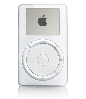
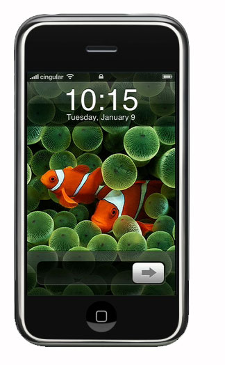
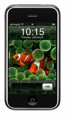
As the head of design at Apple, Jonathan Ive has combined what he describes as “fanatical care beyond the obvious stuff” with relentless experiments into new tools, materials and production processes, to design such ground-breaking products as the iMAC, iBook, the PowerBook G4 and the iPod MP3 player. He won the Design Museum's first Designer of the Year prize for the 2002 iMac and iPod.

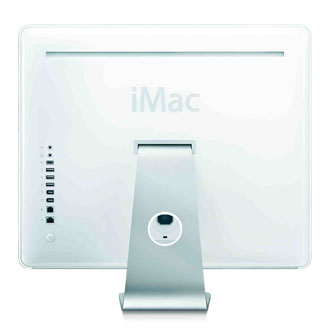
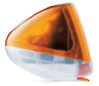
Born in London in 1967, Ive studied art and design at Newcastle Polytechnic before co-founding Tangerine, a design consultancy where he developed everything from power tools to televisions. In 1992, one of his clients – Apple – offered him a job at its headquarters in Cupertino, California. Working closesly with Apple’s co-founder, Steve Jobs, Ive developed the iMac. As well as selling more than 2m units in its first year, the iMac transformed product design by introducing colour and light to the drab world of computing where, until its arrival, new products were encased in opaque grey or beige plastic.

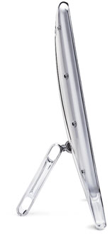
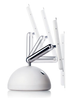
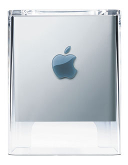
Ive and his close-knit team of designers at Apple have since applied the same lateral thinking and passionate attention to detail to the development of equally innovative new products such as the Cube, the iPod and the PowerBook G4, the world’s lightest and slimmest 17 inch laptop, and the ultra-slim iMac G5.

Q. How did you you first become interested in design?

A. I remember always being intrested in made objects. The fact they had been designed was not obvious or even interesting to me initially. As a kid, I remember taking apart whatever I could get my hands on. Later, this developed into more of an interest in how they were made, how they worked, their form and material.

Q. When did you decide to pursue design as a career and how did you go about it?

A. By the age of thirteen or fourteen I was pretty certain that I wanted to draw and make stuff. I knew that I wanted to design but I had no idea what I’d design as I was interested in everything: cars, products, furniture, jewellery, boats. After visiting a few design consultancies I eventually decided that product design would be a pretty good foundation as it seemed the most general. I studied art and design at school and went on to Newcastle Polytechnic. I figured out some basic stuff - that form and colour defines your perception of the nature of an object, whether or not it is intended to. I learnt the fundamentals of how you make things and I started to understand the historical and cultural context of an object’s design. I wish my drawing skills had improved, but while that bothered me then, it doesn’t now.

Q. After graduating, you joined the design consultancy Tangerine. In retrospect, how useful was your experience there?

A. I was pretty naïve. I hadn’t been out of college for long but I learnt lots by designing a range of different objects: from hair combs and ceramics, to power tools and televisions. Importantly, I worked out what I was good at and what I was bad at. It became pretty clear what I wanted to do. I was really only interested in design. I was neither interested, nor good at building a business.

Q. Why did you decide to join Apple?

A. I went through college having a real problem with computers. I was convinced that I was technically inept, which was frustrating as I wanted to use computers to help me with various aspects of my design. Right at the end of my time at college I discovered the Mac. I remember being astounded at just how much better it was than anything else I had tried to use. I was struck by the care taken with the whole user experience. I had a sense of connection via the object with the designers. I started to learn more about the company, how it had been founded, its values and its structure. The more I learnt about this cheeky almost rebellious company the more it appealed to me, as it unapologetically pointed to an alternative in a complacent and creatively bankrupt industry. Apple stood for something and had a reason for being that wasn’t just about making momey.


Q. What are the advantages of designing for one company? And the disadvantages? What are the particular characteristics of the set-up at Apple that has made the experience of working there rewarding for you?

A. It is pretty humbling when so much of your effectiveness is defined by context. Not only is it critical that the leadership of a company clearly understands its products and the role of design, but that the development, marketing and sales teams are also equally committed to the same goals. More than ever I am aware that what we have achieved with design is massively reliant on the commitment of lots of different teams to solve the same problems and on their sharing the same goals. I like being part of something that is bigger than design. There is a loyalty that I have for Apple and a belief that this company has an impact beyond design which feels important. I also have a sense of being accountable as we really live, sometimes pretty painfully with the consequences of what we do.

Q. Similarly, what are the advantages - and disadvantages - of concentrating on the design of a particular product, in your case, the computer? And is the computer a richer and more rewarding area of design for you to concentrate on now than other products?

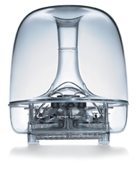
A. I had been concerned that moving away from working independently for a number of clients on a broad range of products would be difficult. Surprisingly this has not been an issue, as we are really designing systems that include so many different components - headphones, remote controls, a mouse, speakers as well as computers. The issue has really been the focus on designing technologically based products. I love working within such a relatively new product category. The opportunities are remarkable as you can be working on just one product that can instantly shatter an entire history of product types and implicated systems. The iPod is a good example as it is not only a very new product but it clearly turns our users’ previous experience and understanding of storing and listening to music upside down.

Q. What are the defining qualities of the design of an Apple product? To what degree are they related to the design heritage of Apple before your arrival there?

A. In the 1970s, Apple talked about being at the intersection of technology and the arts. I think that the product qualities are really consequent to the bigger goals that were established when the company was founded. The defining qualities are about use: ease and simplicity. Caring beyond the functional imperative, we also acknowledge that products have a significance way beyond traditional views of function.

Monday, January 08, 2007

What's in a credit roll? New graphics !
By Alice Rawsthorn
NEW YORK: The first thing Peter Miles did when he began work on the graphic design of Sofia Coppola's movie "Marie Antoinette" was to design a T-shirt for the production crew. "It was a tricky place to start," he recalled. "I had to do something very quickly, but knew that I'd be stuck with it for the rest of the film."

Coppola had said that she wanted the graphics to "have the feel of a revolution," and Miles depicted the title as if it were a slogan on a political banner, or a cover of one of the postpunk new romantic singles featured on the soundtrack. The same logo that he dreamed up for those T-shirts more than a year ago has since appeared in all of the film's graphics: from the posters, to the credits that surface to the strains of the Gang of Four.

What makes this project unusual is that Peter Miles is neither an in-house designer at Sony Pictures, which produced "Marie Antoinette," nor a specialist film designer. He works as a freelance graphic designer in New York for clients such as the fashion designer, Marc Jacobs, and the artists, Juergen Teller and Tracey Emin.

Sony hired him principally because Coppola suggested it, but also in the hope that Miles would bring the cool sensibility to the film's graphics, which had proved so marketable in Marc Jacobs's advertising aimed at the same young women who were expected to enjoy the movie.
At a time when Hollywood is struggling to redefine its appeal to a fragmented audience against so many competing claims for filmgoers' time and money, other studios are bringing in outsiders to work on film graphics.


The acclaimed American book designer Chip Kidd has worked on several film projects this year.
The best film graphics have almost always come about at the director's behest. Among the earliest examples are the titles created by the Hungarian-born scriptwriter Emeric Pressburger for the movies he made with the British director Michael Powell in the 1940s and 1950s. While Powell was on location, Pressburger stayed in London to devise ingenious openings for films like "A Mat
ter of Life and Death" (1946), often incorporating the written credits into a concise film within a-film.

Even Saul Bass, the Los Angeles-based designer who was regarded as the greatest film title designer of the 20th century, owed most of his commissions to empathetic directors: Oscar Preminger and Alfred Hitchcock in the 1950s, John Frankenheimer in the 1960s and, later, Martin Scorsese.

A contemporary equivalent is the collaboration between the Spanish filmmaker Pedro Almodóvar and Juan Gatti, the Argentinian-born graphic designer, who has designed all of his title sequences since "Women on the Verge of a Nervous Breakdown" (1987), including "Volver" this year.

Gatti starts to think about the
titles as soon as he has read the script, but doesn't decide on themes and techniques until he has seen the movie's rough cut and discussed his ideas with Almodóvar. For "Volver's" credits, he created an animated end sequence inspired by the patterns of the dresses worn by the women in the film. (See iht.com/design for a story on Gatti and Almodóvar's collaboration.)


When Miles worked on his first movie project with Coppola, "Lost in Translation," Sony Pictures left them to their own devices because the budget was low, as were its box office expectations. "Sofia told me that in her head, the film was a sophisticated 1930s extension of the Park Hyatt Tokyo, the hotel where it was filmed," said Miles. "I very quickly came across a font, Geometric, that fitted her brief." They decided on an image of the film's star, Bill Murray, sitting on a hotel bed for the poster. As "Lost in Translation" became a hit, Coppola secured a bigger budget for "Marie Antoinette," and Sony wanted to be more closely involved in the marketing. "When you work on that kind of scale there are a lot of people whose opinions have to be heard and reflected," noted Miles. "Sony wanted us to communicate all of that and to hit a specific audience - women in their late teens and 20s." Accustomed to having full creative control of his work, Miles admitted that he found it challenging to accommodate all of Sony's requirements. "But they wanted Sofia to have a strong hold on all aspects of the film," he said. "And Sony went along with what she wanted, and not grudgingly."

Sunday, January 07, 2007


bonjourno my little monkeys - some have
asked for my new schedule, so here it is,
so far. Back soon, cheers - Th


and like everything else in life
click to enlarge

Saturday, January 06, 2007

“Art Is...” 1996 School of Visual Arts Poster


This poster began with an assignment from the chairman of the School of Visual Arts, Silas Rhodes, to interpret the phrase “Art is...” Six designers were given the same problem, and the results were distributed simultaneously throughout the city on the subways and at bus shelters. Trying to define art is obviously not a simple task, but the variety and range of the responses made for a lively series of public announcements.

In my own case the accompanying text attempts to extend the visual message, a point that the text omits. I realize that some forms are intrinsically and mysteriously more satisfying than others. I am convinced that the form of the bowler hat is, sculpturally speaking, one of the most elegant and aesthetically pleasing objects ever made. Can we call it art if that was not its intent? That question will require more than a poster to answer it. by Milton Glaser

Art director: Milton Glaser
Graphic designer: Milton Glaser
Client: School of Visual Arts

Tuesday, January 02, 2007

some great two page spreads


click to enlarge

editorial design 1995 (Rollling Stone)

Art Director Fred Woodward

Graphic Designer Geraldine Hessler

Photo Mark Seliger


take this last page ... at first glance - not a very complicated layout,
the designer is using a simple contrast of scale, between the two pages
and photographs, to create a juxtaposition. There's a tension created
that makes the two pages contrast in an interesting way ... but
there's more ... always more, especially to someone who knows a little about the
people involved, and their musical lives.