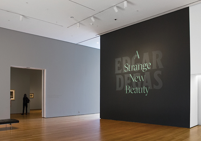
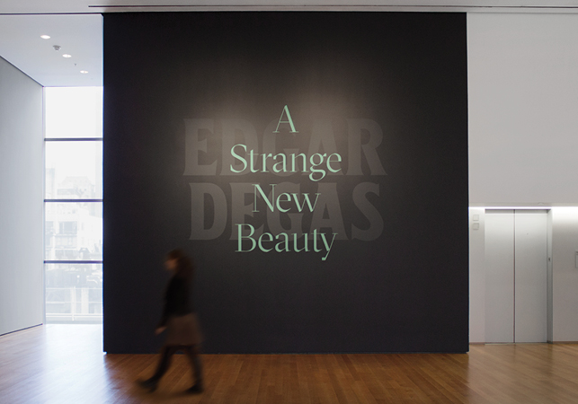
Title wall of Edgar Degas: A Strange New Beauty at The Museum of Modern Art. Photo: Vanessa Lam
Looking at the exhibition
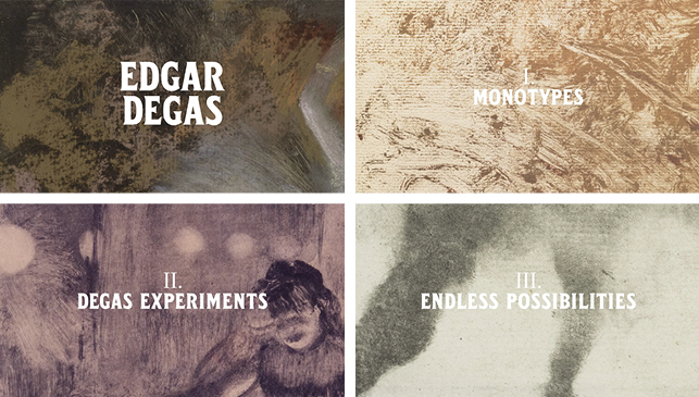
Edgar Degas: A Strange New Beauty, one can immediately sense how strikingly modern the artworks feel, even after 120 years. Organized by senior curator Jodi Hauptman and curatorial assistant Heidi Hirschl, the show features the artist’s experimental and radical works that have rarely been attached to the widely conceived notion of “Degas” (two words: pink tutus).
For the graphic design of this exhibition, I felt compelled to create a custom typeface that blended these two sensibilities—historical leanings infused with a contemporary bent.
Glyphic serifs were especially interesting, as their flared serifs placed them somewhere in that delicate balance between a
traditional serif and a
modern sans. In researching, I was greatly inspired by an old French type specimen from the turn of the century, the same period when Degas was experimenting with his unorthodox monotypes.
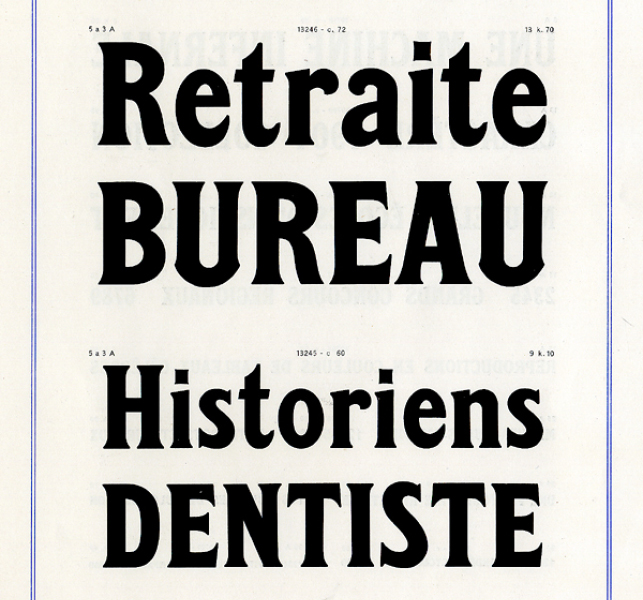
Character specimens by foundry Deberny & Peignot. Source: Museum of Printing and Graphic Communication, Lyon, France
Though the example included only a handful of letters, it still served as an excellent starting point for creating a custom alphabet. The original font featured ornamental details that were verging on Art Nouveau, which were too dated looking for our purposes. I decided to keep the basic proportions of the original letters, but pare them down.
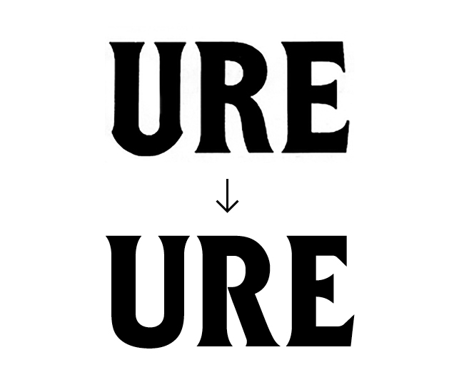
Top: Original inspiration; Bottom: Custom typeface
This included straightening out and simplifying aspects of the typeface that were perhaps too decorative. We didn’t want a typeface that was too frilly or soft, and it was important to maintain a bold and almost aggressive feel that could speak to the “strange new” spirit of the show. Below you can see the comparison of the inspiration image and the redrawn typeface.
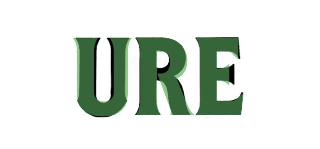
Overlay of the original source inspiration with the new custom typeface
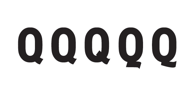
Letter explorations and variations
After many tests and tweaks, I arrived at a finished product that felt like it spoke to the dark forms in the exhibition and also straddled the ambiguous line between old and new. It was historically inspired but not historical, which was essential in reflecting the ways that Degas approached, questioned, and pushed the conventions of his time.
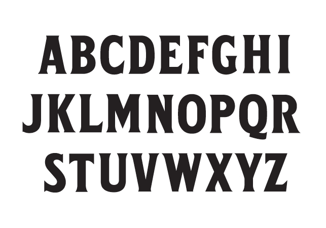
The finished typeface
Exhibition title wall. Photo: Vanessa Lam
Custom typeface in use inside the exhibition galleries. Photo: Vanessa Lam