this is a private blog for my design students and assorted other survivors. Tro blemakers all
this is a private blog for my design students and assorted other survivors. Tro blemakers all.

Saturday, March 31, 2012


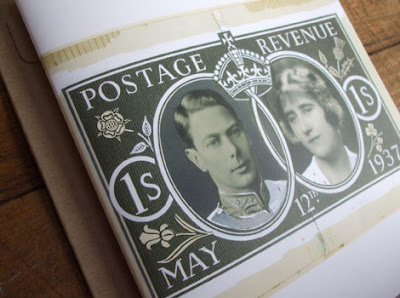
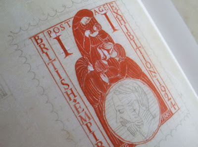
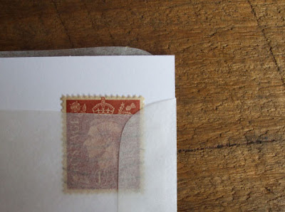
It is I suspect, and reasonably so - a little known fact, that while the legendary type designer, artist and pervert, Eric Gill was a type designing genius, he was also coincidentally, an abject failure as a stamp designer.
It's not that he didn't try.
He tried quite a few times in fact and was even invited to try stamp design on a number of occasions. But for some reason, his attempts at philatelic composition were met with rejection, rejection, rejection.
His stroppy attitude probably didn't help. Not one to hide his opinions (who does that remind you of ?
Eric made sure the powers that be knew his feelings on the subject of stamp design.
His thinking on the subject was - that the humble, utilitarian postage stamp was just that, and no more,

Gill thought stamp design should be free from ornamentation, whimsy and sentimentality. And that anyone who felt otherwise, like the fiddly-fingered stamp collectors, were horribly misguided in both their thoughts on the matter and their chosen leisure-time pursuit.
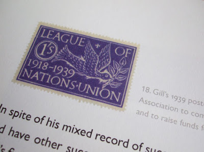
Hardly surprising then I guess, that the decision makers at the British Post Office booted out the cantankerous old beard's designs, time after time.
In fact, I suspect they had a right laugh doing it.
Of course, Gill has unlucky too. His Edward VIII coronation issue stamps were all ready to roll off the press when the idiot king dropped his crown in favour of that American floozy Wallace Simpson.
In 1940 Gill drew a British crown design for inclusion on a special Anglo-French issue stamp only to have the work well and truly buggered by the Nazis when they forced France to surrender making the stamp design rather inappropriate.
This is all admittedly from the "Ministry of What ? ", but the minutiae is where the secrets lay people..

A Design Film Festival 2011: Making actual TYPE Faces

Wednesday, March 28, 2012

In an ancient culture far far away, and like totally a long time ago
(more than 3 whole weeks !), books were important.

So important were books - that people would actually read
them, even all the way to the end - they'd cherish, protect and collect
them too. These wordy titans would lovingly hoard them like glittering
jewels in a crown, proudly displayed for all to see.

Granted, sometimes this adoration went a trifle too far, resulting in
a little web site called bookshelfporn, if you want to see these forbidden
pleasures, the lingual fruits that the ancients so adored
click right here twitter boy ...


Monday, March 26, 2012

Leggo my leggo - from the department of,"ah geez .. I wish
I'd thought of that", OK you wieners, it's contest time ! How
many can you identify ? I got most of them, but not all.
Let's see how you do. If you get all of them, you'll win a
brand new iPad, donated by Wesley and Taline.


Saturday, March 24, 2012

my nine fave typefaces ( this week ) what are yours ?


An insight into Dubai’s most interesting art galleries.

'Al Quoz' is the dusty industrial heart of Dubai, where 16 art galleries organically settled in the last 10 years. In the midst of 166 cement factories some of the most interesting Middle Eastern talents were discovered and introduced to the international art scene. Low rents and generous spaces, a unique feel and art from all over the world - 'Al Quoz' is far from fitting the cliché of shiny dull Dubai.

Thursday, March 22, 2012

Onlab, a Swiss design studio, dig 1 & 2 please visit and, look through their archives

Tuesday, March 20, 2012


Dig 1 Grids ... Another piece of interesting grid design to look at is Twitter.

The website has relaunched their website design with a new format, one which perfectly fits into the golden ratio. "At least since the 20th century, many artists and architects have proportioned their works to approximate the golden ratio—especially in the form of the golden rectangle, in which the ratio of the longer side to the shorter is the golden ratio—believing this proportion to be aesthetically pleasing"
The visual idea of the golden ratio, is the notion of perfect proportions, and something called positional hierarchies - it is a formula calculated to be the ideally pleasing structure to look at. It appears within and is intrinsic to, an extraordinary array of life's designs found in nature, and aesthetics.

It is reported that it was used as far back as the Egyptian’s when building the Pyramids.

If you were to look at the bottom of a pine cone, or the classic nautilus shell, you would instantly see the recognizable curl, most often associated with the Golden Sections display. However in this case it has been used within a website design, to make it more compositionally elegant and easier for the eye to navigate.

The use of the golden ratio, or golden mean or golden section as it is sometimes also known, has meant that the website maintains proportional consistency and organization throughout - without being tedious to look at. The information displayed is well laid out, elegantly proportionate and easily understandable and that, for the most part, is down to the golden ratio's remarkable order. You probably know what a ratio is in general. It's a measure of proportion. If there are 100 boys in a school and 50 girls, then the ratio of boys to girls is 100:50, which can be thought of as the fraction 100/50 = 2/1. So you can also say the ratio is 2:1 ("two to one").

Suppose that you have a piece of rope, and you cut it in some place so that you now have two pieces of rope. If you cut it in the middle, then the two pieces are equal, so their lengths are in a 1:1 ratio. If you cut the rope 1/3 of the way down from one end, then the bigger piece will be twice as long as the smaller piece, so their lengths are in a 2:1 ratio.

In theory, it's possible to cut the rope so that the ratio of the larger piece to the smaller piece, is the same ratio as the original uncut rope length to the bigger piece. THIS special ratio is defined as the golden ratio. There are lots of equivalent ways of defining it, but that's the formal definition.

Unfortunately, there's no neat way of writing the number. You can't write it out as the ratio of two whole numbers. So like pi, it's an irrational number. But expressed as a decimal it's approximately equal to 1.618. You can use algebra to show that it's exact value is (1+√5)/2.

It turns out that the golden ratio has lots of other interesting properties. It shows up in a lot of Greek and Roman architecture, because golden rectangles (a rectangle whose length to width are in the golden ratio) are believed to be most aesthetically pleasing. It also appears in nature. Also, take the Fibonacci sequence: 1, 1, 2, 3, 5, 8, 13, 21....

This is the sequence of numbers where you start with "1, 1", and keep adding the two previous numbers to get the next number (1+1 = 2, 1+2 = 3, 2+3 = 5, 3+5 = 8, etc.). It turns out that if you keep writing this out, the ratios of consecutive numbers get closer and closer to the golden ratio: 1/1, 2/1, 3/2, 5/3, 8/5, 13/8, 21/13...

see it's simple ! next week Fractal Equations and Mandelbrot sets, dude.


Design one, please peruse the I LoveTypography web site. During the next couple of weeks we will be discussing type, its history, design and contemporary uses. It may seem to you to be a relatively small part of design, but it is an essential aspect - as much as colour, line or concept is. Many interesting designs have failed due to the designers lack of type awareness. So check the site out, especially the popular and recent articles sections found on the right side of the page, and please read sections 1 to 4 of "History of Typography", it's a great site. the word typography is linked