this is a private blog for my design students and assorted other survivors. Tro blemakers all. this is a private blog for my design students and assorted other survivors. Tro blemakers all. this is a private blog for my design students and assorted other survivors. Tro blemakers all. this is a private blog for my design students and assorted other survivors. Tro blemakers all.
Tuesday, October 31, 2006
investigate using repetition and pattern, and try to appreciate simplicity , so as to improve your ability to work with it as a design tool, experiment with colour and try to develope your own palette & study someone else's sense of colour which you particularly appreciate, or even admire
Monday, October 30, 2006
a editorialdouble page spread - 1995 Rolling StoneMagazine, designers Fred Woodward and Gail Anderson
click for clarity
consider how the designers have used a simple graphic device (juxtaposing two images of starkly conflicting scale) to create a tension, or "drama" on the page, and also to make a visual pun about Jay's famous chin.
Sunday, October 29, 2006
book cover No.1 designed by John Gall (2001) typefaces Filosophia, Sackers Gothic
click to enlarge
Saturday, October 28, 2006
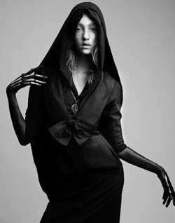
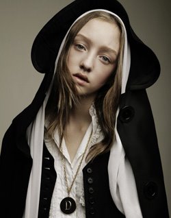
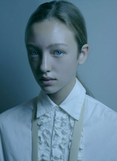
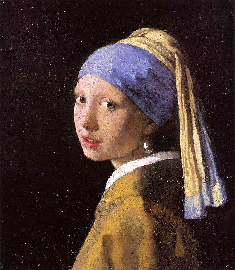
a very young Canadian model - Johanna Sticlkand, who is currently working with the houses of Christian Dior, Sofia Kokosolaki,Van Noten, Givenchy , Chloe, Galliano and Cacharel. She has a strange, odd, an ... early Renaissance or Late Flemish aspect. see Vermeer or Jan van Eyck
Friday, October 27, 2006
design 2 students, yourHalloween mask assignment is due this week !
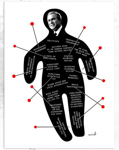
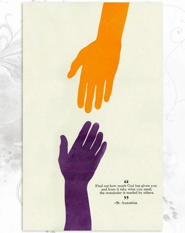
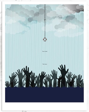
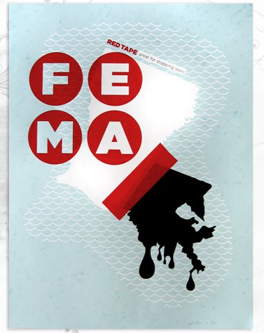
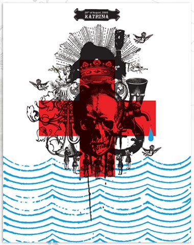
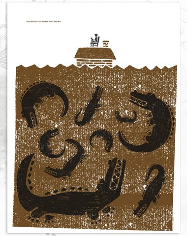
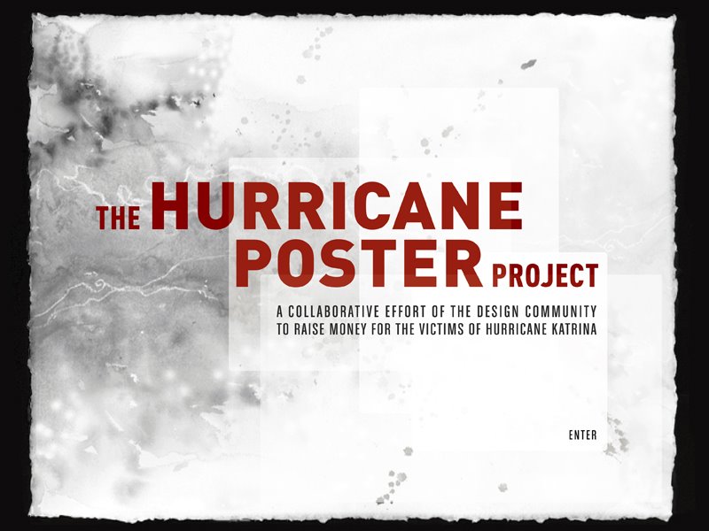
Hurricane Katerina this last year there was a contest to raise money and public awarness for the victims of Katerina. The event was open to designers to create a poster inspired by the events surrounding the hurricane. Here are some excerpts (to contribute, you can buy a posters on line) click to enlarge
Thursday, October 26, 2006
le french photographe Jean-Baptiste Mondino click to enlargé
some drawings by the directorTim Burton forHalloween
Wednesday, October 25, 2006
Logo
- can you guess what it's for ? Winners will get $ 20.00 from your mom.
Tuesday, October 24, 2006
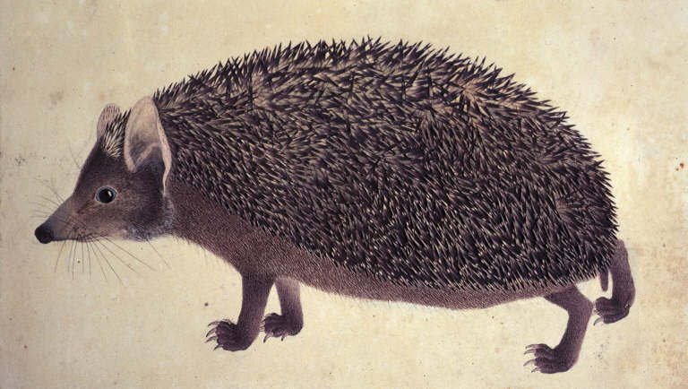
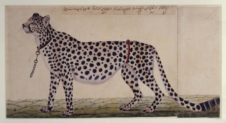
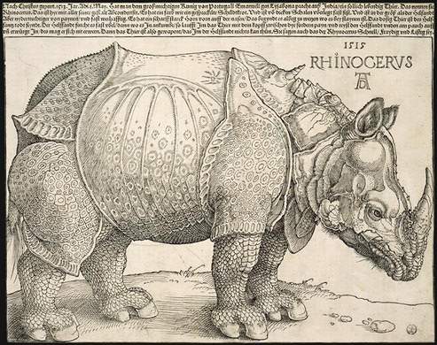
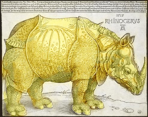
charming , if a little inexact - 19th.c Natural History illustrations.
There's a charming relaxed quality to the pictures as the drawings seem to avoid the often rigid, but technically accurate execution of many contemporary naturalist illustrations.
Until the invention of photography and in particular the dry plate in the 1850's, which produced the ubiquitous albumen print, the public relied on drawings for evidence, drawn proofs, as it were. So as one drew an animal, so was the animal perceived.
There's a famous and likely apocryphal story about Durer's famous print of the Rhinocerous. An early owner of the print had, thinking the image a little bland or grey, given it a pale yellow/ochre wash, and in doing so, convinced generations of viewers of the then unknown creature that the great beast was a bright and horrible breakfast nook yellow.
click to enrage
art Vs. design
Written by Craig A Elimeliah Published on January 13, 2006.
I have read so many books and articles on design and on art, what it is and how it should be executed. I must admit that since becoming a Producer my designing days have taken a backseat to management, i enjoyed being a designer and now I enjoy working with designers as well as every other aspect of production. I was at home contemplating what the difference between design and art is and I think I have come up with some pretty clear lines between the two and have also identified where those lines have become blurred.
Now it is my understanding that design in the commercial sense is a very calculated and defined process, it is discussed amongst a group and implemented taking careful steps to make sure the objectives of the project are met. A designer is similar to an engineer in that respect and must not only have an eye for color and style but must adhere to very intricate functional details that will meet the objectives of the project. The word "design" lends itself to a hint that someone or something has carefully created this "thing" and much planning and thought has been executed to produce the imagery or materials used for the project.
On the other hand Art is something completely separate, any good artist should convey a message or inspire an emotion it doesn't have to adhere to any specific rules, the artist is creating his own rules. Art is something that can elicit a single thought or feeling such as simplicity or strength, love or pain and the composition simply flows from the hand of the artist. The artist is free to express themselves in any medium and color scheme, using any number of methods to convey their message. No artist ever has to explain why they did something a certain way other than that this is what they felt would best portray the feeling or emotion or message.
Many designers are artists and many artists are designers, the line between the two is complex and intriguing. I was perusing some art books and something strange caught my eye, i had noticed that many of the artists were not creating a unique, almost chaotic portrait of their innermost selves or inspirations rather they were clearly using popular trends to capture the attention of the viewer. I noticed that many of the pieces being shown were "throwbacks" of past artists styles or color and simply refreshed for public consumption. The very fact that older artists inspire newer artists seems to contradict the whole definition of art. These artists are following a method, a pattern or a standard that has already been established by another artist and therefore they are not creating something completely new rather following instructions laid down by a previous artist rendering that piece to be more design than art.
I can completely appreciate the paths laid down by past artists who establish a style or method but at this point it seems that when that style or method is used the art then turns into design. I looked through some older books and saw a rather obvious occurrence in the art being displayed, many of the newer artists were simply copying things from the past. I admire a persons talent for picking up a brush and creating an image that has an impact on its viewer but when i see it over and over again by different people who are all claiming to be "of the school of...", and that this is legitimate, unique art, i find that a bit hard to swallow. If the artist said "I have designed something in the standard of Picasso" and this is simply a design based on his style but a new twist has been added then I would feel more comfortable accepting it for what it is, a design. But when an artists style and methods are completely the same as someone else's and even if the message is different I feel that this cannot be passed off as art because the newness and the chaotic nature of it simply flowing from the source seems to be absent and it becomes more like a paint by numbers project than a creation that has never been seen before.
I do not claim to be an expert on defining what art is and what it is not but i do know that if we look at the differences between art and design we will see a very clear line drawn between the two. An engineer, if given the exact coordinates to place different colored pixels in specific places could render a beautiful web site or ad simply by following instructions, most design projects have a detailed set of instructions and most design is based on current trends and influences. An artist on the other hand could never be given any specific instructions in creating a new chaotic and unique masterpiece because his emotions and soul is dictating the movement of his hands and the impulses for the usage of the medium. No art director is going to yell at an artist for producing something completely unique because that is what makes an artist an artist and not a designer.
I feel that designers who are passionate about their work should try and dedicate time to create "art" for art sake and train themselves to express emotion and feeling through their designs. Uniqueness comes from passion and not adhering to any rules that may force the artist to make even one stroke that was unintended. Commercialism has been dictating the course of design and has made a clear and thick line between the artist and the designer. Following trends and applying imagery based on specific needs and goals is the easy part, allowing yourself to express a message or emotion free of any specifications is where true beauty is born. Designers who are looking for the next big trend or who want to be the one to create that trend must create chaotic and truly original pieces to display their artistic prowess and then apply those unique methods to their design at work and i think this will create a truly harmonious balance between art and design.
Craig Elimeliah is a Producer at Firstborn Multimedia, an interactive agency in New York City. I am also a writer and designer.
d2 assignments so fart
fait le blog Guy Fawkes Day Celebration Death Mask Pen toolski - constructivism and illustrator Collectives - An Exaltation Of Larks Closeups Assimulation & Creation -we are BORG
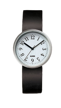
the classic design by the late Achille Castiglioni and his friend Max Huber
the watch's design elegantly illustrates Mies van der Rohe's famous dictum that ....
"less is more"
Monday, October 23, 2006
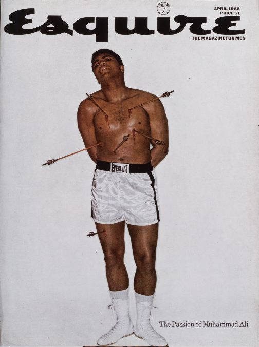
4 Classic New York Magazine Covers
Esquire (April 1968) The controversial April 1968 cover depicting Muhammad Ali impaled by six arrows appeared on the heels of his refusal to be inducted into the U.S. Army because of his religious beliefs. (Ali, convicted violating the Selective Service Act, was barred from the ring and stripped of his title.) The cover, the second of three Esquire covers defending Ali, shows the boxer martyred as St. Sebastian, a patron saint of athletes and one who was shot with arrows for his steadfast religious beliefs. This was one of the covers designed by George Lois, Esquire’s Art Director during the 1960s.
click to enlarge
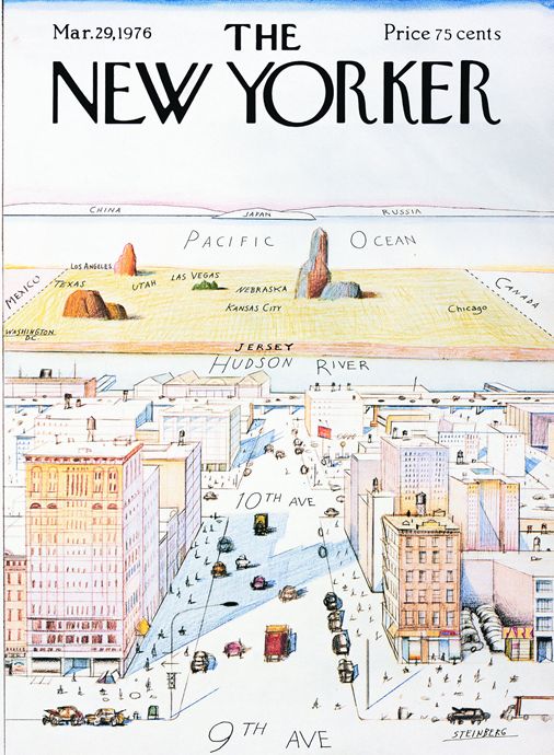
The New Yorker (March 29, 1976)Saul Steinberg’s March 29, 1976 The New Yorker cover, “View of the World from 9th Avenue,” has come to represent Manhattan’s telescoped perception of the country beyond the Hudson River. The cartoon showed the supposed limited mental geography of Manhattanites.
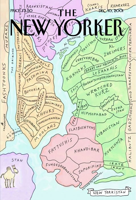
The New Yorker (December 10, 2001) This New Yorker cover by Maira Kalman and Rich Meyerowitz features a map of “New Yorkistan” where the city is divided into Middle Eastern names. The pastel map pastel map showed a flat, bird's-eye view of New York City drawn in pen and wash. It echoed Saul Steinberg’s map “View of the World from 9th Avenue,” published on the cover of The New Yorker on March 29, 1976
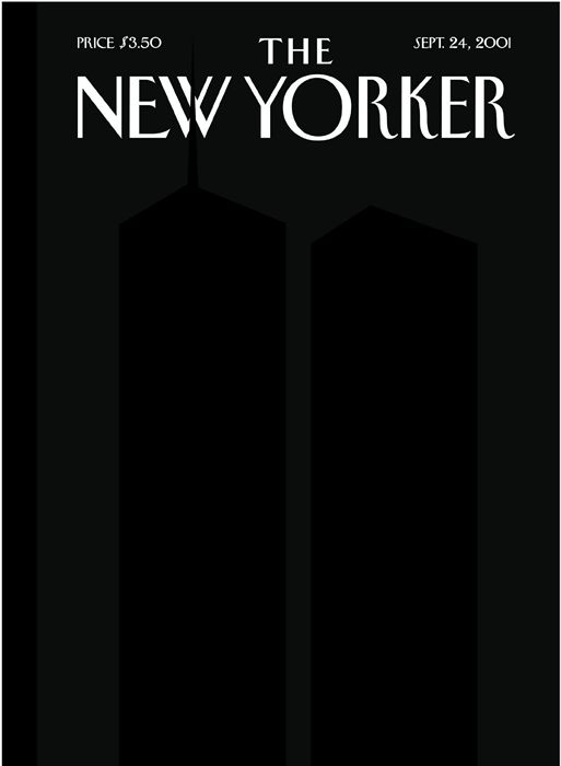
The New Yorker (September 24, 2001) New Yorker Covers Editor Françoise Mouly repositioned Art Spiegelman’s silhouettes, inspired by Ad Reinhardt's black-on-black paintings, so that the north tower's antenna breaks the "W" of the magazine's logo. Spiegelman wanted to see the emptiness, and find the awful/awe-filled image of all that disappeared the on 9/11. The silhouetted Twin Towers were printed in a fifth, black ink, on a field of black made up of the standard four color printing inks. An overprinted clear varnish helps create the ghost images that linger, insisting on their presence through the blackness
a friend sent an e-mail wondering whether it was snowing ... ?
Saturday, October 21, 2006
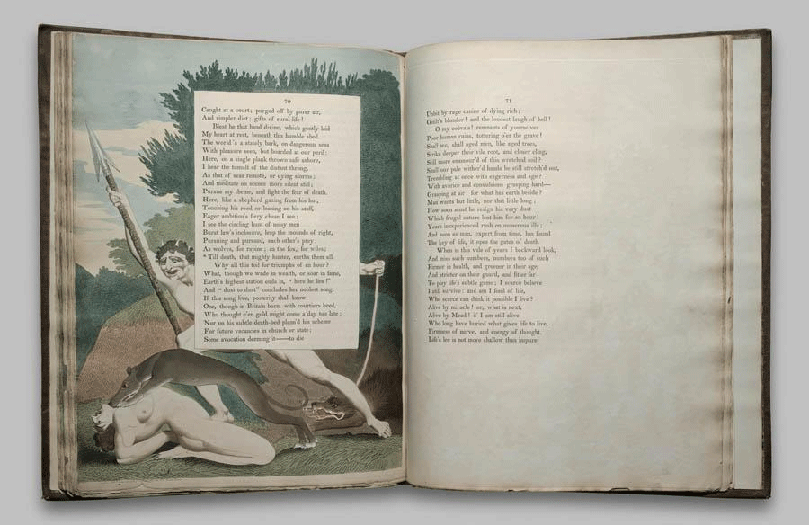
the remarkable William Blake,printmaker, illustrator, book designer, poet and visionary
Autograph draft of four poems: 'I saw a Monk of Charlemaine'; 'Morning'; 'Terror in the house does roar'; and 'Each Man in his Spectres power'.
The sketch of the head of King Henry VIII, after Holbein's portrait the Notebook of William Blake - England; circa 1787-1818
click to enlarge
Friday, October 20, 2006
click to enlarge
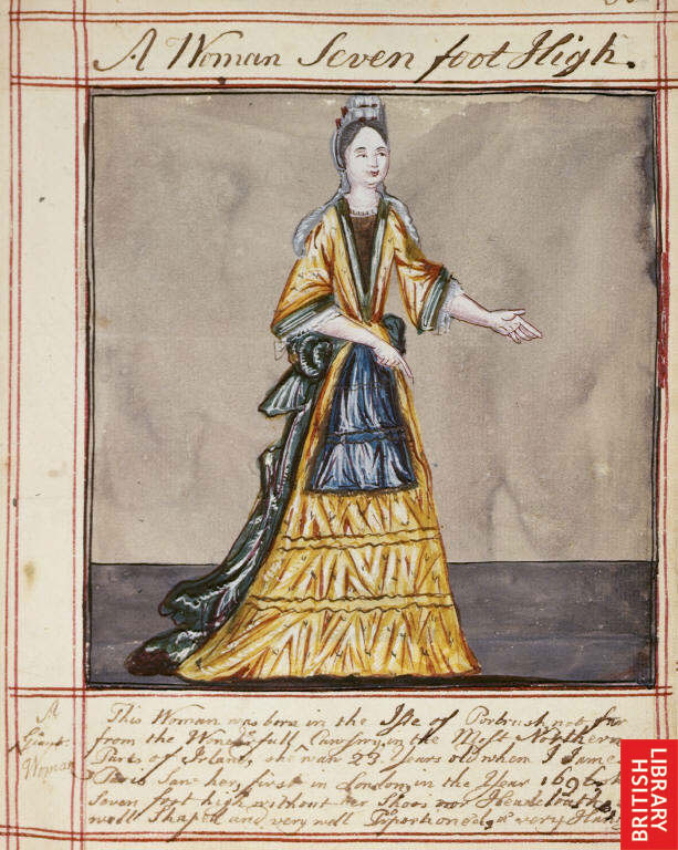
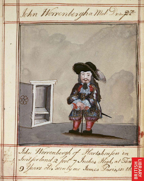
Drawings of a woman from Portrush, Ireland, 'seven foot high'; a small person dressed en regalia, and a very hairy hairy hairy person, who were all seen, and then drawn by James Paris in London in 1696. The titles of the works, is Drawings of Human Prodigies.
It's hard to know what people thought of each other in the early 17th.cent. and for our purposes, more importantly how they expressed these feelings in images. (this is at least somewhat discernable)
While these drawings clearly exploit the "uniqueness" of the subjects, they are not critical or distant, and seem a rather whimsical depiction of a remarkable encounter. The text is full of admiration and awe. I guess political correctness had not yet reared its ugly head.
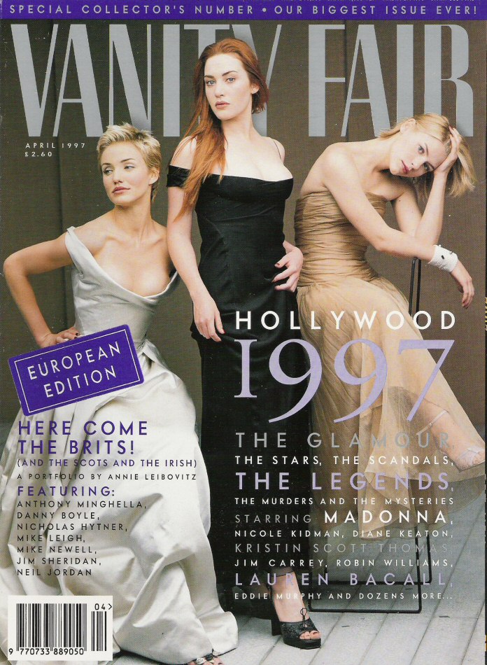
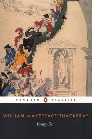
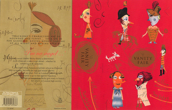
An assortment of images inspired by, or devoted to the late Victorian novel by William Makepeace Thackeray. Thackeray's novel satirizes the petty cruelties and deep moral failings of "upperclass" society in early 19th.C England. A beautiful sad tale, it is replete with the visual excesses of the burgeoning Empire. A sweeping visual landscape of a novel, awash with absurd parades and parties, ornate meals by candelight, the lovely wet soft green of the southern English plains and the busy mad roccoco of late Victorian fashions. It is interesting to see over time, and across disiplines, how the novel is visually represented.


