this is a private blog for my design students and assorted other survivors. Tro blemakers all. this is a private blog for my design students and assorted other survivors. Tro blemakers all. this is a private blog for my design students and assorted other survivors. Tro blemakers all. this is a private blog for my design students and assorted other survivors. Tro blemakers all.
Saturday, January 24, 2015
http://www.brucemaudesign.com/work?project_id=108 dig it
Dagobert Peche(1887 - 1923) he died young, from too much ice cream and loud, bad, rock and roll. He studied Architecture at the Academy of Fine Art in Vienna (Wiener) and after four years of freelancing, joined the Wiener Werkstätte. Dagobert joined the Werkstätte in 1915, during World War I. His work was more ornamental than the work of other well known contemporaries like Moser and Hoffmann - because he came at a later time, when Viennese design was not quite as preoccupied with geometry, as was typically the case.
Saturday, January 17, 2015
the Capelli stool, just beautiful, and and even more poetical, it's utterly useless (insert insult here)
Thursday, January 15, 2015
The electronics company Philips was to the Dutch city of Eindhoven what Rolls Royce is to Derby, or Mercedes to Stuttgart. It was founded there, and grew to become the biggest employer. But when from the 1980s on Philipsbegan to shift its operations out of Eindhoven, culminating with the move of its head office to Amsterdam in 1997, it left a void. Like a lover scorned, Eindhoven needed to go out and get itself a makeover. Technology and design sectors blossomed, and many of the old factories became homes to creative start-ups.As part of the effort to rebrand itself, it seemed apt that Eindhoven should turn to an aspect of design – namely, typeface.
The city’s municipality and Eindhoven 365, its marketing department, embarked on a collaborative effort to commission a new city font. They created a virtual design agency, with designers from competing agencies working together. The results can now be seen all over the city.
Eindhoven’s typeface is deliberately a little rough round the edges.Illustration: Virtual Design Agency
As the original sketches were made from sticky tape, the corners of the letters in the final design are missing. The result is a slightly rough-around-the-edges typeface. That fits this once-industrial city, says Remco van de Craats, co-owner of one of the city’s design agencies tasked with coming up with Eindhoven’s typeface. Eindhoven, he says, is a city “very much in transition.”
But can a typeface really represent what’s unique about a city? Van de Craats, not surprisingly, thinks so. Type has a lot of effect on the atmosphere of a place, he says, calling it “the voice of the city”: “I think cities that don’t have this very dynamic energy, they don’t feel the need to change their identity.”
That identity, for many of the world’s largest cities, is intimately tied up with typeface. Johnston Sans and Gill Sans, which are used on the London Underground, say “London” even before you’ve read the signs. In New York it’s Gotham, or Helvetica (where once it was Standard) on the subways. The Legible Cities movement, which is creating a new Cyrillic alphabet for Moscow’s transit system, is gaining momentum.
“When typefaces get attached to cities,” explains Dan Rhatigan, a New York-based type designer, “it’s because typefaces become part of people’s everyday experience. People don’t identify typeface necessarily; very few of us can look at something and say what it is, but it has an effect, it’s a personality.”
Though much of this font personality stems from transit systems – Helvetica in New York, or Frutiger in Paris – fonts come from everywhere: Anandabazar Patrika (AKA Linotype Bengali and now effectively the typeface of the entirety of Bangladesh and West Bengal) grew out of a city newspaper in Kolkata. Because Sheffield was home to the type foundry Stephenson Blake & Co, officials attempted to use the company’s Granby Condensed as the city’s official typeface – an attempt that proved difficult in practice and led to the creation of Wayfarer, still visible around the city today. And more are commissioned every year:Stockholm Type is hot off the presses.
But it is small, post-industrial cities that seem particularly eager to, as it were, make a name for themselves. In Chattanooga, a city of 200,000 on a bend in the Tennessee river, typeface designers Jeremy Dooley and Robbie De Villiers set up a Kickstarter to raise funds for a new city font, securing more than $10,000 (£6,600).
Chattanooga, Dooley believes, was the ideal city for such a project. Its small size made it easy for the design community to rally around the project. He also points out: “If you’ve got a very diverse kind of a city that’s a lot more fragmented, there’s going to be a lot more difficulty in coming with one unifying [typeface].” Where bigger cities have become associated with a typeface, it has tended to happen more organically, or via specific projects for transport networks or road signage, rather than through a city-wide project such as Chattanooga’s.
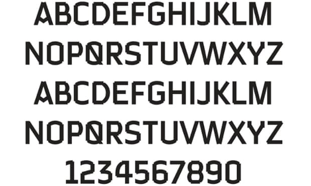
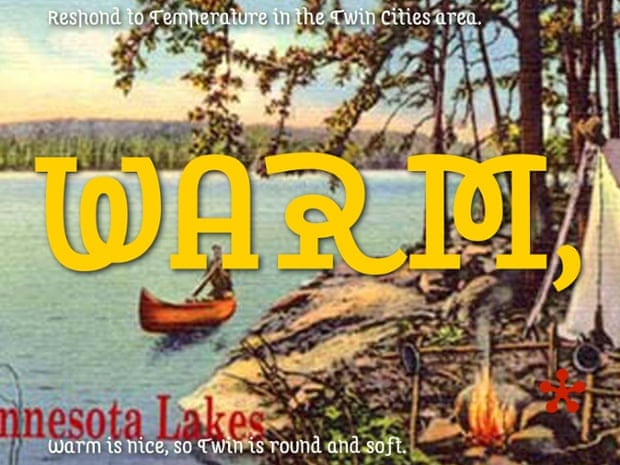
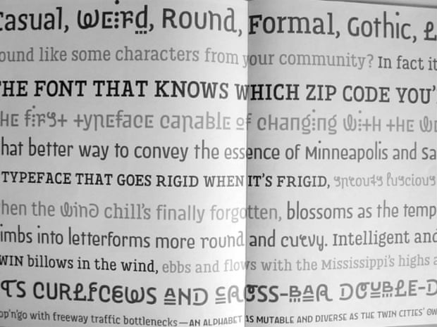
A font for the twin cities of Minneapolis and St PaulPhotograph: PR
“Rome feels different to London; there’s a certain tangibility,” he says. “And now, as a typeface designer, I see part of it is the typefaces being used. In any city in the world – largely because the graphic designers doing the branding feed off one another – a vernacular develops ... in the same way as an accent, for example.”
In designing the font for Chattanooga, Dooley looked to the city’s Cherokee heritage – the written form of the Cherokee language is still used in the two nearby reserves – and its history as a major railway point. De Villiers, for his part, sought an equal emphasis on the future: “Chattanooga ambitiously wants to see itself as a kind of Silicon Valley alternate,” he says. “In North America they were the first city to have their own gigabit internet. They’ve really been investing in that [broadband] infrastructure and they want people to have that idea about what Chattanooga is and what it wants to be.”
Chartype, the font the pair have created, aims to align all those themes. It is a chunky slab serif with “an 1880s kind of a feel,” Dooley says. “They’re really popular right now with graphic designers in the US, so it’s still contemporary.” The font is now visible all around town: because it’s free, different companies have adopted it, as have the Chattanooga visitors’ bureau and library.
Paul Bailey, a brand consultant at London-based 1977 Design, says it’s exactly by tapping into “what makes this place this place” that makes a typeface work. As one of the most important visual aspects of any brand, typography can be used to “reflect a certain kind of personality”, he says – reflect, he stresses, not create. “You can’t pick a nice, modern typeface if the city is actually really run down. People can quickly see through it. You can’t rebrand something and then tell people ‘This is what your city is like,’ because if it’s not, they’ll just say ‘That’s rubbish, it’s not like that at all.’”
Pinteres
The typeface created by Just Rossum and Erik Blokland for the Minneapolis and StPaulPhotograph: Just Rossum and Erik Blokland
But you can, Bailey says, use fonts to signal “where a city brand is moving to”. That’s what a team at the University of Missouri–St Louis are hoping to achieve by raising funds to design a typeface called St Louis. According to Jennifer McKnight – an assistant professor and designer at the university who is running the project with Terry Suhre, the university’s gallery director – the city of St Louis was one of the nation’s top type-founding cities in the late 19th century, and played a key role in the industrialisation of type-founding. She and Suhre now want to tap into this heritage, via a competition to design a new typeface, but also to “suggest a way that design might be the suggested way to solve our city’s problems”.
“Some say the region lives in the past,” McKnight says. Just like Eindhoven, St Louis has been hit hard by the loss of manufacturing – in this case the closing of the local Ford plant and big cuts at Anheuser-Busch. “Many of us are wondering how to reframe or rename St Louis into a city on the rise, instead of a city whose time is past. With the rise of interactive design, design that doesn’t need to be made in a hub city, we were hoping in this project that perhaps design could be a player in how we make our city grow.”
But while it’s clear that typography, as one manifestation of design, can and has done a lot for these smaller cities, it cannot be the whole solution. “A new typeface in itself isn’t going to change a city,” says Bailey. “But it might help change the mindset of the people in a city and inspire them to make the change themselves.”