this is a private blog for my design students and assorted other survivors. Tro blemakers all
this is a private blog for my design students and assorted other survivors. Tro blemakers all.

Sunday, February 25, 2007

A brief example of student's work. Both on their way forward : Mohamed is currently at Concordia in Design, and Sean's right in the midst of applying to it. These young art punks both share some of the requisite traits of success - (a motif, perchance ? ) such as - curiosity and enthusiasm about other 's work, a commitment to the craft and its materials and perhaps most importantly, they work very, very hard.

recent surfboard bottom designs (06/07) - Mohamed Thaim - cleek to enlarge


here's a new poster ( 24 x 36 ) - a meditation on saying what you think - by Sean Yendrys


Saturday, February 24, 2007

Dieter Rams studied architecture and interior design at Wiesbaden Arts and Crafts School from 1947 to 1953. In 1955, he started his work for Braun where he soon became the head of the product design department. Since 1981, Dieter Rams has also been a Professor at the Academy of Fine Arts in Hamburg.

One of Germany's best-known industrial designers, he is considered one of the great representatives of functionalism. Rams has received numerous design awards.

" Rams was a key figure in the German Functionalist design renaissance of the late 1950s and 1960s. Eventually becoming head of Braun's design staff, Rams' influence in the advent of clean and simple Rationalist design was soon evidenced in many products.

Rams once explained his design approach in the phrase "Weniger, aber besser" which freely translates as "Less, but better." Rams and his staff designed many memorable products for Braun, including the famous SK-4 record player and the high-quality 'D'-series (D45, D46) of 35mm film slide projectors. He is also known for the designing the 606 Universal Shelving System by Vitsœ in 1960.
Many of his designs - wonderfully sleek coffee makers, calculators, radios, audio/visual equipment, consumer appliances, and office products - have found a permanent home at many museums over the world, including MoMA in New York. For nearly 30 years Dieter Rams served as head of design for Braun A.G. until his retirement in 1997. "

Dieter Rams stands for an integrity in design and for true functionalism. He is anti-styling & anti-waste, against the throwaway society. He likes to develop a product over years, steadily improving it. It comes as no surprise to find that his preferred automobile is a Porsche. Not that he is dismissive of such marketing-led niche vehicles as the cartoonish new Beetle & Mini, or the shape making school of architecture represented by Frank Gehry et al.

Dieter's slogan is "less, but better". .. see below


Dieter Rams
on 'good design'
Based on my experience as a designer, I have distilled the essentials of my design philosophy into ten points. But these points cannot be set in stone because, just as technology and culture are constantly developing, so are ideas about good design.

Good design is innovative
The possibilities for innovation are not, by any means, exhausted. Technological development is always offering new opportunities for innovative design. But innovative design always develops in tandem with innovative technology, and can never be an end in itself.

Good design makes a product useful
A product is bought to be used. It has to satisfy certain criteria, not only functional, but also psychological and aesthetic. Good design emphasises the usefulness of a product whilst disregarding anything that could possibly detract from it.

Good design is aesthetic
The aesthetic quality of a product is integral to its usefulness because products we use every day affect our person and our well-being. But only well-executed objects can be beautiful.

Good design makes a product understandable
It clarifies the product’s structure. Better still, it can make the product talk. At best, it is self-explanatory.

Good design is honest
It does not make a product more innovative, powerful or valuable than it really is. It does not attempt to manipulate the consumer with promises that cannot be kept.

Good design is unobtrusive
Products fulfilling a purpose are like tools. They are neither decorative objects nor works of art. Their design should therefore be both neutral and restrained, to leave room for the user’s self-expression.

Good design is long-lasting
It avoids being fashionable and therefore never appears antiquated. Unlike fashionable design, it lasts many years - even in today’s throwaway society.

Good design is thorough down to the last detail
Nothing must be arbitrary or left to chance. Care and accuracy in the design process show respect towards the consumer.

Good design is environmentally friendly
Design makes an important contribution to the preservation of the environment. It conserves resources and minimises physical and visual pollution throughout the lifecycle of the product.

Good design is as little design as possible
Less but better - because it concentrates on the essential aspects, and the products are not burdened with inessentials. Back to purity, back to simplicity!

Copyright Dieter Rams 2003

Friday, February 16, 2007

digital two, be afraid, be very afraid .....

Sunday, February 11, 2007

vintage Vogue covers, that iconographic combination of image and typestyle


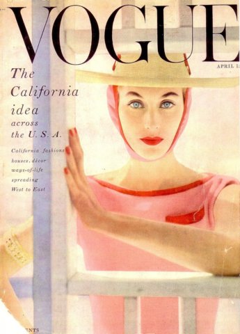
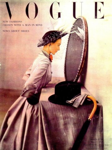
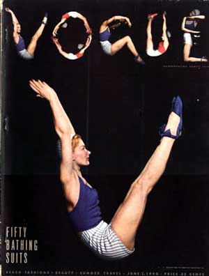
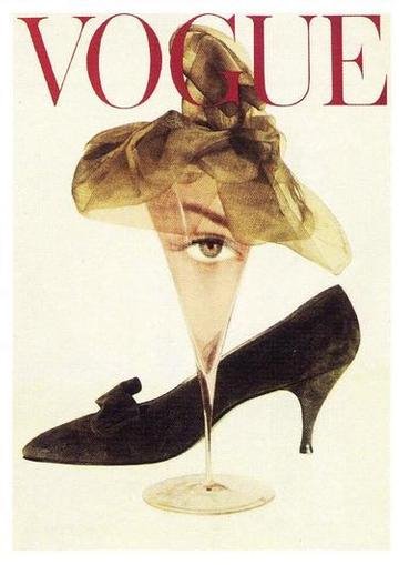
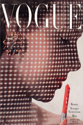
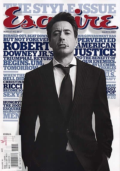
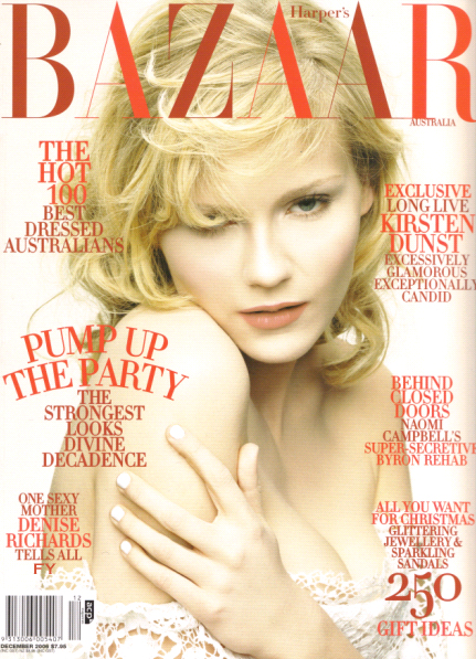
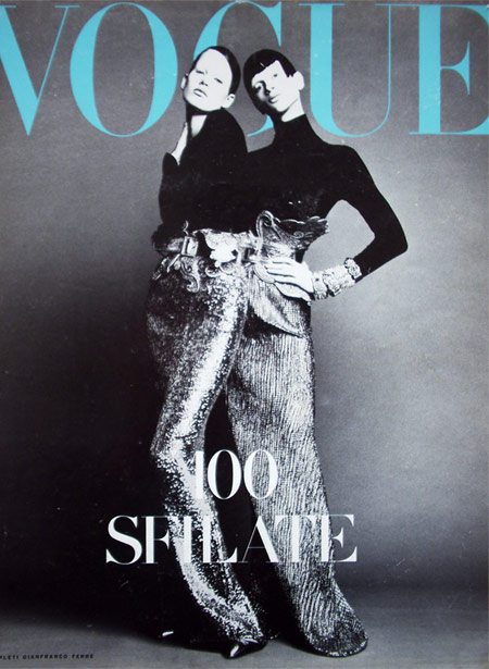
click to enlargealways the best photographers ... Irving Penn, Cecil Beaton,William Kline, Guy Bourdin, Norman Parkinson, Steven Meisel, David Bailey and on.. each era's changing ethos faithfully reflected in the lens, recording fashion and style like a fossil record.

But the venerable type face, is a rare constant in the fast and faithless landscape of fashion, and is as if - carved in the stone which originally inspired its design. Roman stone carved glyphs, 2nd Century - then to baskerville's stylish tombs & grave stones types - on to the 18th.C. to the typographic studio of Firmin Didot - then, in its most recent incarnation - as the 1930's Linotype Didot

per your request, excerpts. click to enlargo


Thursday, February 08, 2007

the Art of Direction - Jean-Paul Goude


french american japanese
clicques aux fait grande
design two - here's some interesting current
examples of working with text design - remember you must
ensure that your wonderful text assignments are
finished for 2 classes hence. ar
aaaargrgthh !.....


Esquire, obstensibly a men's magazine, is renowned for
the writing of its cover stories as well as its hardhitting,
witty cover concepts (see earlier post). Published since
the early 1930's, it has featured writers such as Hemingway,
F.Scott Fitzgerald, J.D.Salinger and Tom Wolfe etc.
It was
also home to many influential designers such as
Paul Rand,
Jean-Paul Goude and Andy Warhol


When Harper’s Bazaar began publication it was a weekly
magazine catering to women in the middle and upper classes.
They showcased fashion from Germany and Paris in a newspaper
design format. It wasn’t until 1901 that Harper’s moved to a
monthly issued magazine which it maintains today. Since its
debut in 1867 as America's first fashion magazine, the pages
of Harper's Bazaar, first called "Harper's Bazar", has been
home to talent such as: Diana Vreeland, Anna Wintour,
Alexey Brodovich, Man Ray, Richard Avedon etc.


click to making big


this was the invitation to the Heatherettes show at this months NYC
fashion week, c'est way big fun

Tuesday, February 06, 2007

click the image to enlarge


A brilliant, contemporary illustration - with clear
neo-classical overtones... can you say Chariscuro ?
Jacques-Louis David ? or perhaps Caravaggio ?

Caravaggio's novelty was a radical, almost sexual
naturalism which combined close physical observation
with a dramatic, even theatrical, approach to chiaroscuro,
the use of light and shadow. In Caravaggio's hands this
new style ( ... well it was new during the early 1600's )
was the vehicle for a radically authentic and moving sense of
power and sensuality.

extra marks and a ca$h prize, if you can find out who made the poster
ps. all cash prizes must be redeemed from Co-0rdinator Siberock or Mr. Nobby Stiles
design 2 assignment - in a continuation of our particular
attention to text design & its structure - do for next class -
deduce the following - who, what, when, where, and why ?

No.3 is not nearly as difficult as you think ....


anyone who thinks bemusedly, that "it's a font sir" will suffice as an
answer, will be sorely dissapointed. This kind of "answer", will be
met with an abject derision & a big pointy stick. do your work

Friday, February 02, 2007

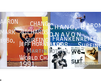
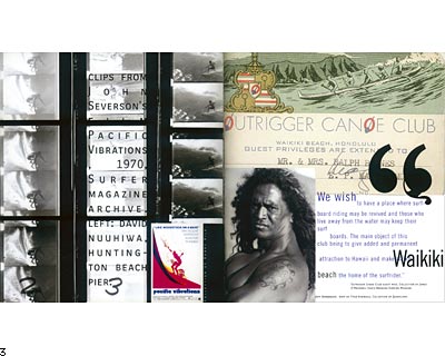
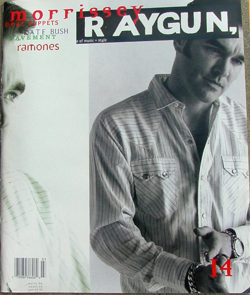
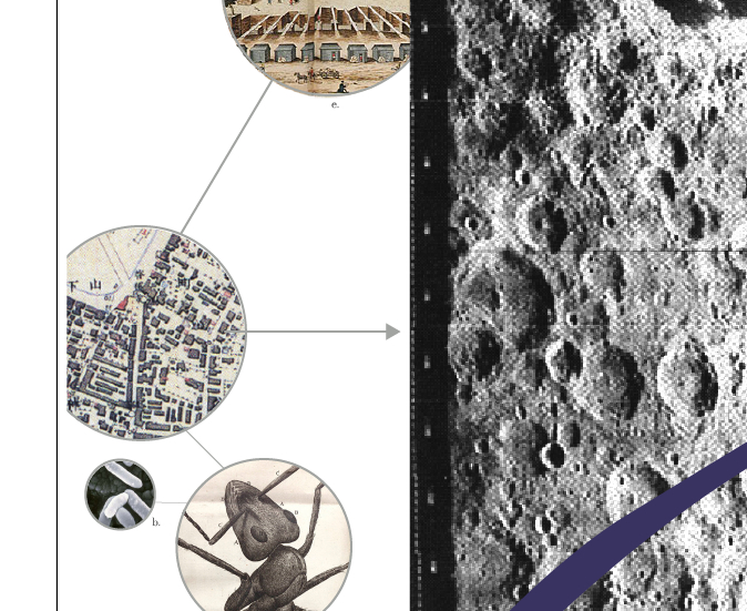
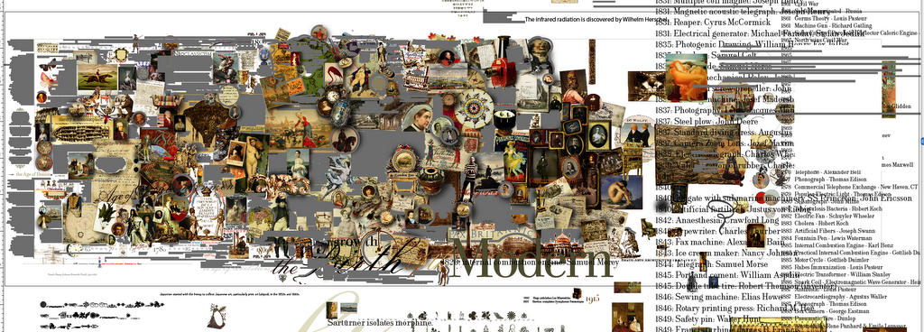
the page & typographic design of David Carson


One of the most consistently innovative and influential graphic designers of today, David Carson's work features an interesting combination of modern, de-constructed forms - yet technically elegant, historically influenced designs.

Improvisational, his work can include found signage and objects, anything really, that fits the concept. His designs wonderfully articulate how it is possible to combine for dramatic effect, seemingly contradictory elements.


Interestingly, the structure of his work seems influenced by or reminicent of - the late 19th. decadent poets ie. Apollinare, Nerval, Cravan et al - who "discovered" improvised/found poems, by combining words at random, which later helped inspire the early collage work of the Surrealists and Dadaists giants, such as Kurt Schwitters, Raoul Hausmann, John Heartfiled and Max Ernst et al.