this is a private blog for my design students and assorted other survivors. Tro blemakers all
this is a private blog for my design students and assorted other survivors. Tro blemakers all.

Friday, April 22, 2011


the fascinating work of Léon Gimpel

From Wikipedia, the free encyclopedia, the Vanier students bestest friend - Léon Gimpel (13 May 1878-7 October 1948)[1] was a French photographer.

Born in Paris in 1878 , Gimpel worked for his family's fabric company, managed by his older brother Eugene. In 1897 his interest in photography was kindled when he acquired a Kodak detective camera, he soon swapped this for a Spido Gaumont which allowed him greater creative freedom.

By 1900 he was working prodigiously, documenting
the 1900 World's Fair in Paris. By 1904 his work was being published regularly in the magazines La Vie au Grand Air, La Vie Illustrée and L'Illustration.

A restless and innovative photographer, Gimpel experimented
with perspective, produced self portraits using distorting mirrors and experimented with night time photography. At an air show at Béthény in August 1909, Gimpel ascended in an air ballon to photograph the crowds below, pioneering aerial photography. However it is his pioneering work in colour photography that he is most
notable for.


In 1904, Gimpel met Auguste and Louis Lumière, who had just displayed their invention the autochrome to the Académie des Sciences. Limited by the long exposure time required, Gimpel used the process, to photograph still lifes and landscapes. Assisted by his colleague Fernand Monpillard, Gimpel modified the plates to produce "instant" colour pictures. Thanks to his works Gimpel was the only photographer who succeeded in capturing, in colour, scenes of everyday life during la Belle Époque.

On June 10, 1907 Gimpel was the first photographer to have images published in color. A special edition of L'Illustration was published to demonstrate the new technology, it included an insert featuring four autochromes taken by Gimpel, a group of soldiers, two scenic views of Villefranche-sur-Mer and sunset at Lake Geneva. A few weeks later on June 29, 1907, Gimpel published the first color news photographs when L'Illustration published his picture of Frederick VIII of Denmark and his wife Louise of Sweden, who were visiting France at the time. Gimpel produced many works using the autochrome, arguably the most famous are the images known as The Grenata Street Army produced during the First World War. Gimpel befriended a group of children from the Grenata Street neighbourhood of Paris who had established their own 'army'. Under his guidance he helped them build their tanks and aircraft, documenting their 'battles' against the Boche. On a more serious note Gimpel also recorded the French experience of the First World War visiting munitions factories and trenches on the Western Front.

Gimpel married Marguerite Bouillon in 1939 and settled in Béarn. He died in 1948 at Sérignac-Meyracq. Although largely forgotten, his work has experienced a revival recently.

The band Beirut used one of his photographs as the inspiration behind their 2007 album The Flying Club Cup. A major respective took place at Musee d'Orsay in Paris in February 2008. His work helped influence the 2009 Spike Jonze film Where the Wild Things Are.
WOWé !

Another fantastic video by Everynone in collaboration with WNYC | Radiolab.


Monday, April 18, 2011

Paper Record Player from kellianderson on Vimeo.


thanks to leplumagegris

Sunday, April 10, 2011

just watch it, it will almost fix everything, all-together too funny, enjoy ! warning extreme silliness, occasional swearing, and really really bad dancing. OH! and cowbell !

Saturday, April 09, 2011

I've been reviewing some of your mid-term magazine assignments, and I must admit they are much better than I expected at this stage. Some of them are in fact rather lovely, and demonstrate a sophisticated use of colour and interesting compositions. Johnson's layout in particular. Well done Mr.Ta ! Here are some vintage David Carson Raygun covers to inspire you, decades old, but they still walk the walk. eh ?


Cleek to make more bigs - A cool event and an opportunity
to see some interesting work by young, emerging designers
and former students. Check it out.

Wednesday, April 06, 2011


An important reminder: ! Don't Forget !

Digital 1 and 2, please remember that you must hand in at the beginning of the last class a "portfolio".

It should contain all of your work (graded or ungraded), all of the assignments for your particular class.

Such as, but not limited to: the Pollock assignment, the David Carson Project, The Blog, any/all layout typesetting assignments, le Magazine, the Sculptural letterform poster, the Street Sign assignment, the Onomatopoeia assignment, and the Film Titles assignment, etc. (note: not all projects apply to all sections, if you don't recognize a project relax.). Every section is, naturally, slightly different.

It can constitute anything you want really, the basic assignments or beyond - to infinity- it can contain a re-working or improvements of earlier projects, like the book or CD, or the product assignments or personal stuff you've done or just the assignments, as you wish.

Put your portfolio - your greatest hits, on a USB key (it will be returned next semester) or on a DVD (it will not be returned next semester), make sure that all the files are there, correctly.

If I open the portfolio and there are files missing, or fonts missing well you can guess what the result will be. Remember to always check your files on another computer, so as to ensure that it is universally openable and all the parts are there. Don't forget to " create outlines " in illustrator !

Make sure that the files are all saved as jpegs or pdf's, also ensure that you've handed in a copy, never ever hand in an original.

This is not an optional or negotiable part of the class, it is resolutely, absolute.

Due the beginning of our last class & complete. If you have questions, see me in class.
It's always about the idea, about the content. There's never really a substitute,
for it, even for things as innocuous as business cards. the cards be linked.
Thanks Qi.


Saturday, April 02, 2011

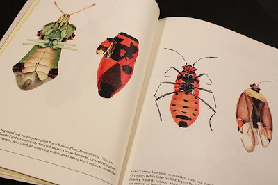
the extraordinary drawings of Cornelia Hesse-Honegger

Magazine of the Month


Underscore is created and self-published by Singapore-based design agency Hjgher. As such it is partly a show-case for the agency, but more importantly, according to editor Justin Long, it’s the magazine they felt should be out there but wasn’t.


Justin describes Underscore as ‘a magazine attuned to a simple rhythm,
quality of life’. And the physical manifestation certainly achieves quality –

this is a lovingly created, calmly paced magazine that sets it apart from
so much of todays media. The name has a double meaning – it underscores

the values it espouses but also, in a nice touch, refers to the other meaning
of the word, background music. So alongside
each issue the team prepare
a musical soundtrack to be listened while reading (available on the website
and signified alongside the related texts, below).


Book-like in design (and feel – 144pp of heavy matt paper bulk it out to

about 15mm thick), the magazine immerses the reader in a global trawl
of curiousities. Issue two (the top cover) is based on the theme ‘Constant’

while the first issue (the lower cover) was about emptiness.


Although based in Singapore the magazine has a global outlook, a quick flick yielding material about Japan, Switzerland, Berlin and Ireland. Only two issues into the project, the Hjgher team have already developed a community of like-minded collaborators around the magazine enabling the team to do things they would never have been able to achieve before launching the publication.


The colour palette, layout and typography (featuring a custom headline sans serif) are all subtle but establish a clear identity that shares some elements with Monocle in the way it refers to book design but has far more flexibility than that magazine.


The cover of issue two and the spread above feature artist Cornelia Hesse-Honegger’s drawings of insects genetically damaged by the Chernobyl radiation. The issue also carries a pull-out print of one of the insects.

Highly recommended for its design and content, the second issue of Underscore is currentlyavailable throughout Europe, the Middle East and China, and issue three is due June this year.
HOW A MAGAZINE GETS MADE