this is a private blog for my design students and assorted other survivors. Tro blemakers all
this is a private blog for my design students and assorted other survivors. Tro blemakers all.

Sunday, April 29, 2007

Information design and "findability" design 2 future project

click the picture punk !
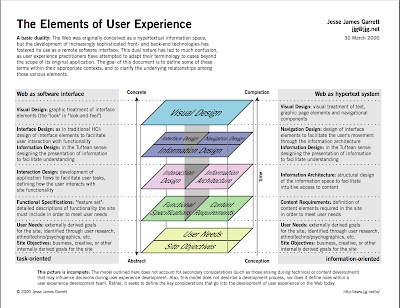


for D2 - Defining Information Architecture

Perhaps we should take a moment, before proceeding, to review the definition of information architecture:

  1. The structural design of shared information environments.
  2. The combination of organization, labeling, search, and navigation systems within web sites and intranets.
  3. The art and science of shaping information products and experiences to support usability and findability.
  4. An emerging discipline and community of practice focused on bringing principles of design and architecture to the digital landscape.

How do you find your way in an age of information overload?
How can you filter streams of complex information to pull out only what you want?
Why does it matter how information is structured when Google seems to magically
bring up the right answer to your questions?
What does it mean to be "findable" in this day and age?


and finally, ..... are you, what you find ? ....
Caslon Pro Typeface

William Caslon released his first typefaces in 1770. Caslon’s types were based on
seventeenth-century Dutch old style designs, which were then used extensively in
England. Because of their remarkable practicality, Caslon’s designs met with instant
success. Caslon’s types became popular throughout Europe and the American colonies;printer Benjamin Franklin hardly used any other typeface. The first printings of the American Declaration of Independence and the Constitution were set in Caslon. For her Caslon revival, designer Carol Twombly studied specimen pages printed by William Caslon between 1734 and 1770.


Wednesday, April 25, 2007

A thousand years ago .... when I was but a wee lad, these were my toys. Not literally - but toys more or less like these ones, kept us all amused in the rain, flashlight under the blankets, through the flu and the terrors of visiting relatives.

Our toys were always a starting point, and placed firmly in the dirt the game began, the fantasy unfolding around us. They were mostly made of tin, some were lead (this was in the days before enviromental impact studies) and the best tin toys, came in super fantastic colorful boxes. These wonders, were carried to the birthday table by our favorite uncles, or saved for - shilling, by shilling.

No wires or infra-red, no sub-dermal cortical implants or version centric 124 bit operating systems. We didn't need them, We had our own.

click on them


where's waldo ?


Tuesday, April 24, 2007


Sunday, April 22, 2007


here's an interesting interview from the AIGA


to read the full interview (it's short) go here

http://www.aiga.org/content.cfm/underground-comix-come-of-ag
e

Saturday, April 21, 2007

whilst preparing something for another class - I encountered these
beautiful pictures. Interestingly and to my amusment I noticed, each image exhibits, -
despite the fact that they more or less are all from the same early days of the Renaissance - aspects or subject matter, current to pending technical topics in both, D1 & D2

Can you guess the features I refer to ? If you can, I will sing God Save The Queen for you backwards and everyone will get free cake , again.


do click,
they are
fascinating

Friday, April 20, 2007

can you spot the difference ? and are you certain there is one ?
the first winner will receive a most excellent book, but before
you jump, you right clicking monkeys, ..... look and think...


for an interesting & amusing experience, do check out this
interactive site devoted to sub atomic particle theory and poetry ..
www.wordcircuits.com/gallery/subatomic/index.html

Thursday, April 19, 2007

new yorker - Anil Gupta's - tattoos


click to enlarge - the detail and shading is quite remarkable.
Oddly, and in despite of current trends in tattooing, this particular
tattoo is very evocative of the complex mechanalia (look it up, figure it out )
of late 18th & early 19th century's
Automata,the Turing Machine or perhaps
Babbage and Sterling's Difference Engine. A rather interesting perspective....
Bäst a NYC-based graffiti artist, works mostly in hand-printed
posters installed with very strong paste.


Images usually consist of borrowed pieces of antique pop-media and are accompanied by the artist's monicker.


BAST has no website and is anonymous, but is frequently featured on sites like the Wooster Collective


Wednesday, April 18, 2007

things most remarkable No.6
for extra marks - identify each
object, person
or image beyond the
meerly obvious.


here's the answer for (b) as no one figured out either ... losers

On July 05 1990 Christie's sold the Badminton Cabinet for $15 million.
The cabinet was commissioned in 1726 by Henry Somerset, the third duke
of Beaufort ( as in the Beaufort Sea or Beaufort Scale .. look it up ) .

It took about 30 craftsmen six years to build the Badminton
Cabinet out of ebony, rare woods, semi prescious stones, inlaid pearl,
gilt-bronze , pietra dura and (get ready) Ormolou ... ha ha .
But it doesn't end here, my little monkees...

On December 09 2004 the cabinet went up for auction once again at Christies.

After furious bidding the gavel came down and Dr. Johan Kraeftner, director
of the Liechtenstein Museum in Vienna, on behalf of Prinz Hans-Adam II of
Liechtenstein, ( we'lll discuss this particular absurdity in class, Lichenstein ?? )
had the winning bid on the world's most expensive piece of furniture at £19,045,250.00 or $36,662,106.00 USD. ... And like your Grandmother, they promptly covered it in clear plastic and would'nt let anyone
except really important guests sit on it.

Tuesday, April 17, 2007

CD design - The Smashing Pumpkins: Machina/The Machines of God CD 2001

The special challenge of this design project was in the accuracy of its elements.
The piece is intended to replicate the look and feel of an ancient alchemical journal.

Historically correct typography, color palette and the use of extremely detailed
illustrations had to be combined in a way that resembled a broken and faded book
from that era.

"To achieve the aged and well­handled feeling, we began by searching for dusty old
volumes from used bookstores. Most of the interior pages of the booklet are
re­photographed spreads from existing materials. The water­stained and aged
yellowed pages were then retouched erasing the existing type allowing us a clean
surface for our copy and illustrations. From the washed­out look of the black type to
the intentional misregistration of second color type, every detail was intended to
duplicate the printing capabilities that would have existed during that time period."

click me to see


Art directors: Gregory Sylvester, Thomas Wolfe, Billy Corgan, Yelena Yemchuk

Designers: Gregory Sylvester, Thomas Wolfe
Illustrator: Vasily Kafanov

Typefaces: Historical Allsorts, Volgare
Trim size: 4 3/4 x 4 3/4 inches
the classic Nike - "Just do it" - Braille poster 1993

Art director/designer: Guido Brouwers
Illustrator: Guido Brouwers
Copywriter: Laura Houston­Emery
Typographer: Schlagel Typesetting

just click me


Donnie Brasco” the Title Sequence design

The film director, Mike Newell, wanted to suggest the obsessive nature of the main character, an outsider and a predator. He had spent three years prior to the first scene of the movie on the streets, in bars, clubs, and lounges following Al Pacino’s character and looking for an opening into this criminal family. Instead of shooting live­action footage of Johnny Depp, the existing unit production stills were animated editorially to create this quality, which is intrinsic to the film.


Editor: Kurt Mattila
Designers: Adam Bluming,
Olivia D’Ablis, Kurt Mattila

Typeface: Bell Gothic ( I think .. )