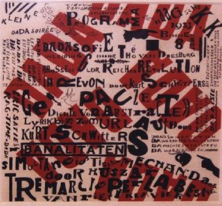
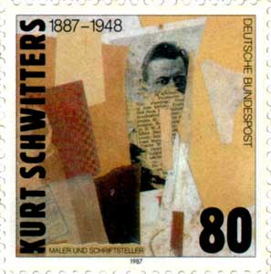
this is a private blog for my design students and assorted other survivors. Tro blemakers all
this is a private blog for my design students and assorted other survivors. Tro blemakers all.

Friday, September 29, 2006

When two typefaces are set in the same point
size, one often looks bigger than the other.
Bigger x-heights, introduced in the twentieth
century, make a typeface appear larger.
Differences in line weight and character width
also affect the letters' apparent scale.


Mrs Eaves, designed by Zuzana Licko in 1996,
rejects the modern appetite for supersized
x-heights. The font, inspired by the eighteenth-
century designs of John Baskerville, is named
after Sarah Eaves, Baskerville's mistress, house
keeper, and collaborator. The couple lived
together for sixteen years before marrying in
1764.

the Mrs.Eaves font

Wednesday, September 20, 2006


photograph by
Richard Avedon


Although the name
Alexey Brodovitch may not be
familiar to everyone, in the world of graphic arts it speaks
volumes. Designer, photographer, and interior designer
Brodovitch reigned as art director of Harper's Bazaar from
1934 until 1958. Working with artists such as Man Ray,
Richard Avedon, and Henri Cartier-Bresson, he dramatically
altered American magazine design. The double-page spread
was one of his signature innovations, as was the emphasis
on negative space in layouts.


Brodovitch (1898-1971) is a legend among graphic designers.
A Russian who fled the Bolshevik Revolution and eventually
settled in Paris and then New York, Brodovitch was one of the
pioneers of graphic design in the twentieth century. As the art
director of Harper's Bazaar for two decades (1934-58) he designed
and produced several exquisite and highly collectable books
with collaborators such as Richard Avedon and André Kertész;
was a talented photographer himself; and, through an informal
class called the Design Lab in New York, trained a younger
generation of photographers and designers who went on to
become famous artists and art directors in their own right.
click to enlarge


Monday, September 18, 2006

Kurt Schwitters - typographer, painter, graphic designer and collagist
(consider David Carson's work in relation to Schwitter's)
In the winter of 1918, Germany plunged into revolution; the Great War was ended and the Weimar Republic proclaimed. When the revolution reached the city of Hanover, Kurt Schwitters was working as a mechanical draftsman in an ironworks outside the city, while painting and writing poetry in his spare time. He was thirty-one, and beginning to make a small reputation for himself: that June, some of his paintings had been exhibited at the renowned Sturm gallery in Berlin. . . . Schwitters (1887-1948) started his career as an expressionist painter before turning to wood constructions and paper collages in 1917. While being associated with not only the German Dada movement but also artists from the Bauhaus and de Stilj in Holland, Schwitters was always fiercely independent and avoided being absorbed into any of the avant-garde art movements that flourished in Europe between the wars.

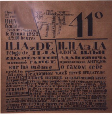
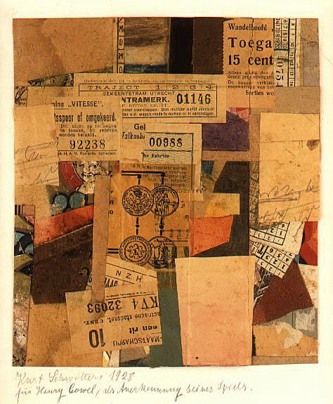
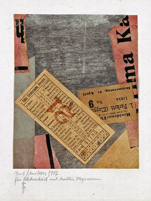
Living in somewhat easy prosperity in Hanover, he was sometimes belittled by his Berlin Dada colleagues for his lack of enthusiasm with radical politics. Inventing the name "Merz" in 1920, he became, in effect, a one-man art movement, best known for his mastery of the art of collage and for his contribution to the history of radical typography through his various journals and other publications.


Included in Hitler's Entartete Kunst (degenerate art) exhibition, Schwitters, like many of his contemporaries, left Germany in 1937, initially moving to Norway and three years later, as the German army advanced, he fled again to Scotland only to be arrested and interned as a an enemy alien. By 1943, he was living with his son and daughter-in-law in London, scraping together an income from commissioned portrait paintings and continuing to work on his 'Merz' collages and constructions.
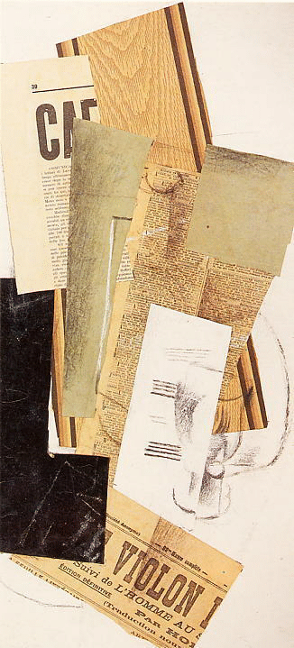
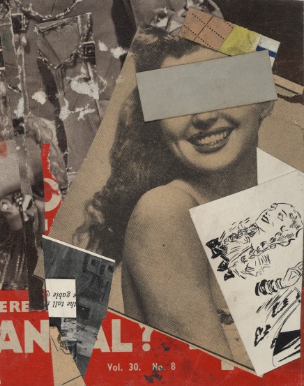
Created in war-ravaged London in 1943, the title Out of the Dark may be a reference to renewed optimism in the efforts of the allied forces or perhaps to the possibility of being able to work in daylight after the long nights of enforced blackout. Although collaged from an Australian fruit label, emphasis is given in the composition to the words "British Empire". Considering the artist's poverty and obvious alienation as a German citizen in London, it is also an ironic reference to the deprivation of the times; a box of fresh apples would have been an extreme luxury and the artist's lifestyle is hinted at through the bus ticket to the Fulham Road and the printed one penny coin (with Britannia turned decidedly on her head).


A subtle shift occurred in Schwitters' work, living as an exile, in relative isolation from his previous colleagues. In some of the English collages there is a more pronounced use of found imagery as the predominant element in the overall composition which inevitably suggests more 'meaning' to the work. The overall abstract composition is no longer more important than individual collaged elements. Another collage from the year before The Proposal 1942 (also known as The Courtship) uses as its base a 19th century lithographic illustration of a family sitting around a table that is almost puritan in its restraint on which is collaged reproductions from a glossy magazine of plates of food - biscuits, roast chicken, doughnuts, tarts etc. The culture of prosperity alluded to in this and other 1940's collages is very obviously America, as gleaned by Schwitters through American magazines sent to him by his friend Käte Steinitz who had emigrated there in 1936.


The shift in Schwitters' collages from an emphasis on composition to a subtle, yet unmistakable, social comment, is the most important development to emerge in the work of his late, 'in exile' period. While visually, this may appear to be a seemingly insignificant shift in emphasis, it has much in common with the early work of The Independent Group which, in turn, developed into Pop Art.

Monday, September 11, 2006

a lovely example of late 18th. century Copperplate engraving and Copperplate hand
(writing) as well as an amusing, if odd choice of symbol to associate with silversmithing and plate.This artisan's shop was located on Fleet street in Central London (where the early newspapers were located) at a pub called The Grasshopper.

There were many public houses in this very old, very famous and occasionally very nasty part of central London. Sweeney Todd the Demon Barber had his shop on Fleet street, where he is said to have slain over 150 customers with his silver edged razors. Perhaps this fellow knew him .....


click to enlarge
If you can, check out the "tumbling type" motion graphics
that studio 1741 Films designed for the trailer of the new movie

The Prestige


Sunday, September 10, 2006

Josef Müller-Brockmann"...In the ever-evolving world of the contemporary graphic design those who came before are often forgotten in the search of the next big thing.

It is surprising then that many new, fashionable designs intentionally conjure work that was created by designers of earlier era - designers who worked not with a computer but with pen and paper - designers like Josef Müller-Brockmann.
One of the 20th. centurys most important graphic designers, the Swiss-born Müller Brockmann is the father of functional,objective design and an influential figure for generations of designers around the world. While many contemporaries moved to the United States and elsewhere in Europe, Müller-Brockmann based himself in Zurich and established his reputation there.

He adapted his approach to a changing world, moving from an early illustrative style to a modern constructivist approach, making full use of geometrical form and the grid system to provide an underlying structure to graphic work."
written by Kerry William Purcell


'I would advise young people to look at everything they encounter in a critical light . . .
Then I would urge them at all times to be self-critical'
Josef Müller-Brockmann


click to enlarge
Josef Müller-Brockmann
was born in Switzerland in 1914 and studied architecture, design and art history at the University of Zurich and at the city's Kunstegewerbeschule. He began his career as an apprentice to the designer Walter Diggelman, and then, in 1936, establishing his own Zurich studio specialising in graphics, exhibition design and photography.
Müller-Brockmann was founder and, from 1958 to 1965, co-editor of the trilingual journal Neue Grafik (New Graphic Design) which spread the principles of Swiss design internationally. He was also a professor of graphic design at the Kunstgewerbeschule, in Zurich from 1950 to 1960 .

By the 1950s he was established as the leading practitioner and theorist of the Swiss Style, which sought a universal graphic expression through a grid-based design purged of extraneous illustration and subjective feeling.

Friday, September 08, 2006

Walmor Correa - Brazilian artist/illustrator
click to enlargo
" Back to my studio I started rethinking my first impressions on nature, evolution and
science and applied these very questions on a new series of works called Catalogações/
Coleções in which I created little paintings of imaginary insects with new functions. I
used real-life pins stuck into the images similar to old insect collectors. The species were displayed in entomological cabinets, according to the tradition of natural history museums.

After this project I looked back on my early constant visits to the school laboratories, those temples of silence and death. Feeding on these memories I created the Cartesian Dioramas, big-sized pictures made of acrylic and graphite on canvas with several animals surrounded by an ethereal environment where they stand individually, each one having its own highlight, which is related to old natural museum dioramas where animals are stuffed and displayed as a sample of nature. Without actually interfering in nature, I let the viewer’s imagination follow its own course. I provide clues about my creative process through texts with individual names I make up, along with some of the features which I consider necessary so as to confer an identity on these impossible beings I have brought to life."


Saturday, September 02, 2006

the innovation and excellence of Emigre Magazine

Emigre was/is a graphic design magazine published by Emigre Graphics from 1984 to 2005. It was first published in San Francisco by Dutch-born Rudy Vander Lans using fonts designed by his wife, Czechoslovakian-born Zuzana Licko hence the name Emigre. It was one of the first publications to use Macintosh computers and had a huge influence on graphic designers moving into high end desktop publishing (DTP). Its experimentation with layouts, use of guest designers, and opinionated political or critical articles also had an effect on other design publications and designers. Originally intended to be a journal for graphic design, Emigre also served as a medium for typographical experimentation and to showcase Emigre’s own typefaces.
Emigre designed or commissioned; typefaces, magazines, posters, music cd's, even pottery .?

It was a kind of Babylon of coolster design and culture. Cutting edge, aventurous, (some would likely say ... illegible) design exploration and production of very innovative, and often fascinating design by some of the best type designers and graphic artists working today.

It still sells typefaces and other things today, but the magazine itself has ceased publication. It was a unique place, where graphic design was explored for its own sake....and throughout its publication, Emigre influenced, informed and inspired a generation of graphic artists.

click to enlarge


for more information go to http://www.emigre.com/