this is a private blog for my design students and assorted other survivors. Tro blemakers all
this is a private blog for my design students and assorted other survivors. Tro blemakers all.

Tuesday, August 29, 2006

Mind the Gap !!

Kindly step back from the doors sir ...


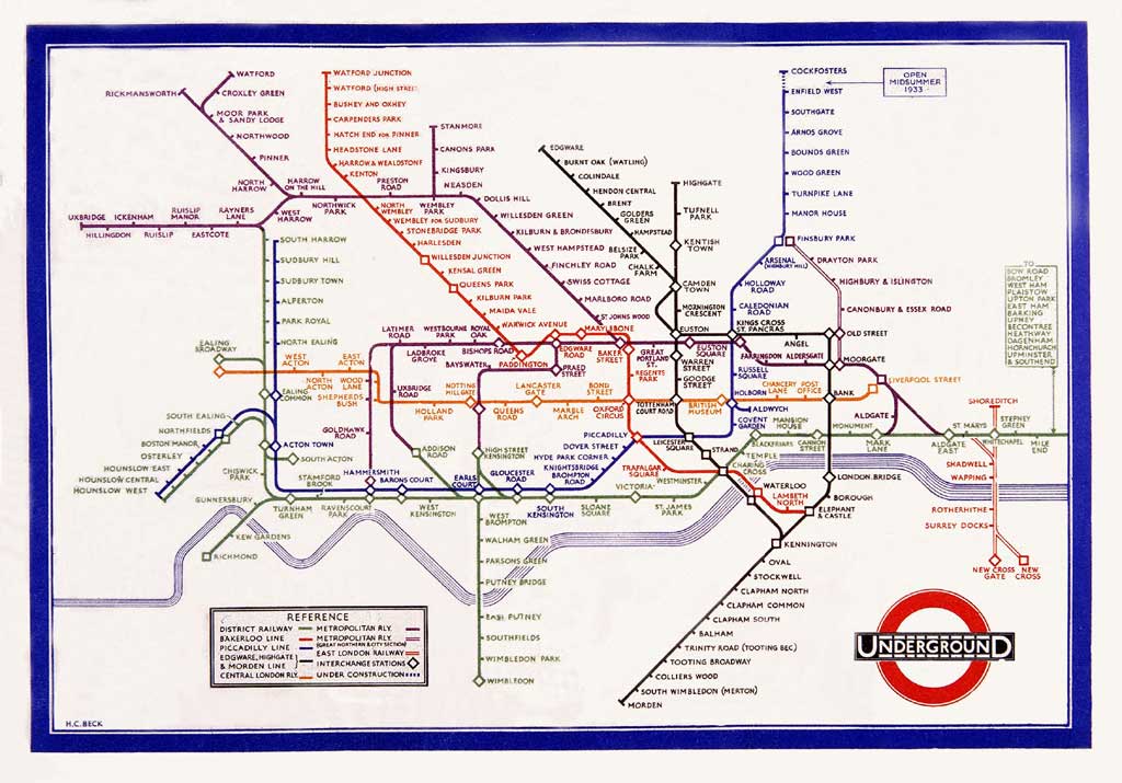
" The London Underground Map. What a piece of perfection it is,
created in 1931 by a forgotten hero named Harry Beck, an out-of-
work draughtsman who realized that when you are under ground
it doesn't matter where you are. Beck saw - and what an intuitive
stroke this was - that as long as the stations were presented in their
right sequence with their interchanges clearly delineated, he could
freely distort scale, indeed abandon it altogether. He gave his map
the orderly precision of an electrical wiring system, and in so doing
created an entirely new, imaginary London that has very little to
do with the disorderly geography of the city above. " excerpted from
Notes from a Small Island - by Bill Bryson
Underground Roundel


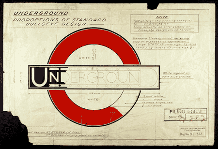
The roundel, symbol of London's public transport and a powerful
icon of the city itself, is almost 100 years old. From its humble
beginnings as a platform name board in 1908, the roundel has
become a famous company trademark, providing a unified corporate
identity for all London's transport services. The famous roundel,
originally known as the bar and circle, was first introduced on station
platforms in 1908 in an attempt to make the station name more clearly
visible on walls cluttered with commercial advertising and billboards.

The early platform bar and circle was a solid red, vitreous enamel disc,
fitted with a horizontal blue and white name bar framed with timber
moulding. From about 1911, the Underground logotype, with its large
U and D and hyphens, began to appear across the bar of the bar and circle
symbol. However it was not until 1913, when publicity manager Frank Pick
commissioned the typographer Edward Johnston to design a company
typeface that the roundel began standardised.


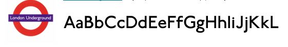
He was then asked to apply his successful sans serif typeface to the bar and
circle in 1916. Johnston reworked the Underground logotype in his new
typeface and incorporated it with a red ring. Johnson's version of the roundel
was registered as a trademark in 1917. Thus the roundel finally arrived as one
of the first corporate identity symbols and although over the years has been
refined it still retains its essential origins.

and no, that's not my dad on the right...

Tuesday, August 22, 2006

José Guadalupe Posada, La Calavera de Pascual Orozco, a photorelief print
On the Day of the Dead (Nov.2), Mexicans commemorate those who have died. Skulls (calaveras) and skeletons are the motifs of the festival, appearing as papier maché decorations, cakes, sweets, and illustrations in broadsheets. The press celebrate the day by publishing satirical and humorous broadsheets, which comment on the inevitability of death and include mock epitaphs of well-known figures, such as politicians. This sheet is one of twenty-four calaveras in The British Museum.

The Mexican illustrator José Guadalupe Posada (1852-1913), is best known for his illustrations in the calavera newspapers, that are published specifically to celebrate this day. In 1888 Posada moved to Mexico City where he worked for a number of publishers.

Posada produced a wide range of illustrations for broadsheets, covering subjects from political and social events to murders, executions and bizarre occurrences; ballad sheets, books of love poetry, holy pictures and gameboards for children. It is however, for his skeletal figures illustrating calaveras that he is chiefly remembered. His printing blocks were used long after his death, and his name became a generic term for his style of printmaking.


Marian Bantjes, a Vancouver Typographer and Graphic Designer
made this invitation to a Halloween party. A lovely, elegantly funky , halloweeny creepy, technically brilliant, and gracefully drawn homage to the baroque (as an adjective) stylings of CopperPlate handwriting which was all the rage during the late 1700's until the early 1900's.Gymnastic styling, florridly fluent adams family meets illuminated celtic manuscripts. rather Brilliant !


handwriting,longhand,calligraphy,etc.


click for clarity