Tuesday, April 24, 2012
"Bradbury Thompson was truly a master of almost every aspect of the design profession.
He studied printing production, was an art director for Mademoisellemagazine, designed books,
pushed the boundaries of conventional typography and taught design at Yale University.
He designed 60+ issues of Westvaco Inspirations for the Westvaco Paper Corporation.
His designs reached thousands of designers, printers and typographers.
Born in 1911 in Topeka, Kansas and educated at Washburn University Thompson stayed in
touch with the university throughout his career. From 1969-1979 Thompson worked together
with Washburn to create the Washburn Bible. The book was the most significant development
in Bible typography since Gutenberg first published his masterpiece in 1455. Another significant
point in his career, in the field of typography, was his publication of Alphabet 26, which was
labeled as amonoalphabet. It contained only 26 unique characters, case was established by size
only instead of entirely new characters (i.e. r/R, e/E, a/A). Thompson's work garnered him the
highest award of every major design organization including AIGA, the Art Directors Club and
the Type Directors Club. He died in 1995."
Friday, April 20, 2012
Likely the most widely used form of any three dimensional application in design - packaging serves as a dominant, and an extremely influential form of communication with consumers - since it provides a daily, intimate, and largely symbiotic experience for individuals in their routine lives.
We're submerged in packaging in fact, from our jeans, to our genes. it is just about everywhere really .... even on the bloody moon.
Millions of different products require unique, individual packaging solutions to set themselves apart from the ocean of competition when they reach their retail destinations.
This never-ending creation of new products, while grotesque in aspect, at least provides designers both with an ecosystem of materials, and the impetus to develop new and different package designs which in kind, reciprocally trigger a perpetually evolving array of production techniques and materials, to satisfy both the market and the industry which maintains it. hmmmn ..
Products can be packaged in paper, cardboard, plastic, rubber, metal, even space, among other things (what's next ? flesh ? don't laugh ....)
Products can be packaged in paper, cardboard, plastic, rubber, metal, even space, among other things (what's next ? flesh ? don't laugh ....)
This morphogenesis (if i can borrow a term from evolutionary biology) requires not only a matrix of production materials and processes, but also encourages the development of emerging printing and imaging techniques in order to create and address the constantly mutating aesthetics of branding for the individual product or line of products.
This never-ending list of possible production vectors, requires product designers to be well versed in typography, color and three-dimensional design etc. to ensure that their package designs are unique in every aspect. So get to work, you little Angry Birds, the new coolest thing, is just a moment away. In fact if you blink, you'll miss it.
Thursday, April 19, 2012

Traversing the world between art and design, Tadanori Yokoo's work has a very personal nature and often reflects his own interests. He began working as a designer during the late 1960's and his work often resembles a collage style that was quite the opposite of the modernist, swiss graphic movement.
Interested in mysticism, psychedelia and the Indian culture, his work is often associated with the 1960s pop culture. He has repeated several motifs throughout his work including the rising sun and waterfalls. In 1998 a large scale exhibition of his posters was held in Japan, the 40,000 people that crowded the exhibition during its thirteen-day event were a testament to his enduring popularity. In 1981 he unexpectedly "retired" from commercial work and took up
painting after seeing a Picasso retrospective at the Museum of Modern
Art (New York). His career as a fine artist continues to this day with
numerous exhibitions of his paintings every year, but alongside this he
remains fully engaged and prolific as a graphic designer.
Wednesday, April 18, 2012


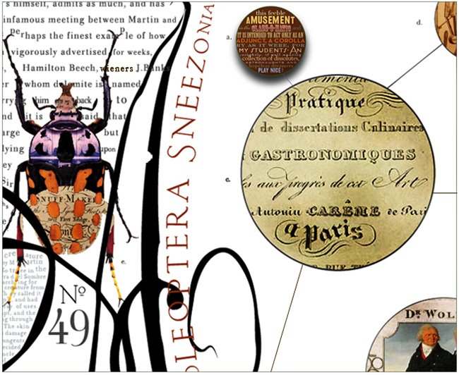
" Mike Libby (b 1976), creator of INSECT LAB, is a multi-disciplinary
artist who makes sculptures, models, collages and drawings using diverse
materials, detailed craftsmanship and conceptual curiosity. Mike exhibits
Insect Lab and his other work in the state of Maine, where he was born,
and throughout the US and in parts of Europe, his work is in a variety of
collections local and worldwide. And he enjoys being an active member
of his local community in Southern Maine as a citizen, a visiting artist at
several educational institutions and an entrepreneur. Mike Graduated with
a degree in Sculpture from RISD in 1999 and has since attended the Vermont
Studio Center, been artist-in-residence at the University of Maine at Orono,
and has enjoyed being a recent presenter at local Pecha Kucha events in
Portland, Maine.
Through Insect Lab, Mike has worked widely with book writers, editors,
publishers, and members of the science fiction community, curators of
galleries and museums, debuted at high end craft shows such as
CraftBoston, Philadelphia and Smithsonian, has been a guest of Hasbro,
featured through Neiman Marcus and just this past year is carried by
Anthropologie. Originally from central Maine, he currently resides and
works in South Portland, hoping to adopt a rescue dog soon. "

Tuesday, April 17, 2012
Bernbach on creativity:
“I think the most important thing in advertising is to be
original and fresh… Because you can have all the right
things in an ad, and if nobody is made to stop and listen
to you, you’ve wasted it.
And we in America are spending so darn much money
for efficiency, to measure things, that we’re achieving
boredom like we’ve never achieved before. We’re right
about everything, but nobody looks.”
Friday, April 13, 2012
Wednesday, April 04, 2012
whilst doing some research for a project, I came across the NYPL digital archives which is a robust collection of images, patterns, plans, details and well almost everything else, check it out !


Sunday, April 01, 2012
Subscribe to:
Posts (Atom)


