
size, one often looks bigger than the other.
Bigger x-heights, introduced in the twentieth
century, make a typeface appear larger.
Differences in line weight and character width
also affect the letters' apparent scale.
Bigger x-heights, introduced in the twentieth
century, make a typeface appear larger.
Differences in line weight and character width
also affect the letters' apparent scale.
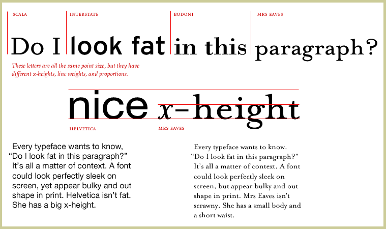
Mrs Eaves, designed by Zuzana Licko in 1996,
rejects the modern appetite for supersized
x-heights. The font, inspired by the eighteenth-
century designs of John Baskerville, is named
after Sarah Eaves, Baskerville's mistress, house
keeper, and collaborator. The couple lived
together for sixteen years before marrying in
1764.
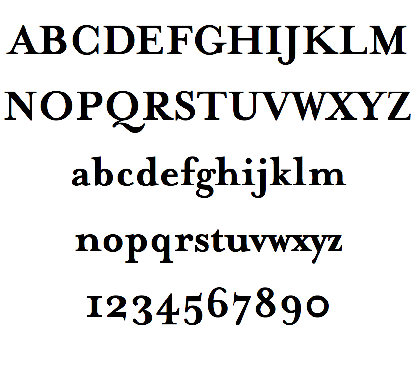
the Mrs.Eaves font


2 comments:
Very interesting, I just noticed that i could have found the answer for the first Assignment in your blog :)
yes you could, cheeky bugger ;-}
Post a Comment