this is a private blog for my design students and assorted other survivors. Tro blemakers all
this is a private blog for my design students and assorted other survivors. Tro blemakers all.

Thursday, November 10, 2011


Vienna at the turn of the 20th century witnessed a great surge
in scientific and artistic innovation, just a few years shy of the
collapse of the Austro-Hungarian empire.

Art Nouveau was prevalent throughout European art and
design and took a particularly strong hold in Germany,
where it was known as Jugendstil (youth-style). The
ubiquitous movement was epitomized at Munich, but took
on a unique form in Austria. The Union of Austrian Artists
was founded by the painter Gustav Klimt out of the coffeehouse
bohemian culture of Vienna and spurred by rebellion against
what was called “historicism”: the proclivity of the Vienna
Künstlerhaus towards conservative, classical forms.

Klimt and his followers considered the prevailing art of their
contemporaries as grievously out-dated, and unfit for
the changing social needs of a new machine age.


Monday, November 07, 2011


way too cool for school,

From the department of - " See Nothing Ever Really Changes" ... these shoes which were a huge hit at this seasons fashion week in Milan and NYC, are identical to shoes which I used to "sell" out of the back door of my very first real job at Crocket and Jones Shoes for the then princely sum of 4 Guineas - hundreds of years ago. What's next, bellbottoms ? you just watch, me boyo ...

Thursday, November 03, 2011

Alexey Brodovitch was a photographer, designer and teacher. However, he was most famous for his art direction, primarily for the magazine Harper's Bazaar, in which he re-invented magazine layout & page design. He spent his early life in and out of the military before spending time in Paris, which is where he began his career in the graphic arts. His first major success came after winning a poster competition for a local theater, the 2nd place poster was created by a short, little known Spanish guy named Picasso.


Tuesday, November 01, 2011


A recent image (large poster) by former student Mohamed Thiam.
Mo's doing graduate studies in design at the Cranbrook Institute
.


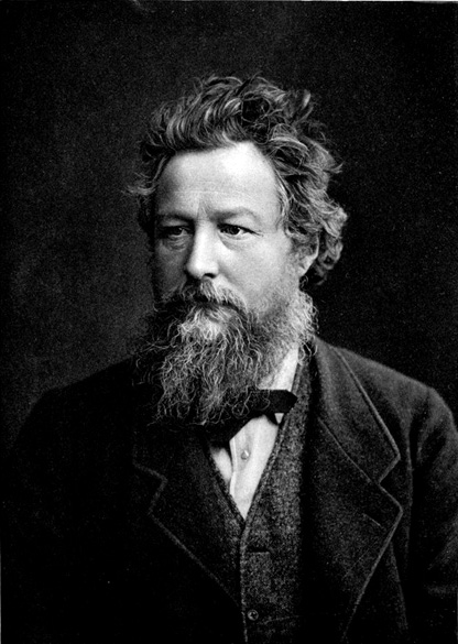
William Morris
was born in Walthamstow, Essex, on 24 March 1834. The son of a wealthy businessman, he enjoyed a comfortable childhood before going to Marlborough and Exeter College, Oxford.

He originally intended to take holy orders, but his reading of the social criticism of Carlyle, Kingsley and Ruskin led him to reconsider the Church and devote his life to art.

After leaving Oxford, Morris was briefly articled to G. E. Street, the Gothic Revival architect, but he soon left, having determined to become a painter. His admiration for the Pre-Raphaelites led him to be introduced to Dante Gabriel Rossetti whose influence can be seen on Morris's only surviving painting La Belle Iseult.


Arts and Crafts Movement

In the 1860s Morris decided that his creative future lay in the field of the decorative arts. His career as a designer began when he decorated the Red House, Bexleyheath, which had been built for him by Philip Webb.

The success of this venture led to the formation of Morris, Marshall, Faulkner & Co. in 1861. The 'Firm' (later renamed Morris & Co) was particularly well-known for its stained glass, examples of which can be seen in churches throughout Britain. Morris produced some 150 designs which are often characterised by their delightful foliage patterns.

Among his many other works were Icelandic and classical translations, Sigurd the Volsung, The Pilgrims of Hope, and a series of prose romances which included A Dream of John Ball, News from Nowhere, and The Well at the World's End.


Politics

Morris entered national politics in 1876 as treasurer of the Eastern Question Association. This was a post he was to occupy in two further radical organisations: the National Liberal League and the Radical Union.

He soon became disillusioned with the Liberals and in 1883 joined the socialist Democratic Federation. After disagreements with the Federation's leader, H. M. Hyndman, he formed the Socialist League, and later the Hammersmith Socialist Society.

During the 1880s he was probably the most active propagandist for the socialist cause, giving hundreds of lectures and speeches throughout the country.

The Kelmscott Press

In 1890 Morris founded the Kelmscott Press in premises near his last home at Kelmscott House in Hammersmith (now the headquarters of the William Morris Society). Morris designed three typefaces for the Press: Golden, Chaucer, and Troy. These were inspired respectively by fifteenth-century Italian and German typography. In all, sixty-six volumes were printed by the Kelmscott Press, the most impressive of which was its magnificent edition of Chaucer which was published in 1896. Morris died at Kelmscott House on 3 October 1896.


Classic "moderne" watch design, the first - circa 1910, the other a WW2 pilots watch, circa 1938. Notice if you will in the first, the round robust case and bezel and as well, the wonderful over sized winder, the Art Nouveau numbers, and in the second, the groovy glow in the dark Radium all black face dial.

In such an interesting way, the stylistic differences immediately obvious between the two watches, echos the similar distinctions found between the two so very different worlds of pre & post war Europe itself.

The former was enthusiastically decorative, rather benign and likely hand made, the latter watch - simple, formal and much more utilitarian, and mass produced. just like Lady Gaga

Sunday, October 30, 2011

Steve Jobs on Creativity

"Creativity is just connecting things. When you ask creative people how they did something, they feel a little guilty because they didn’t really do it, they just saw something. It seemed obvious to them after a while. That’s because they were able to connect experiences they’ve had and synthesize new things. And the reason they were able to do that was that they’ve had more experiences or they have thought more about their experiences than other people. Unfortunately, that’s too rare a commodity. A lot of people in our industry haven’t had very diverse experiences. So they don’t have enough dots to connect, and they end up with very linear solutions without a broad perspective on the problem. The broader one’s understanding of the human experience, the better design we will have.”

– Steve Jobs, Wired, February, 1995

Christian Küpper, who adopted the pseudonym Theo van Doesburg, was born in Utrecht, the Netherlands, on August 30, 1883. A Dutch artist - practicing painting, writing, poetry, typography and architecture, but he had been more successful writing about art than working as a studio artist. Quite adept at making new contacts due to his flamboyant, impulsive personality, he had many productive connections in the art world.

In 1917 he founded the group De Stijl and the periodical of the same name together with the architects J. J. P. Oud and Jan Wils, Vilmos Huszár, Piet Mondrian, Bart van der Leck, and Georges Vantongerloo. The periodical propagated the group's theories.

The term De Stijl
has come to represent their common aims and utopian vision.

The essential idea underlying De Stijl’s radical utopian program was the creation of a universal aesthetic language based in part on a rejection of the decorative excesses of Art Nouveau in favor of a simple, logical style that emphasized construction and function, one that would be appropriate for every aspect of modern life.

They simplified visual compositions to the vertical and horizontal directions, and used only primary colors along with black and white.

THEO VAN DOESBURG


The Netherlands, Utrecht, 1883 - 1931

"There is an old and a new consciousness of time.
The old is connected with the individual.
The new is connected with the universal.
The struggle of the individual against the universal is revealing itself in the world-war as well as in the art of the present day."
- Theo Van Doesburg


Monday, October 17, 2011

I wish I was in this band, I think I'd fit right in, just like Ronnie Wood. Where's my bloody hat ?

When Selfridge's (the London Dept. store ) opened in 1909 it displayed the Bleriot XI, the first airplane to cross the English Channel from Dover to Calais, ushering in an era of glamorous association between travel, technology and luxury goods. The Concorde brought this era to its pinnacle, and its grounding and removal from service also brought the era to a close.

(btw. the pictures above are of the Selfridges in Birmingham ... quite amazing ! especially so, if you knew Birmingham ...)

The fastest commercial plane ever engineered couldn't keep up with political and economic changes that made it untenable to operate, relegating it to the status of technological dinosaur for use only in museums and books.

Olympus is a celebration of the tremendous technological feat of Concorde and also a eulogy for the elegance and aspirations that died with it.

Using a maintenance manual purchased on Ebay for £6 (12$) and a lot of styrofoam, paper and glue, designers PostlerFerguson engage in a bit of recent-past archaeology to construct a full-scale model of the Rolls-Royce/Snecma Olympus 593 jet engine from the Concorde.

Taking the form of an abstracted, three-dimensional technical drawing, it balances the beautiful technical perfection of the engine against the distance between today's budget-airline reality and the era of technological optimism it comes from.

Monday, October 10, 2011

Creative Review highlighted this new issue of stamps from the Royal Mail by Hat-Trick, celebrating the 50 year anniversary of the Royal Shakespeare Company. The stamps feature images of David Tennant as Hamlet, Anthony Sher as Prospero, Chuk Iwuji as Henry VI, Paul Schofield as King Lear, Sara Kestleman as Titania, Ian McKellen and Francesca Annis as Romeo and Juliet accompanied by a line from a play rendered in gorgeous expressive lettering. I know that lettering has been applied to portraits for centuries, but these have a particularly graphic novel feel about them — the expressiveness, the iconic phrases used, the packing of text into white space, these are all ideas best known (to me at least) from the world of comics. Makes a lovely change from your usual setting of Shakespeare for stuff like this in an antique revival type — and is perfect for a company like the RSC. Get them from Royal Mail here.


Were five stolen masterpieces worth
£400m crushed in rubbish truck after
'art heist of the century'?
http://www.dailymail.co.uk/news/article-2047140/Five-masterpieces-stolen-Paris-museum-art-heist-century-crushed-rubish-truck.html
the MUSEUM of Obsolete Objects
click if you dare
Yakov G. Chernikov (1889–1951) Yakov G. Chernikov (1889–1951), was a Russian artist, designer, and architect learned in classical and modern styles. As a draftsman he was on par with Piranesi and Rembrandt; his most forward-thinking drawings resemble the style of Yoshitaka Amano. This combination of knowledge and skill made him one of the most accomplished Russian Constructivist writers and architects; Chernikov designed sixty buildings—although most were not built—and wrote numerous books about architecture and graphic design.


In the late 1920s the state-controlled world of Soviet architecture began to turn against the Constructivists. In 1932 Stalin tired of the pointless political debate between Constructivism’s remaining supporters and many critics. He barred architects from political speech and limited Soviet architecture to classical revival. Unable to practice in his Constructivist style, Chernikov began drawing architectural fantasies that were usually not intended to be built. But he still needed work free from politics and in the 1940s he began to study and draw typefaces, an activity unlikely to draw attention.

Intended for used in an architecture textbook Chernikov’s typeface drawings are examinations of historical alphabets. These are not the overly rationalized alphabets of the renaissance, although Chernikov did examine the alphabets of Durer and Tory. Chernikov’s letters are modeled on historical forms, drawn onto grids with notation about proportion and geometry. The grids are arranged as tables for easy comparison. Consistent with Chernikov’s belief that graphics are superior to words these tables can be understood without Russian literacy. Most of the alphabets are Russian Cyrillic but there are also examinations of Slavonic, Latin, Greek, Phoenician, Persian Cuneiform, Cypriot, Demotic, Hebrew, Burmese, Samaritan, Tibetan, Syriac, Ethiopic, Palmyrian, Manchu, Arabic,
Formosan, Iberian, and Georgian alphabets.


Chernikov also excelled at non-objective drawing, leading him to develop complex ornaments in a new constructed style. His ornamental drawings reveal a powerful imagination and great technical skill. Chernikov achieved accuracy and beauty that rival great Islamic ornamentation without aping it. At a glance these ornaments resemble Spirograph drawings; examination reveals myriad circles painstakingly drawn along a path combine to form lively gestures. Chernikov drew by hand what today can seem only possible with a computer.

Thursday, October 06, 2011


These days we too often use terms like original and visionary indiscriminately,
but here, sadly, is a rare instance where those words actually seem to fit. Steve Jobs was both those things, and like Edison and the Wrights before him, he re-shaped the universe. In this world of coal, he was a diamond.

Tuesday, October 04, 2011


Bauhaus in Tel Aviv series 2002

Designed by Saharr Aharoni.


Sunday, October 02, 2011


The other day I had nice visit with a former student who came by to catch me up. He's returning to design school again after a couple of years working freelance in the fashion industry - doing print and web design. He's done quite well, and it was, he felt - the right time for him to go back to school and finish this phase of his studies.

Whilst a student - he had, I'd noticed - something about him ? A rare skill as it turns out. Sure he was gifted, but that's not really that uncommon - no, that wasn't it, and he was also, despite his relatively young age - quite sophisticated, but that wasn't it either.

Nope ... what made him unique was - he knew something all on his own, something that takes years to develop really, if it ever develops at all. It's something that most designers never really understand - or if they do suspect its existence - they're afraid to let it out of the box.

He knew when to stop.

He understood how to let a material, a simple line, or a discreet concept - speak for itself. He rarely overdid things. He knew when to sit back, when to push himself away from the table, he knew how, and most importantly - when to finish....

It's something that you need to always keep in mind - because it's as important to design, as silence is to music.

Here's a link to a personal project that he and his brother are collaborating on. Cheers


Thursday, September 29, 2011

Thursday, September 22, 2011


Collaboration with Braun

Midway through the decade of the 50s, the HfG and Braun, began a phase of cooperation. Braun needed to stand out from the competition and asked Otl Aicher, Hans Gugelot, and students to work on new designs for the company. Dieter Rams, who was a newly hired Braun designer, collaborated with HfG on developing the forward-looking Braun product design approach. With this partnership the "Braun style" was developed, and according to Thomas Maldonado, "the style differed from Olivetti who sought unity in variety, while the style of Braun sought unity in the product and its coherence with other products. Because of this, the Braun-HfG collaboration was a formidable test bench for the design of "honest" form and coherent identity as an alternative to the random "styling" of individual objects.

btw. doesn't the radio's styling remind you of another, now rather ubiquitous entity ? extra marks you slackers !


Tuesday, September 20, 2011

Monday, September 19, 2011

D1&2- click on the image to enlarge it. and if you can .....
notice the bold yet balanced composition, and the overall elegance of
the pages proportions, the lovely sinuous line of the letterforms, and
particularly see the way some descending letters extend beyond the text
block - so as to better balance the pages dense blackletter body type.
This is accomplished by the letters descenders reaching out like a blackbirds
tail - beyond the text grid into the empty space and do note - the singular
hidden beauty, of the rather obscured ornate scroll work found just behind the
Capital h on the right or (recto) page...

bloody remarkable ... you can't do this on your iPhone punk

"The International Typographic Style, also known as the Swiss Style, is a graphic design style developed in Switzerland in the 1950s that emphasizes cleanliness, readability and objectivity.[1]Hallmarks of the style are asymmetric layouts, use of a grid, sans-serif typefaces like Akzidenz Grotesk, and flush left, ragged right text. The style is also associated with a preference for photography in place of illustrations or drawings. Many of the early International Typographic Style works featured typography as a primary design element in addition to its use in text, and it is for this that the style is named.[2]"
dig 1 und 2 please visit der links

Friday, September 16, 2011

the Design two- "it's not what you know ... ,

BUT who you know", list "


Walter Gropius

Edgar Brandt

Harley Earl

David Carson

The Eames

Norman BelGeddes

Weiner Werkstatte

Arne Jacobson

Marcello Nizzoli

Wesley and Sean

Tangerine Studio

Joseph Hofmann

Henry VanDerVelde

Gerrit Reitveld

Rudy Van derLans

George Jensen

George Nelson

Dieter Ram

Adbusters

Georg Kleeman

Richard Sapper

Peter Saville

GTF

William Morris

Charles Rennie Macintosh

the Bauhaus

Hoefler & Frere Jones

Micheal Graves

Frank Lloyd Wright

Phillipe Starck

Norman Foster

Alvar Alto

Milton Glaser

R. Buckminster Fuller

Eric Gill

Brad Holland

Memphis Group

Herbert Mayer

William Van Allen

Marrianne Brandt

Jonathan Ive

Alvin Lustig

Chip Kidd

Tangerine

Paul Rand

Henry Van de Velde

William Morris

Welles Coates

Raymond Lowey

Robin and Lucienne Day

Wally Olins

Mies van der Rohe

Emigre

Ellen Lupton

Tobias Freres

Joseph Muller Brockmann

LeCorbusier

Seymour Chwast

Pentagram

Push Pin Studios

Aubrey Beardsley

the Dadaists

John Heartfield

Ettore Stottas

the Constructivists

Hector Guimard

Firmin Didot

Jasper Morrison

Christopher Wren

Bruno Matheson

Victor Horta

Antonin Gaudi

Alexey Brodovitch

Alphonse Mucha

Fredric Law Olmstead

Alessi

Rene Lalique

Johannis Itten

Richard Neutra

Thursday, September 15, 2011

The incredible 3D Drawing Machine from Florence

Imagine a machine that lets you draw in perfect perspective

with nothing but your own eyes and a pen? Artists Ryan and

Trevor Oakes have invented a machine to draw realistic scenes

in perspective. Their unique machine helps them use a technique
which splits the ocular system allowing them to create views
that match the field of view of human vision.
Here's the video link http://vimeo.com/26633949

Thursday, September 01, 2011

the brilliant work of Krzystof Domadrdzki. Here's the link. Thanks to Davido