this is a private blog for my design students and assorted other survivors. Tro blemakers all
this is a private blog for my design students and assorted other survivors. Tro blemakers all.

Friday, March 30, 2007


Esquire continuing their innovative typography and cover design - there is an interesting site chronicling their covers' evolutions
www.esquire.com/cover-archive

Thursday, March 29, 2007

digital 1 - pop assignment (pun intended) , due next class.use
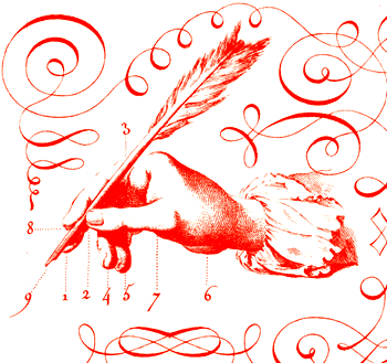
the following picture in an illustrator illustration.


two things ! ok three things ,,,

(a) before you ask - ... use it anyway you want, ... no caveats,
period. ( look it up )

(b) for inspiration: here are - just three of many artists - who
are particularly famous for using found objects in interesting
and evocative ways. there are many..

- do your research, check out ... Tibor Kalman, Claes Oldenburg
and of course Mr. Andy Warhol - et al. Juxtaposition rules - and
your job is to consider, and to see how - as it has always been -
rightfully so that JUXTAposition is one of the most essential tools
in composition. So much so, that ..

Entire genres of design,painting and photography - have, so to
speak - stood on its sholders. (sorry, its the wine). And if asked,
you little monkees, you better be able to provide informed and
interesting answers and examples about its application !
( and you will be, so do the work )

Wednesday, March 28, 2007

things most remarkable No.5
for extra marks - identify each
idea, or subject, object or person
beyond the
meerly obvious.

and no it's not me, punk.


Tuesday, March 27, 2007

Note to Branden and Christopher only, the production number of Michel Siry, the Line Producer, is (514) 279-0184. Good luck, dress sharp, which means leave 3/4 of your jewelry at home Christopher !!!

ps. There will be a meeting on Thursday at 2pm at Vanier between Michel Siry (our line producer) and Peggy McCoy ( Vanier Student services ).

It would be good if the wranglers could attend.

UPDATE !!! the meeting is at 3, not 2.

Monday, March 26, 2007

hey hipsters ... here's a super chance for you ! click for details


Claude Garamond,
French (1480-1561)
click me to enlarge


Sunday, March 25, 2007


Hans Wegner Dies at 92; Danish Furniture Designer

By DAVID COLMAN

Published: February 6, 2007
Hans Wegner, whose Danish Modern furniture — most famously his chairs — helped change the course of design history in the 1950s and ’60s by sanding modernism’s sharp edges and giving aesthetes a comfortable seat, died on Jan. 26 in Copenhagen. He was 92.

Hans Wegner at his home in 1997.

His death was confirmed by his daughter Marianne Wegner, who worked alongside her father for more than 20 years.

Mr. Wegner (pronounced VEG-ner in English and VAY-ner in Danish) was one of a small group of Danish furniture designers whose elegant but comfortable creations made Danish Modern all the rage among cosmopolitan Americans of the ’50s and ’60s.

He also earned a footnote in political history, when, in 1960, Vice President Richard M. Nixon and Senator John F. Kennedy were seated on Wegner chairs during the first nationally televised presidential debate.

“He was one of what I think of as the humble giants of 20th-century design, those men who would probably shun the term designer and prefer to call themselves cabinetmakers,” said Paola Antonelli, the curator of architecture and design at the Museum of Modern Art in New York, where many of Mr. Wegner’s chairs are not only on display but in use, in the museum’s several restaurants.

Describing the appeal of his furniture, she said, “First and foremost, it’s comfortable, and saying that it’s comfortable before saying it’s beautiful is really high praise, because the truth is that it’s incredibly elegant.”

Mr. Wegner rose to international prominence as one of a handful of Danes who seized the design world’s attention with a fresh aesthetic of sculptural and organic modern furniture. Others were Arne Jacobsen, Finn Juhl, Borge Mogensen and Poul Kjaerholm.

Their works, often made in warm blond wood, domesticated the cold chrome shine of the Bauhaus-influenced International style. In the process, they found a way to dovetail the words “Danish” and “modern” for the first time, joining cabinetmaker-guild traditions of high craftsmanship, quality and comfort with modernist principles of simplicity and graphic beauty.

This unity was epitomized by Mr. Wegner’s two best-known chair designs, both introduced in late 1949. One was the Wishbone chair, with a Y-shaped back split and a curved back and armrest suggested by a child’s Chinese chair he saw. Sometimes called the Y-back, it is an understated work of simplicity and comfort, its graceful shape hinting at both East Asian design and modernist ideals. It is still made today by the Danish firm Carl Hansen & Son.

His other 1949 success became known simply as the Chair, or the Round Chair. (Mr. Wegner did not name his chairs, letting manufacturers or customers name them as they liked, leading to some confusion over the years.) The Chair is a strikingly modern design, with a caned seat and a back and armrests made of one continuous semicircle of wood. This was the chair used in the Kennedy-Nixon debate.

Born in 1914, Hans Jorgen Wegner learned woodworking as a boy, the son of a cobbler, in Tondern, in southern Denmark. He was studying design in Copenhagen in 1938 when he was hired by Mr. Jacobsen and Erik Moller to design furniture for the town hall they were creating in Aarhus, Denmark. Before the project was over, he met Inga Helbo, a secretary in Mr. Jacobsen’s office. They later married.

Once the Aarhus project was completed, Mr. Wegner started his own design business, and by the mid-1940s he had created chair designs for the Fritz Hansen and Johannes Hansen furniture companies, including the Peacock chair, a smart update of the Windsor chair.

Working out of a studio at his house, Mr. Wegner produced hundreds of prototypes and had to be pressed to leave work for family vacations. Asked what his other interests were, his daughter Marianne, said with a laugh: “Apart from furniture? None.” Mr. Wegner’s wife and another daughter, Eva Wegner, also survive him.

By the late 1960s, the rage for Danish Modern had cooled in the United States. But Mr. Wegner kept working, creating new designs for another Danish company, P P Mobler. He retired in the early 1990s, when Marianne, an architect, took over his studio.

Over the last decade he was able to witness a surge of renewed interest in his work. Mid-century Modern furniture is again in high demand, according to spokesmen for P P Mobler and Carl Hansen. What was a chic look a half-century ago has today joined the pantheon of mainstream style, perhaps a fitting tribute to a man who believed that a chair should be made well enough to last at least 50 years.
a favorite chair design by Hans Wegner, 1963.


Form-pressed plywood, upholstery. Still made in Denmark by
Carl Hansen & Son.


The Hans Wegner three-legged shell chair was originally introduced in 1963.


A few limited series were produced, but the project soon came to a
stand still. The chair was relaunched in 1997 and after 34 years of
oblivion the chair finally got another break. As a curiosity, it is
worth mentioning that one of the original shell chairs from the 60s
sold for $20,000 at Christies in London in 1999.


Seat and back are made of formpressed plywood shells. The 3 legs
consist of a laminated construction, the 2 front legs are made of one
continuous piece and the hind leg is a separate element. To enhance
the comfort, Wegner has added 2 upholstered cushions which are
fastened to the shell with screws from the back. In spite of its three-legs
it stands well on the floor and does not easily topple over. Although
it is low and does not feature armrests it is easy to get up by seizing the
front edge and pulling oneself up.

current cost for a new one about $ 2000 US or about a gazillion canadian


Friday, March 23, 2007

brand identity ? - just click me


What social associations come with a brand identity ? what about Japanese brand identity?

Technologically sophisticated ? Efficient but boring ? Cheap and durable ? A little kooky ?

All cultures come with a plethora of stereotypes, and tying a brand to a national identity can carry some risk. Over the past 50 years, Japanese companies have mostly tried to downplay their country of origin, in part because of historical and contemporary antagonisms in their major export market, the US.


Even today, an accepted brand like Toyota continues to spin off baby brands like Lexus and Scion, in part to mask, however superficially, its Japanese roots.


So it is interesting when a Japanese brand discards discretion for an emboldened embrace of its culture in brand identity. The contemporary consumer is multicultural, seeks the exotic, and may even perceive Japan as being (kookily) cool.

But where the brand really begins to innovate, is with its philosophy of "un-branded" fashion. UNIQLO-clothes sport no overt logos, which fans of the (paradoxical) "no-brand" Japanese brand "MUJI " (look it up ) will no doubt warm to. The premise is that consumers can make their own fashion choices. do you ?

They do not need to have a style dictated to them from on high. In a country like Japan, where a surprising majority of young dressers in the street can be classified by the fashion magazine they subscribe to, this is nothing short of a seismic shift in thinking.

The idea is simple yet empowering: Your clothes don't define you; you define your clothes.


www.uniqlo.com/us/

Thursday, March 22, 2007

.. aww .. geeez ... that's really gotta hurt ....

a late 1600's Dutch, hand-cast, hand tipped volume. The book
chronicles, in
miraculously grotesque detail ... and a with rather
disturbing amount of relish ... - the way that many of the Christian
Saints and Martyrs - met their fate. An early literary "faces of death"
or Tour of Duty 2 ...

I guess this millennium didn't invent featureless cruelty after all.
Just new and improved ways of viewing it.


click to engorge

fontanalia

It feels like almost everywhere I go, I seem to collect images of - or to photograph - typefaces and things in 'letter form'. Even for a while going so far as to collect huge signs, and some of the other more manageable marginalia of the craft, like old letters, cast type, etc. ( can someone smell obsession ? ) - Here, are but a scant few examples, of what I am speaking of, err - as it were.

Stylistically at least - a "letterforms" seem almost always to have something interesting to them; often they're amusing, and occasionally they're perfectly elegant in their functionality (like a sign in London when I was a kid, which read - PISS OFF ! - and I understood perfectly what it meant). Early on, I realized (to my delight) that letterforms can also tell stories about the people who made them, the place that they are from, and sometimes the time and purpose they served.

So as you get to know typography better, (or at the minimum recognize that it exists) you will begin to perhaps appreciate, how letterforms can occasionally say as much, or even more than the words they inhabit.

Can you guess where these are from ? If someone can get all of them right, i'll eat tofu, in my
most favorite blue dress, on fire, while riding a unicycle, upsidedown. promise, maybe


Wednesday, March 21, 2007

Abram Games was one of the great poster designers of the 20th century.His contribution to the development of graphic communication was remarkable for having been made within the circumstances of propaganda communication during WW2.


Images such as Your Talk
or May Kill Your Comrades or Don't Crow About What You Know, About applied modern design sophistication to the primary messages of wartime in a witty and effective way.


The war established Games as a master of poster design. He continued to work until the 1980's and produced a distinguished body of work for London Transport, BOAC, and other British organisations. At the same time Games worked tirelessly for Jewish causes and made some remarkable contributions to Hebrew typography through book design.


Born in Whitechapel in the East End of London on the day World War I began in 1914, Games was the son of Joseph Gamse, a Latvian photographer who later anglicised the family name to Games, and Sarah, a seamstress born on the border of Russia and Poland. Abram, or Abraham as he was originally called, was educated locally but when he left Hackney Downs School at the age of 16 in 1930, his headmaster scoffed at his hopes of becoming an artist and refused to support his application for a scholarship to St Martins School of Art. Games’ parents paid his fees, which they could ill afford. Unable to buy artists’ materials, Games resorted to drawing on the white card of hat boxes. Disillusioned by the teaching at St Martins and worried about the expense of studying there, Games left after two terms. He continued life classes in the evening while working for his father as a photographer’s assistant.

In 1932, Games was hired as a studio boy at Askew-Young, a commercial art studio. Never popular with his employers, he was fired in 1936 after being caught jumping over four chairs as a joke. In the same year, Games won £20 as first prize in a poster competition to encourage people to enrol for London County Council evening classes. Bolstered by his success, he embarked on a career as a freelance commercial artist and won poster commissions for London Transport, Shell and the Post Office."