

Filosofia
By Zuzana Licko
This text was first published in 1996 on the front side of the promotional poster for Filosofia. The poster was titled "It's Their Bodoni," and was designed by Massimo Vignelli.
Before the age of personal computers, when I used to spec typefaces out of photo typesetters' style books, my favorite typeface was Bodoni. I was attracted to its clean lines and geometric shapes, and the variety of headline style choices. However, for practical reasons, I often decided against using Bodoni for long texts, as the extreme contrast made it difficult to read at small sizes.
Since then, there have been many digital font revivals and reworkings of Bodoni's typefaces, some of which have brought to light the numerous variations in Bodoni's type designs not evident in the earlier photo types.
For example, the recent ITC Bodoni was released in three variants, each optimized for a range of sizes, and each with very distinct features, reflecting the variety of Bodoni's work.
Bodoni

In fact, Bodoni spent his entire life building a large collection of over 400 fonts. He started with Fournier's types as a model, and over time developed a personal style that tended toward simplicity, austerity and a greater contrast between the vertical stems and hairlines than previously seen, resulting in what we know today as the modern face.
In the preface of his "Manuale Tipografico" Bodoni stated: "It is proper here to offer the four different heads under which it seems to me are derived the beauties of type, and the first to these is regularity - conformity without ambiguity, variety without dissonance, and equality and symmetry without confusion."
This apparent development toward the geometry of Modern Face may explain the prevalence of excessively geometric Bodoni revivals which may have gone a step further in this progression than Bodoni intended.
Bodoni's many fonts also included small increments in sizes, sometimes down to half point sizes. As was common practice at the time, each size varied in design to accommodate the effects of the printing process. The characters comprising small text sizes were slightly widened to accommodate ample counters which resisted the tendency to clog up, as well as reduced contrast to ensure that the hairlines would not break up. The display sizes, in turn, were slightly narrower with more contrast, yielding graceful and delicate features which the letterpress process could only maintain at the larger sizes.
This practice disappeared with the introduction of photo type since it became most efficient to simply scale a single design to the various sizes as needed. Since then, technical advancements, including improvements in the printing process itself, have made it less necessary to have size specific design variations. However, it does remain a necessity for the optimum legibility of certain designs, such as Bodoni, which were designed for different manufacturing and printing processes than those used today. In fact, the extreme contrast problem of many Bodoni revivals may be the result of choosing a display size for the model, which subsequently cause the hairlines to erode when reduced to small text sizes.
Although the computer is capable of addressing multiple size masters more readily than photo type did, (Adobe's Multiple Master format can accommodate this), optical scaling remains to be added as a standard feature to the popular font formats, and probably never will, since most contemporary typefaces which are designed for today's technology do not so critically demand such technical wizardry.
Because Bodoni created so many variations, many different Bodoni revivals and interpretations are possible. However, determining which most truly reflect Bodoni's work can be eternally debated.
Filosofia is my interpretation of a Bodoni. It shows my personal preference for a geometric Bodoni, while incorporating such features as the slightly bulging round serif endings which often appeared in printed samples of Bodoni's work and reflect Bodoni's origins in letterpress technology.

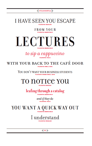
The Filosofia Regular family is designed for text applications. It is somewhat rugged with reduced contrast to withstand the reduction to text sizes. The Filosofia Grand family is intended for display applications and is therefore more delicate and refined. An additional variant, included in the Grand package, is a Unicase version which uses a single height for characters that are otherwise separated into upper and lower case. This is similar to Bradbury Thompson's Alphabet Twenty Six, except that Thompson's goal was to create a text alphabet free of such redundancies as the two different forms which represent the character "a" or "A", whereas Filosofia Unicase does have stylistic variants to provide flexibility for headline use. "


No comments:
Post a Comment