
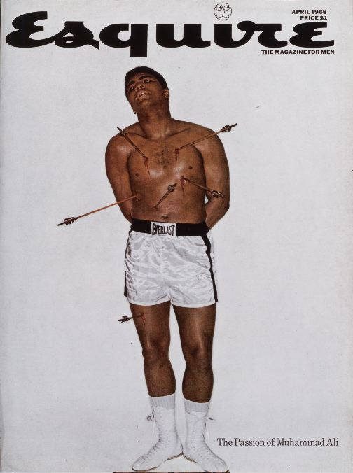
Esquire (April 1968)
The controversial April 1968 cover depicting Muhammad Ali impaled by six arrows appeared on the heels of his refusal to be inducted into the U.S. Army because of his religious beliefs. (Ali, convicted violating the Selective Service Act, was barred from the ring and stripped of his title.) The cover, the second of three Esquire covers defending Ali, shows the boxer martyred as St. Sebastian, a patron saint of athletes and one who was shot with arrows for his steadfast religious beliefs. This was one of the covers designed by George Lois, Esquire’s Art Director during the 1960s.
click to enlarge
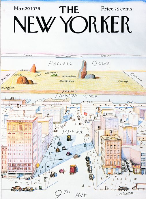
The New Yorker (March 29, 1976) Saul Steinberg’s March 29, 1976 The New Yorker cover, “View of the World from 9th Avenue,” has come to represent Manhattan’s telescoped perception of the country beyond the Hudson River. The cartoon showed the supposed limited mental geography of Manhattanites.
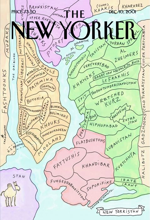
The New Yorker (December 10, 2001)
This New Yorker cover by Maira Kalman and Rich Meyerowitz features a map of “New Yorkistan” where the city is divided into Middle Eastern names. The pastel map pastel map showed a flat, bird's-eye view of New York City drawn in pen and wash. It echoed Saul Steinberg’s map “View of the World from 9th Avenue,” published on the cover of The New Yorker on March 29, 1976
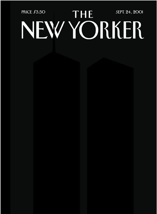
The New Yorker (September 24, 2001)
New Yorker Covers Editor Françoise Mouly repositioned Art Spiegelman’s silhouettes, inspired by Ad Reinhardt's black-on-black paintings, so that the north tower's antenna breaks the "W" of the magazine's logo. Spiegelman wanted to see the emptiness, and find the awful/awe-filled image of all that disappeared the on 9/11. The silhouetted Twin Towers were printed in a fifth, black ink, on a field of black made up of the standard four color printing inks. An overprinted clear varnish helps create the ghost images that linger, insisting on their presence through the blackness


No comments:
Post a Comment