

Sunday, October 30, 2011
Steve Jobs on Creativity
"Creativity is just connecting things. When you ask creative people how they did something, they feel a little guilty because they didn’t really do it, they just saw something. It seemed obvious to them after a while. That’s because they were able to connect experiences they’ve had and synthesize new things. And the reason they were able to do that was that they’ve had more experiences or they have thought more about their experiences than other people. Unfortunately, that’s too rare a commodity. A lot of people in our industry haven’t had very diverse experiences. So they don’t have enough dots to connect, and they end up with very linear solutions without a broad perspective on the problem. The broader one’s understanding of the human experience, the better design we will have.”
– Steve Jobs, Wired, February, 1995
 Christian Küpper, who adopted the pseudonym Theo van Doesburg, was born in Utrecht, the Netherlands, on August 30, 1883. A Dutch artist - practicing painting, writing, poetry, typography and architecture, but he had been more successful writing about art than working as a studio artist. Quite adept at making new contacts due to his flamboyant, impulsive personality, he had many productive connections in the art world.
In 1917 he founded the group De Stijl and the periodical of the same name together with the architects J. J. P. Oud and Jan Wils, Vilmos Huszár, Piet Mondrian, Bart van der Leck, and Georges Vantongerloo. The periodical propagated the group's theories.
The term De Stijl has come to represent their common aims and utopian vision.
The term De Stijl has come to represent their common aims and utopian vision.
The essential idea underlying De Stijl’s radical utopian program was the creation of a universal aesthetic language based in part on a rejection of the decorative excesses of Art Nouveau in favor of a simple, logical style that emphasized construction and function, one that would be appropriate for every aspect of modern life.
They simplified visual compositions to the vertical and horizontal directions, and used only primary colors along with black and white.
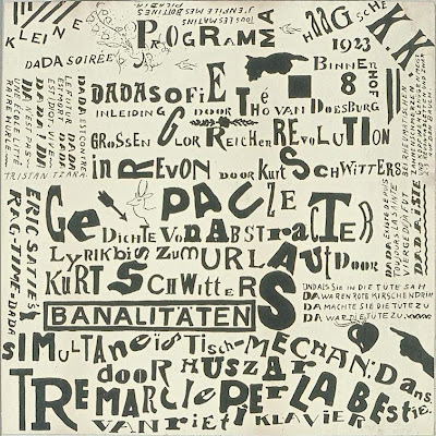
THEO VAN DOESBURG | |
The Netherlands, Utrecht, 1883 - 1931 | |
"There is an old and a new consciousness of time. | |
Monday, October 17, 2011

 When Selfridge's (the London Dept. store ) opened in 1909 it displayed the Bleriot XI, the first airplane to cross the English Channel from Dover to Calais, ushering in an era of glamorous association between travel, technology and luxury goods. The Concorde brought this era to its pinnacle, and its grounding and removal from service also brought the era to a close.
(btw. the pictures above are of the Selfridges in Birmingham ... quite amazing ! especially so, if you knew Birmingham ...)
The fastest commercial plane ever engineered couldn't keep up with political and economic changes that made it untenable to operate, relegating it to the status of technological dinosaur for use only in museums and books.
Olympus is a celebration of the tremendous technological feat of Concorde and also a eulogy for the elegance and aspirations that died with it.
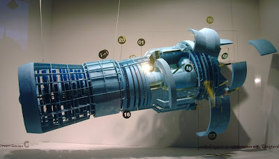
Using a maintenance manual purchased on Ebay for £6 (12$) and a lot of styrofoam, paper and glue, designers PostlerFerguson engage in a bit of recent-past archaeology to construct a full-scale model of the Rolls-Royce/Snecma Olympus 593 jet engine from the Concorde.
Taking the form of an abstracted, three-dimensional technical drawing, it balances the beautiful technical perfection of the engine against the distance between today's budget-airline reality and the era of technological optimism it comes from.

Monday, October 10, 2011
 Creative Review highlighted this new issue of stamps from the Royal Mail by Hat-Trick, celebrating the 50 year anniversary of the Royal Shakespeare Company. The stamps feature images of David Tennant as Hamlet, Anthony Sher as Prospero, Chuk Iwuji as Henry VI, Paul Schofield as King Lear, Sara Kestleman as Titania, Ian McKellen and Francesca Annis as Romeo and Juliet accompanied by a line from a play rendered in gorgeous expressive lettering. I know that lettering has been applied to portraits for centuries, but these have a particularly graphic novel feel about them — the expressiveness, the iconic phrases used, the packing of text into white space, these are all ideas best known (to me at least) from the world of comics. Makes a lovely change from your usual setting of Shakespeare for stuff like this in an antique revival type — and is perfect for a company like the RSC. Get them from Royal Mail here.
Were five stolen masterpieces worth
£400m crushed in rubbish truck after
'art heist of the century'?
http://www.dailymail.co.uk/news/article-2047140/Five-masterpieces-stolen-Paris-museum-art-heist-century-crushed-rubish-truck.html

Yakov G. Chernikov (1889–1951) Yakov G. Chernikov (1889–1951), was a Russian artist, designer, and architect learned in classical and modern styles. As a draftsman he was on par with Piranesi and Rembrandt; his most forward-thinking drawings resemble the style of Yoshitaka Amano. This combination of knowledge and skill made him one of the most accomplished Russian Constructivist writers and architects; Chernikov designed sixty buildings—although most were not built—and wrote numerous books about architecture and graphic design.

In the late 1920s the state-controlled world of Soviet architecture began to turn against the Constructivists. In 1932 Stalin tired of the pointless political debate between Constructivism’s remaining supporters and many critics. He barred architects from political speech and limited Soviet architecture to classical revival. Unable to practice in his Constructivist style, Chernikov began drawing architectural fantasies that were usually not intended to be built. But he still needed work free from politics and in the 1940s he began to study and draw typefaces, an activity unlikely to draw attention.
Intended for used in an architecture textbook Chernikov’s typeface drawings are examinations of historical alphabets. These are not the overly rationalized alphabets of the renaissance, although Chernikov did examine the alphabets of Durer and Tory. Chernikov’s letters are modeled on historical forms, drawn onto grids with notation about proportion and geometry. The grids are arranged as tables for easy comparison. Consistent with Chernikov’s belief that graphics are superior to words these tables can be understood without Russian literacy. Most of the alphabets are Russian Cyrillic but there are also examinations of Slavonic, Latin, Greek, Phoenician, Persian Cuneiform, Cypriot, Demotic, Hebrew, Burmese, Samaritan, Tibetan, Syriac, Ethiopic, Palmyrian, Manchu, Arabic, Formosan, Iberian, and Georgian alphabets.

Chernikov also excelled at non-objective drawing, leading him to develop complex ornaments in a new constructed style. His ornamental drawings reveal a powerful imagination and great technical skill. Chernikov achieved accuracy and beauty that rival great Islamic ornamentation without aping it. At a glance these ornaments resemble Spirograph drawings; examination reveals myriad circles painstakingly drawn along a path combine to form lively gestures. Chernikov drew by hand what today can seem only possible with a computer.

Thursday, October 06, 2011

These days we too often use terms like original and visionary indiscriminately,
but here, sadly, is a rare instance where those words actually seem to fit. Steve Jobs was both those things, and like Edison and the Wrights before him, he re-shaped the universe. In this world of coal, he was a diamond.
Tuesday, October 04, 2011


Sunday, October 02, 2011

The other day I had nice visit with a former student who came by to catch me up. He's returning to design school again after a couple of years working freelance in the fashion industry - doing print and web design. He's done quite well, and it was, he felt - the right time for him to go back to school and finish this phase of his studies.
Whilst a student - he had, I'd noticed - something about him ? A rare skill as it turns out. Sure he was gifted, but that's not really that uncommon - no, that wasn't it, and he was also, despite his relatively young age - quite sophisticated, but that wasn't it either.
Nope ... what made him unique was - he knew something all on his own, something that takes years to develop really, if it ever develops at all. It's something that most designers never really understand - or if they do suspect its existence - they're afraid to let it out of the box.
He knew when to stop.
He understood how to let a material, a simple line, or a discreet concept - speak for itself. He rarely overdid things. He knew when to sit back, when to push himself away from the table, he knew how, and most importantly - when to finish....
It's something that you need to always keep in mind - because it's as important to design, as silence is to music.
Here's a link to a personal project that he and his brother are collaborating on. Cheers


Subscribe to:
Posts (Atom)

