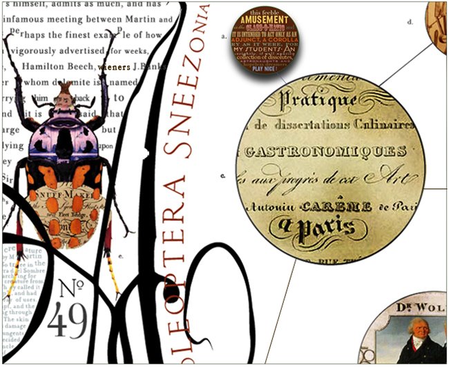
A simple but effective visual prose - a robust, interesting. layout. and also enjoy, some visual gossip, extra stuff from fashion week, held last week in NYC, whether it's miscellanea or marginalia, its your call.
Do consider, please, how the layouts fit together or how they contrast. Do they collide visually, against their neighbor or entreat you towards the next page or image ? Consider the conversation that the page elements must be having amongst themselves. Is it a nice chat over a latte or a sibling's screaming match ?


3 comments:
thought you might like this site:
http://www.xrite.com/custom_page.aspx?PageID=77
I love the layouts and the different points you make about each. it makes me look at layouts in magazines in a whole new light.
thank you,
layouts are easily overlooked, and they can be so beautiful, like a perfectly appointed dinner table, or perfectly drawn bath.
The stages design is an integral, if slightly transparent part of the opera. So it is with the design of a page.
cheers Mlle. Redhead
Post a Comment