click to enlarge
editorial design 1995 (Rollling Stone)
Art Director Fred Woodward
Graphic Designer Geraldine Hessler
Photo Mark Seliger
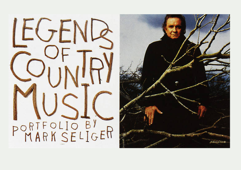

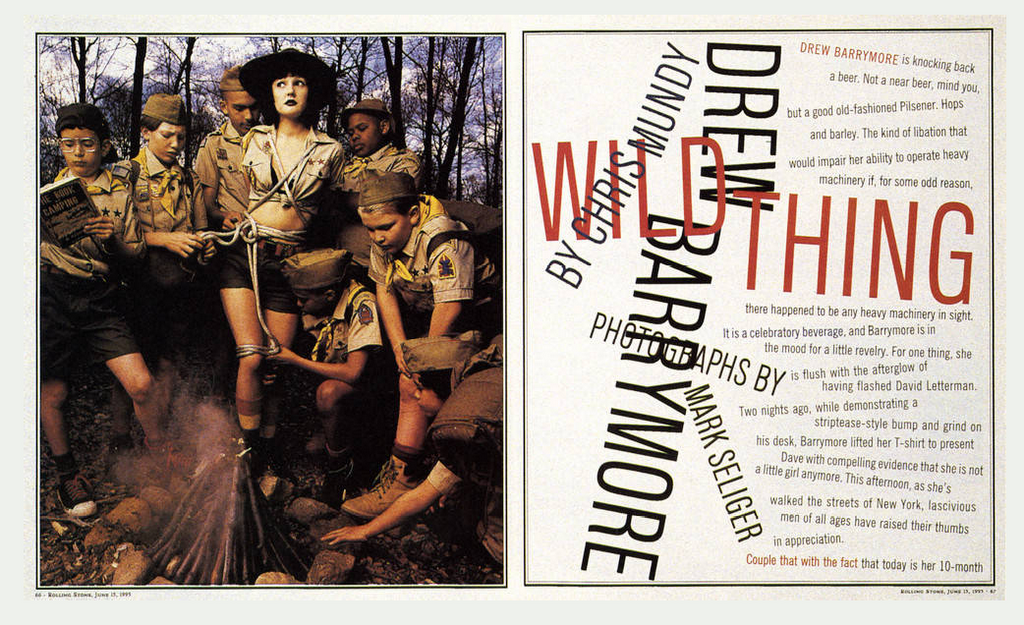
take this last page ... at first glance - not a very complicated layout,
the designer is using a simple contrast of scale, between the two pages
and photographs, to create a juxtaposition. There's a tension created
that makes the two pages contrast in an interesting way ... but
there's more ... always more, especially to someone who knows a little about the
people involved, and their musical lives.


No comments:
Post a Comment