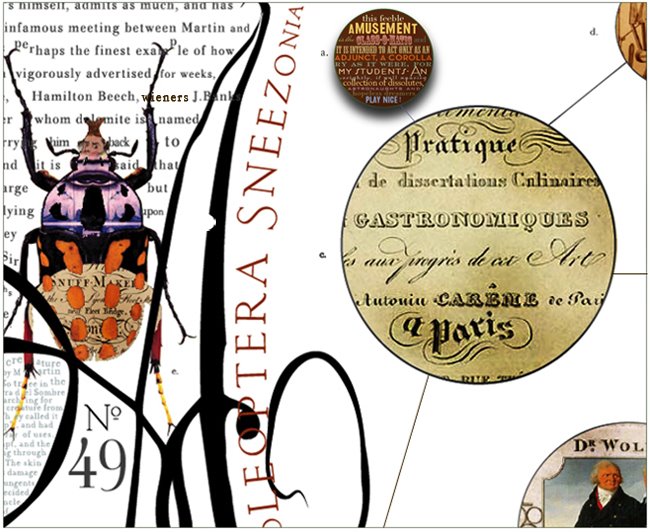
notice the bold yet balanced composition, and the overall elegance of
the pages proportions, the lovely sinuous line of the letterforms, and
particularly see the way some descending letters extend beyond the text
block - so as to better balance the pages dense blackletter body type.
This is accomplished by the letters descenders reaching out like a blackbirds
tail - beyond the text grid into the empty space and do note - the singular
hidden beauty, of the rather obscured ornate scroll work found just behind the
Capital h on the right or (recto) page...
bloody remarkable ... you can't do this on your iPhone punk


No comments:
Post a Comment