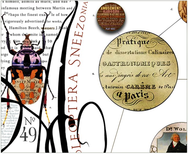


Dig1 - considering type as a matter of form rather than text.
This letterpress poster by Cameron Moll was handcrafted character
by character over the course of roughly 100 hours. Characters from the
Bickham Script Pro, Engravers MT, and Epic typeface families form the
edifice featured in the artwork, the Salt Lake Temple.
Each poster measures 16"x24" and is printed on Crane Lettra Pearl paper.
Letterpressed by Bryce Knudson of Bjørn Letterpress in Provo, Utah.
his named is linked


2 comments:
form rather than text you say...
http://www.livingdesign.info/2010/03/26/qlocktwo-time-in-words-by-biegert-funk/
Post a Comment