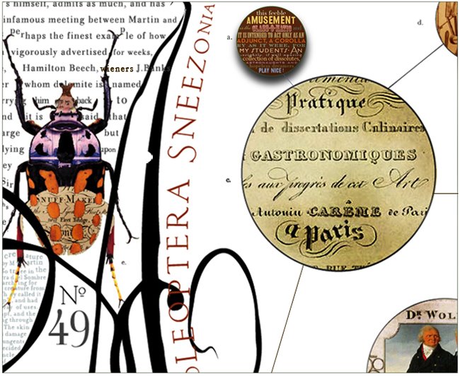
Giggling with invention and re-definition - the 60's s saw design veer dramatically away from the rigid yet perfect symmetry and influence of the International and Swiss schools of design.
In Graphic Design, the trend was towards work that was allot more personal, more colorful, accidental, humorous, and certainly dramatically more idiosyncratic. In Graphic Design and illustration, you see the rise of the individual, the design super star like - Milton Glazer, Seymour Schwast and Robert Crumb et al.
D2, consider and try to appreciate the distinct differences, and nearly opposing approaches - between the two typographic styles.


D2, consider and try to appreciate the distinct differences, and nearly opposing approaches - between the two typographic styles.


1 comment:
Fonts on crack!
Gotta love the way hallucinogens have a way of stretching things out.
Post a Comment