 the exhibit, " Darwin" tells the story of both the life and the science of the 19thcentury scientist and theoretician. It brings together artifacts and documents from throughout his life with a contemporary study of his science.
The main challenge of the exhibit's design was to evoke the Victorian context of his life as well as to emphasize the continuing relevance of his science.
The graphic design focuses on the idea of “looking closely,” inspired by Darwin’s
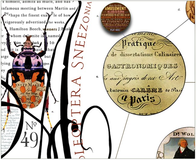
own magnifying glass, the first artifact of the exhibition. Graphics play with shiftingscales, moving back and forth from macro to micro views. Large images are created of many smaller images: an orchid is composed of thousands of tiny birds, insects, reptiles and other animals; a wallpaper pattern is derived from beetles and terriers.


On the macro level, images are enlarged to the point of abstraction for case panels and wall banners. Because the photo budget was limited, these images were generated by simply scanning found objects.
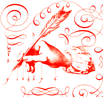
 The London wallpaper literally disintegrates, evoking the corrosive effect of Darwin's theories on the previously established order. The displays typography refers to 19 thcentury woodtype posters, as well as to elements of Victorian book design, with centered and curved elements and graphic flourishes.
The designers did a really wonderful job working under very limited budget, yet were able energetically express and elegantly evoke ( sorry, couldn't help myself ...) Darwin's brilliant work and extraordinary times. (we used to visit this amazing museum as a class, alas)


Creative director: David Harvey
Art director: Stephanie Reyer
Designers: Iris Jan, Rick Onorato, Dan Ownbey, Ellen Sitkin,
Catharine Weese
Photographer: Denis Finnin
Typefaces: Tribute, Consort, Zine Sans


No comments:
Post a Comment