By Alice Rawsthorn
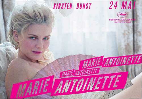
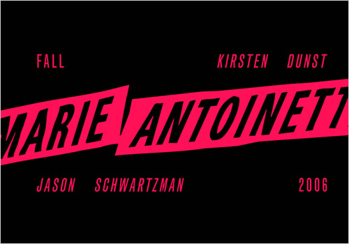 NEW YORK: The first thing Peter Miles did when he began work on the graphic design of Sofia Coppola's movie "Marie Antoinette" was to design a T-shirt for the production crew. "It was a tricky place to start," he recalled. "I had to do something very quickly, but knew that I'd be stuck with it for the rest of the film."
Coppola had said that she wanted the graphics to "have the feel of a revolution," and Miles depicted the title as if it were a slogan on a political banner, or a cover of one of the postpunk new romantic singles featured on the soundtrack. The same logo that he dreamed up for those T-shirts more than a year ago has since appeared in all of the film's graphics: from the posters, to the credits that surface to the strains of the Gang of Four.
What makes this project unusual is that Peter Miles is neither an in-house designer at Sony Pictures, which produced "Marie Antoinette," nor a specialist film designer. He works as a freelance graphic designer in New York for clients such as the fashion designer, Marc Jacobs, and the artists, Juergen Teller and Tracey Emin.
Sony hired him principally because Coppola suggested it, but also in the hope that Miles would bring the cool sensibility to the film's graphics, which had proved so marketable in Marc Jacobs's advertising aimed at the same young women who were expected to enjoy the movie. At a time when Hollywood is struggling to redefine its appeal to a fragmented audience against so many competing claims for filmgoers' time and money, other studios are bringing in outsiders to work on film graphics.


The acclaimed American book designer Chip Kidd has worked on several film projects this year. The best film graphics have almost always come about at the director's behest. Among the earliest examples are the titles created by the Hungarian-born scriptwriter Emeric Pressburger for the movies he made with the British director Michael Powell in the 1940s and 1950s. While Powell was on location, Pressburger stayed in London to devise ingenious openings for films like "A Mat
 ter of Life and Death" (1946), often incorporating the written credits into a concise film within a-film.
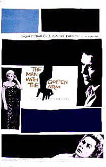
Even Saul Bass, the Los Angeles-based designer who was regarded as the greatest film title designer of the 20th century, owed most of his commissions to empathetic directors: Oscar Preminger and Alfred Hitchcock in the 1950s, John Frankenheimer in the 1960s and, later, Martin Scorsese.
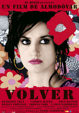
A contemporary equivalent is the collaboration between the Spanish filmmaker Pedro Almodóvar and Juan Gatti, the Argentinian-born graphic designer, who has designed all of his title sequences since "Women on the Verge of a Nervous Breakdown" (1987), including "Volver" this year.
Gatti starts to think about the titles as soon as he has read the script, but doesn't decide on themes and techniques until he has seen the movie's rough cut and discussed his ideas with Almodóvar. For "Volver's" credits, he created an animated end sequence inspired by the patterns of the dresses worn by the women in the film. (See iht.com/design for a story on Gatti and Almodóvar's collaboration.)
 When Miles worked on his first movie project with Coppola, "Lost in Translation," Sony Pictures left them to their own devices because the budget was low, as were its box office expectations. "Sofia told me that in her head, the film was a sophisticated 1930s extension of the Park Hyatt Tokyo, the hotel where it was filmed," said Miles. "I very quickly came across a font, Geometric, that fitted her brief." They decided on an image of the film's star, Bill Murray, sitting on a hotel bed for the poster. As "Lost in Translation" became a hit, Coppola secured a bigger budget for "Marie Antoinette," and Sony wanted to be more closely involved in the marketing. "When you work on that kind of scale there are a lot of people whose opinions have to be heard and reflected," noted Miles. "Sony wanted us to communicate all of that and to hit a specific audience - women in their late teens and 20s." Accustomed to having full creative control of his work, Miles admitted that he found it challenging to accommodate all of Sony's requirements. "But they wanted Sofia to have a strong hold on all aspects of the film," he said. "And Sony went along with what she wanted, and not grudgingly."

No comments:
Post a Comment