this is a private blog for my design students and assorted other survivors. Tro blemakers all
this is a private blog for my design students and assorted other survivors. Tro blemakers all.

Monday, February 04, 2013

The Tour de france. 22 Teams, each with 9 riders. Each rider gets a free helmet, free glasses, jerseys, bibs, socks, shoes and rides on a free bike with a frame, saddle, pedals, wheels and tubes, all of which is provided by sponsors. Each sponsor is hoping to get as much media attention as possible during the Tour de France, which is broadcasted in over 190 countries.

Each sponsor is represented by a logo, which appears on the riders’ jerseys and bicycles. The size of the logo depends on the amount of money provided by the sponsor.

Most of the teams during the Tour de France are UCI World Tour teams, which means they’re competing in de most important races on earth. Some of the major sponsors provide millions of Dollars and Euros. Do high budgets result in good design?

Some team jerseys are a mess, they’re just plastered with logos. Other teams, like AG2R La Mondiale, Garmin-CervĂ©lo and Leopard Trek, managed to find a design agency that created a consistent corporate identity for the team.

We’ve seen high quality design in the Tour de France before, but only sporadically. I don’t know if it’s a trend, but graphic design appears to play a more important role than ever before. Last year’s peloton was possibly the best designed of all time.

Wednesday, January 30, 2013

a logo design by Mohammed Thiam, for a New Zealand publisher


Monday, January 28, 2013


digone here's the link for the photoshop tutorials
makes sure you review the sections on 1. making selections and 2. using layersthen repeat ! both are found in the Photoshop CS3, in the getting started section ...

Friday, January 18, 2013


the Design two- "it's not what you know ... ,
BUT, who you know " list "

design two Spring 2013assignment one, to be assigned/discussed during our first class.

 A research assignment, so, pick one, for next class. You'll be doing a Keynote or Powerpoint presentation on your choice after mid-term


Walter Gropius
Edgar Brandt
Harley Earl
Alexey Brodovitch
David Carson
The Eames
Art Nouveau
Norman BelGeddes
U&Lc
Lucian Bernard
Arts and Crafts Movement
Weiner Werkstatte
Arne Jacobson
Marcello Nizzoli
Wesley and Sean
Bugatti, Daimler and Benz
Tangerine Studio
Joseph Hofmann
Henry VanDerVelde
Gerrit Reitveld
Saul Bass
Rudy Van derLans
George Jensen
George Nelson
Peter Behrens
Dieter Ram
Adbusters
Georg Kleeman
Richard Sapper
Tiffany 
Peter Saville
GTF
William Morris
the Bauhaus
Hoefler & Frere Jones
Micheal Graves
Marian Bantjes
Victor Horta
Frank Lloyd Wright
Phillipe Starck
Chermayeff & Geismar
Norman Foster
Adrian Frutiger
Alvar Alto
Milton Glaser
Louis Fili
R. Buckminster Fuller
Ed Fella
Eric Gill
A.M. Cassandre
Brad Holland
Henri de Toulouse-Lautrec
Herb Lubalin
The Arts and Crafts Movement
Memphis Group
Herbert Mayer
William Van Allen
Marrianne Brandt
Jonathan Ive
Alvin Lustig
Chip Kidd
Tangerine
Paul Rand
Winterhouse
Neville Brody
Henry Van de Velde
Charles Rennie Macintosh
William Morris
April Greiman
Welles Coates
Kurt Schwitters
Michael Beruit
Raymond Lowey
Peter Saville
Robin and Lucienne Day
Wally Olins
Antoni  Gaudi
Jules Cheret
Mies van der Rohe
Emigre
Paul Rand
Ray Gun
Ellen Lupton
Tobias Freres
Winterhouse
Joseph Muller Brockmann
LeCorbusier
Tibor Kalman
Barbara Kruger
Hector Guimard
Seymour Chwast
Pentagram and Push Pin Studios
Aubrey Beardsley
the Dadaists
John Heartfield
Ettore Stottas
the Constructivists
Hector Guimard
Firmin Didot
Jasper Morrison
herbert matter
Christopher Wren
Massimo Vignelli
Bruno Matheson
Victor Horta
Antonin Gaudi
Alexey Brodovitch
Alphonse Mucha
Fredric Law Olmstead
Alessi
Rene Lalique
Johannis Itten
Richard Neutra

d is for designers, at work in the dark, E is for effort, required from the start !
assimilate the following people, it's a design scavenger hunt, as it were .... 

digital one Spring 2013, assignment one ! ~ introduce yourselves to each of these graphic designers & typographers below -look carefully at their work, learn to recognize their styles, and read about their lives and influences. Many have their own web sites ..

One of the names is intentionally quite jumbled, others a little miss-spelled, mixed up on purpose. If you can decode/deduce who they all are, beaux Koo extra marks ..... ( hint ) She's part of a very famous design couple, and the creative force behind an  influential company/magazine specializing one might say in all type of types. 

this assignment is due second class.  no showing off, digital one students onlyto be assigned/discussed during our first class.


Tuesday, October 02, 2012

Earl R. Dean (March 19, 1890 – January 8, 1972) designed the famous contour Coca Cola bottle.

" In 1916, Harold Hirsch, a lawyer for the Coca-Cola Company, came up with a plan to launch a national competition in which bottle manufactures across the country would be asked to design a distinctive bottle – a bottle which a person could recognize even if they felt it in the dark, and so shaped that, even if broken, a person could tell at a glance what it was.

The bottle manufacturer that won this competition was the Root Glass Company of Terre Haute, Indiana. Inspired by a picture of a cocoa pod which was found in an encyclopedia, Earl R. Dean made a pencil sketch of the pod. From this sketch, Dean designed the contour bottle prototype. The prototype never made it to production since its middle diameter was larger than its base. 


According to Dean, this would make it unstable on the conveyor belts. Dean then equalized the middle and bottom diameters and the Contour Coca-Cola Bottle was born."


There are few, if any, single bodies of work as influential in early 20th century graphic design as the work produced for the London Underground. Ranging from typeface to posters to maps, the London Underground graphics of the 1910s through 1930s both exemplified the aesthetics of modernist movements and helped to shape the future of information design and typography.
When Steven Heller asked philosopher Edward Tenner what he considered the most significant graphic design of the past century, Tenner responded, “For lasting and positive influence, I doubt anything beats the London Transport’s ensemble of structures, signs, posters, publications, and maps… It reflected an ideal of ultrarational, benignly hegemonic public authority… The basics of the design have remained, but the system has not kept up, even if its great heritage has been largely preserved”.


The Tube Map
Perhaps the most iconic and famous single design piece from the London Underground collection is the TUBE MAP DESIGN produced by Henry C. Beck in 1931, and published in 1933. This map, which helped to shape information design for decades to come, has been called “a breakthrough,” “revolutionary” and even “the prototype of the modern map”.
As the London railway system grew in the 1920s, the geographically accurate maps of the time became more and more cluttered with stops and lines, confusing passengers in a subterranean system devoid of surface landmarks. Beck, who was an electrical draftsman for the Underground, envisioned a diagrammatic map of the complex maze of rail lines similar to an electrical chart. To accomplish this, he would need to dispose of a certain level of geographic accuracy. In other words, Beck “traded geographical verisimilitude for topographical simplicity and followed a rigid formula: lines ran only vertically, horizontally, or on 45-degree angles”. Additionally, Beck represented the stations at an equal distance from one another on the map, irrespective of the actual geographic distances.
More importantly, Beck’s map introduced a new way of visually interpreting and expressing space, reorganizing geography to conform to visual priorities instead of to literal topography. The simplicity of this reorganization provided an unprecedented level of clarity and logic for public consumption because it reflected a cultural and technological reality which rendered previous notions of time and space anachronistic. This clarity was not dependent on an innate understanding of graphic design, nor on the ability of readers to visualize accurate geography; it relied instead on a shared understanding of modernity, urbanity and visual hierarchies. The map codified and standardized a system of connections and points in space, without regard to the temporal relationships between them. The geometric design served to “overlay everyday life with modernism’s concept of space and time as malleable and serviceable”.
This approach was indeed revolutionary. In fact, it was so radical that the London Underground rejected Beck’s initial design, claiming it would be confusing and incomprehensible to the public. When he resubmitted the design more than a year later, the Underground agreed to a trial printing, which they distributed to the public to elicit feedback. To their surprise, the diagrammatic map was an overwhelming success . The map was printed and universally distributed in 1933.
The original map is widely viewed as a seminal work in both cartography and graphic design. Perhaps indeed the prototype of the modern map, Beck’s design influence can be seen in transport systems across the globe. “All subway maps since, from Cologne to Tokyo to Washington, D.C., have owed a debt to Beck’s design”.


Tuesday, September 25, 2012


Absinthe is an original typeface created by english designer Franck Trebillac. A strong personality set in a balance of retro curls and straight lines. Download the font for free here, available in three cuts: regular, italic and flourish.


Sunday, September 23, 2012

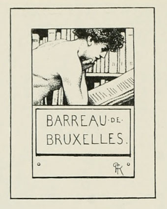
a bookplate is, characteristically, a dedication page, and it's usually found - at the very front of a book.

It can serve various functions; to illustrate something about the volumes owner by theme, or it may delineate the particular interests, personality or more likely the pretentions of the designer of the image, or owners of the book.

You know, the Ex Libris (from the library of... etc.) it acts much as a bumper sticker might on a car - aka Go HABS Go !

The following images are from Modern Book-plates and their Designers, an overview of British, American and European bookplate and book designs published by The Studio magazine in 1898

These small Studio books are rather beautiful objects, and quite collectable - not least, for the period ads in the opening and closing pages of the books. 

A couple of the design styles are familiar from later works, notably Cyril Goldie’s remarkable accumulation of thorns and skulls, (and you guys thought this was a contemporary idea ...) Many others are illustrated in the swirling, tendrilled style of Art Nouveau which The Studio did much to promote in Britain. 

Also of interest are a few entries from well-known fine artists who are seldom associated with this kind of graphic/bookplate design. Among these is Belgian Symbolist Fernand Khnopff and the Brit Symbolist/Decadent Aubrey Beardsley.  


Sunday, September 16, 2012

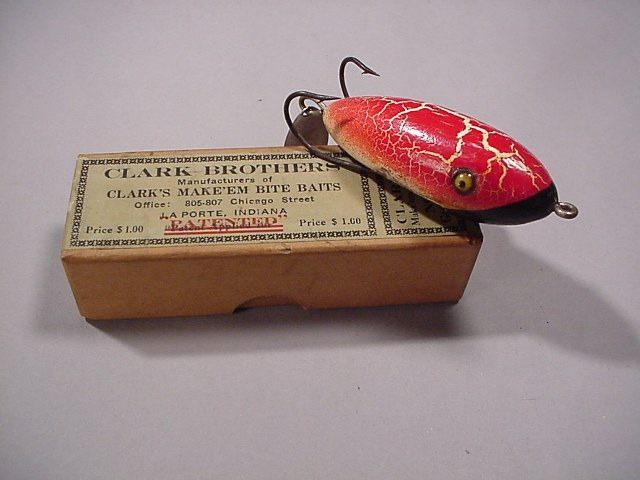
Admittedly, at first glance, most of you will find this post pretty silly.

But, in my defence these quirky objects are - while being faintly ridiculous, secretly marvelous.

Especially, if you look just beneath the surface (excuse the pun). These fishing lures, often called "poppers" are a wonderful fusion of individual styling and some tangible glimpses of real engineering vision, and, just as the classic shark finned Chevy and Ford cars of the American post war, these too, eloquently express the sentiments of their era. 

In fact, I'm not really overstating the case, as this little slice of mid-century Americana - is as expository as any Fender telecaster guitar or any of Raymond Loewy's famous designs for Lucky Strike cigarettes or Coca Cola. Objects, naturally reflect their time, in both form and in materials, and some more notable examples are reasonably so - candidates for the time capsule. 

If you want to know the secrets of an age, check out their toys.

And, as surely as the pale pastel mid-century desert architecture of Las Vegas implies, these mad hat fishing lures are quintessentially mid American, and subtly reiterate that most American of virtues, hope.

Hope, in the sense of that near compulsive faith in one's success, however unlikely, because how else could they possibly work ? They sure don't look like fish? The standing joke of course is - that they catch fisherman, not fish.

Beginning as a fashion in late 1880's in England, artificial lures were then hand made by artisans. Exported world wide through the colonies at the turn of the century, along with other cultural artifacts amusements and pretensions, mass production began in earnest around the 1930's, and continued unabated up and until the 1980's in most of America. 

By then, these artificial fishing lures were are as ubiquitous as the telephone. Naturally each era, re-defines and re-expresses the aesthetics and technologies their age, none, much more so, than these eccentric little baubles. Enjoy


Saturday, September 08, 2012

design two, yes you ! read this
http://www.nytimes.com/2010/07/01/garden/01peter.html?pagewanted=1&_r=1

Sunday, September 02, 2012


from the department of less is more


The Barlow Knife

Origin: Alabama, USA

Price: $42

  • 3.5" (closed), 6" (open)
  • Two blades of high carbon stainless steel 
  • Nickel silver bolster
  • Rosewood handle
Resting on a dresser or nestled safe in the pocket, the timeless Barlow is guaranteed to occupy a place of pride.
With its thick bolster and steady tear drop handle the Barlow knife has, for centuries, been the elegant workhorse of the American farm, camp, and workshop. The Barlow was first deployed in 17th Century Sheffield, England but by the time it hit shores stateside it quickly grew to be the tried and true staple of the American knife maker's catalog, and was hence venerated in traditional folk songs, lore, and even the writings of the great Mark Twain: "Mary gave him a bran-new Barlow knife worth twelve and a half cents; and the convulsion of delight that swept his system shook him to his foundations." (from The Adventures of Tom Sawyer).