Sunday, April 01, 2012
Saturday, March 31, 2012


Wednesday, March 28, 2012
Monday, March 26, 2012
Saturday, March 24, 2012


An insight into Dubai’s most interesting art galleries.
Featuring: 4 Walls Art Gallery, Art Sawa, Ayyam Gallery, Carbon 12, Courtyard Gallery, Etemad Gallery, Gallery Isabelle Van Den Eynde, Green Art Gallery, Lawrie Shabibi Gallery, Meem Gallery,Mojo Gallery, The Flying House, The Jam Jar, The Third Line Gallery, Total Arts Gallery, Traffic Gallery

Tuesday, March 20, 2012

Dig 1 Grids ... Another piece of interesting grid design to look at is Twitter.
Suppose that you have a piece of rope, and you cut it in some place so that you now have two pieces of rope. If you cut it in the middle, then the two pieces are equal, so their lengths are in a 1:1 ratio. If you cut the rope 1/3 of the way down from one end, then the bigger piece will be twice as long as the smaller piece, so their lengths are in a 2:1 ratio.
In theory, it's possible to cut the rope so that the ratio of the larger piece to the smaller piece, is the same ratio as the original uncut rope length to the bigger piece. THIS special ratio is defined as the golden ratio. There are lots of equivalent ways of defining it, but that's the formal definition.
Unfortunately, there's no neat way of writing the number. You can't write it out as the ratio of two whole numbers. So like pi, it's an irrational number. But expressed as a decimal it's approximately equal to 1.618. You can use algebra to show that it's exact value is (1+√5)/2.
It turns out that the golden ratio has lots of other interesting properties. It shows up in a lot of Greek and Roman architecture, because golden rectangles (a rectangle whose length to width are in the golden ratio) are believed to be most aesthetically pleasing. It also appears in nature. Also, take the Fibonacci sequence: 1, 1, 2, 3, 5, 8, 13, 21....
This is the sequence of numbers where you start with "1, 1", and keep adding the two previous numbers to get the next number (1+1 = 2, 1+2 = 3, 2+3 = 5, 3+5 = 8, etc.). It turns out that if you keep writing this out, the ratios of consecutive numbers get closer and closer to the golden ratio: 1/1, 2/1, 3/2, 5/3, 8/5, 13/8, 21/13...


Design one, please peruse the I LoveTypography web site. During the next couple of weeks we will be discussing type, its history, design and contemporary uses. It may seem to you to be a relatively small part of design, but it is an essential aspect - as much as colour, line or concept is. Many interesting designs have failed due to the designers lack of type awareness. So check the site out, especially the popular and recent articles sections found on the right side of the page, and please read sections 1 to 4 of "History of Typography", it's a great site. the word typography is linked
Wednesday, February 29, 2012
Sunday, February 26, 2012
Saturday, February 25, 2012
Wednesday, February 15, 2012


une exposition collective et une publication dirigées par Joseph Ghosn avec les dessins de Charles Berberian, Theo Ellsworth, Charles Burns, Philippe Dupuy, Sammy Harkham, Frédéric Fleury, Blutch, Frédérique Rusch, Paul Hornschemeier, Caroline Andrieu, Nine Antico, Serge Clerc, Frédéric Poincelet, Antoine Marquis, Julien Carreyn, Emmanuelle Pidoux, Fanny Michaëlis, Ludovic Debeurme, Michael Deforge.
“On ne regarde jamais assez les visages dessinés, les figures qui traversent une case, une page et les regards qui les habitent. La bande dessinée, pourtant, est un art de la représentation, du visage restitué, réinventé, mais toujours fidèle à lui-même, à sa vérité. Ou alors à la vérité telle que la perçoit le dessinateur. Les visages, donc, sont ces pièces centrales qui font que l’on reconnaît un personnage, une figure, immédiatement. La tension est toujours là, dans ce qui dessine l’ovale d’un visage, la souplesse ou la dureté d’un regard : le visage, donc, est bien l’ultime frontière de la bande dessinée – et du dessin, d’où qu’il provienne. C’est pour cela qu’en écho à une idée de la galerie 12mail (exposons de la bande dessinée), la seule réponse qui sorte et s’impose est celle de montrer des visages, d’accrocher des regards plutôt que de montrer des planches qui ont leur place dans des livres plutôt que sur des murs.” …
A l’occasion de l’exposition, 12Mail éditera une publication gratuite conçue par Laurent Fétis, éditée à 1000 exemplaires, regroupant les visuels de l’exposition sous forme de posters détachables.
3 février – 30 mars 2012
12MAIL, Paris
Saturday, February 04, 2012
Friday, February 03, 2012
Saturday, January 28, 2012
Tuesday, January 24, 2012
Friday, January 20, 2012
Wednesday, January 18, 2012
Born and living in N.Y., Ruth Marten has worn several hats, in spite of the hair. From 1972 to 1980 she was an important figure in the tattoo underground and, as one of the few women practicing the craft, influenced people's ideas about body decoration. Working during the disco and punk era, she also tattooed in the Musee D'Art Moderne de La Ville de Paris during the 10th Biennale de Paris in 1977.
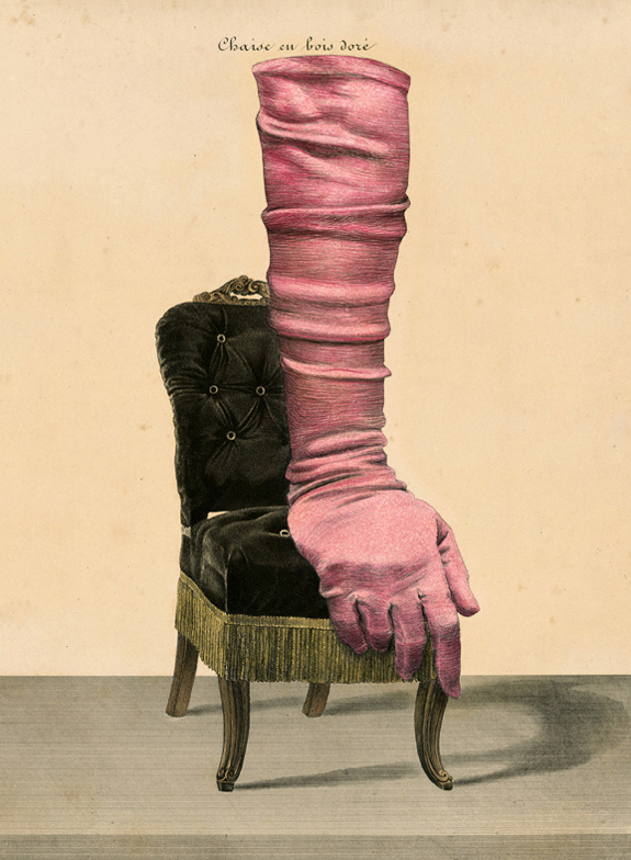
Hired by Jean-Paul Goude for her first illustration (and for 30 years after) she illustrated books, albums and magazines and is most associated with the "Year in Provence" books of Peter Mayle, art-directed for A.A.Knopf by Carol Devine Carson. That love of the printed image informs her newest interest: changing, through over-drawing and collage, the configuration and content of 18th century engravings.
Her book "Histoire un-Naturelle," published for her 2007 London exhibit at Isis Gallery, is a catalogue of the work that came on the heels of a 17 year obsession with hair. Her drawing, painting and sculpture has been exhibited at the Aldrich Museum, the Tang Museum, the Halsey Institute, and is represented in many collections -- most recently in the de Young Museum in San Francisco.