this is a private blog for my design students and assorted other survivors. Tro blemakers all. 
this is a private blog for my design students and assorted other survivors. Tro blemakers all.

Saturday, January 28, 2012


Tuesday, January 24, 2012

digone here's the link for the photoshop tutorials
makes sure you review the sections on 1. making selections and 2. using layers, then repeat ! both are found in the Photoshop CS3, in the getting started section ...

Friday, January 20, 2012

Classic Dieter Rams, Dietrich Lubs watches - circa 1972, they're barely there ... that lovely rational simplicity, which was a constant feature of Rams' genius.

Wednesday, January 18, 2012

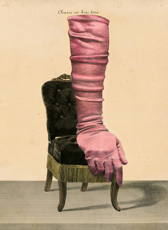
The artist's bio, illustrator Ruth Marten

Born and living in N.Y., Ruth Marten has worn several hats, in spite of the hair. From 1972 to 1980 she was an important figure in the tattoo underground and, as one of the few women practicing the craft, influenced people's ideas about body decoration. Working during the disco and punk era, she also tattooed in the Musee D'Art Moderne de La Ville de Paris during the 10th Biennale de Paris in 1977.

Hired by Jean-Paul Goude for her first illustration (and for 30 years after) she illustrated books, albums and magazines and is most associated with the "Year in Provence" books of Peter Mayle, art-directed for A.A.Knopf by Carol Devine Carson. That love of the printed image informs her newest interest: changing, through over-drawing and collage, the configuration and content of 18th century engravings.

Her book "Histoire un-Naturelle," published for her 2007 London exhibit at Isis Gallery, is a catalogue of the work that came on the heels of a 17 year obsession with hair. Her drawing, painting and sculpture has been exhibited at the Aldrich Museum, the Tang Museum, the Halsey Institute, and is represented in many collections -- most recently in the de Young Museum in San Francisco.


Monday, January 16, 2012

in a time of plastic hearts, LED's and wifi jungles- here are simple things made by hand, made for the hand for use in the world - all from the wünderful Kaufmann Mercantile daily functional design, for the humans still among us

Sunday, January 15, 2012

some examples of the classic London Underground map, the red text is
linked to a little animation of how the maps have changed over time, the other
images will, if clicked, enlarge.


Saturday, January 14, 2012

the Design two- "it's not what you know ... ,

BUT who you know " list "


design two
, assignment one, you'll see.


Walter Gropius

Edgar Brandt

Harley Earl

Alexey Brodovitch

David Carson

The Eames

Art Nouveau

Norman BelGeddes

U&Lc

Weiner Werkstatte

Arne Jacobson

Marcello Nizzoli

Wesley and Sean

Tangerine Studio

Joseph Hofmann

Henry VanDerVelde

Gerrit Reitveld

Saul Bass

Rudy Van derLans

George Jensen

George Nelson

Peter Behrens

Dieter Ram

Adbusters

Georg Kleeman

Richard Sapper

Peter Saville

GTF

William Morris

Charles Rennie Macintosh

the Bauhaus

Hoefler & Frere Jones

Micheal Graves

Marian Bantjes

Frank Lloyd Wright

Phillipe Starck

Chermayeff & Geismar

Norman Foster

Alvar Alto

Milton Glaser

R. Buckminster Fuller

Eric Gill

Brad Holland

Herb Lubalin

The Arts and Crafts Movement

Memphis Group

Herbert Mayer

William Van Allen

Marrianne Brandt

Jonathan Ive

Alvin Lustig

Chip Kidd

Tangerine

Paul Rand

Henry Van de Velde

William Morris

April Greiman

Welles Coates

Michael Beruit

Raymond Lowey

Peter Saville

Robin and Lucienne Day

Wally Olins

Mies van der Rohe

Emigre

Ray Gun

Ellen Lupton

Tobias Freres

Winterhouse

Joseph Muller Brockmann

LeCorbusier

Tibor Kalman

Barbara Kruger

Seymour Chwast

Pentagram

Push Pin Studios

Aubrey Beardsley

the Dadaists

John Heartfield

Ettore Stottas

the Constructivists

Hector Guimard

Firmin Didot

Jasper Morrison

Christopher Wren

Bruno Matheson

Victor Horta

Antonin Gaudi

Alexey Brodovitch

Alphonse Mucha

Fredric Law Olmstead

Alessi

Rene Lalique

Johannis Itten

Richard Neutra


Wednesday, January 11, 2012

d is for designers, at work in the dark, E is for effort, required from the start !
assimilate the following people (D1)

digital one, assignment one ! ~ introduce yourselves to each of these graphic designers & typographers -look carefully at their work, learn to recognize their styles, and read about their lives and influences.

One of the names is quite jumbled, mixed up on purpose. If you can decode/deduce who it is, beaux Koo extra marks ..... She's part of a famous design couple, and an influential company/magazine specializing one might say in all type of types. due second class. please, no showing off, digital one only


Monday, January 09, 2012

my new class schedule for the
winter 2012, click to enlarge ..

Thursday, January 05, 2012

something you all should know, courtesy of one of my personal heros, mid fielder Vinnie Jones

Thursday, December 22, 2011

if there is a Santa ( and I secretly think there is ) this is defintley what he drives on delivery... Merry Christmas !

While at a New York School of Interior Design's show, entitled - “Modern in the Past Tense: Revisiting the Landmark Exhibition “Design 1935-1965: What Modern Was”, I saw a beautiful chair that I had never seen before.

As I'd never seen this design before, I was quite surprised when later that day while walking past the shop
Artifacts of the 20th Century on Crosby Street, and saw a similar chair in their window! the "Pretzel" chair by George Nelson (1908-1986) from 1952.'

George Nelson is one of the preeminent design figures of the twentieth- century.

There is nothing that he could not do. Nelson was a terrific graphic designer and a supremely talented furniture designer too.

His (almost) forty-year relationship with Herman Miller, Inc. began in 1947 when he joined the company as its design director, is a testament to this. While at Herman Miller, Nelson was responsible for bringing on board Charles and Rae Eames, Harry Bertoia, and Isamu Noguchi.

In 1955 Nelson opened his own design practice, George Nelson and Associates, and hired many talented people there as well, including Irving Harper, who understood design in the same way that Nelson did, as "an internal, necessary, and ineradicable logic inherent in the fabricated, synthetic world"


Nelson was incredibly eloquent and wrote about his work better than anyone else could.

He was the co-managing editor of Architectural Forum (from 1935) and founded Industrial Design magazine (1953). Reading his interviews with giants of twentieth- century design like Walter Gropius, Mies van der Rohe, Le Corbusier, Gio Ponti, and the Luckner brothers, which he conducted while living in Europe during the 1930's, and later published in Pencil Points (a magazine which eventually became known as Progressive Architecture), gives us insight into modern design and architecture that is essential to our understanding of the period.

The Pretzel Chair is made out of bent wood and was initially referred to as the Laminated Chair. The curved back, which gives the chair its name, and reminds one of the great Art Nouveau furniture with similar sinuous lines. Bent laminated wood is used not only for the backrest and its twin supports, but also for the four legs that cross underneath the seat.

In 2008, on the 100th anniversary of Nelson’s birth, Vitra placed the chair back into production in a limited Anniversary Edition of 1000 pieces. Nelson’s entire archive is now part of the Vitra Design Museum.

The exhibit at the NYSID, “Modern in the Past Tense: Revisiting the Landmark Exhibition 'Design 1935-1965: What Modern Was'", presents some key pieces of furniture, borrowed from private collectors, to give us a sense of what was on view in the original exhibition.

Saturday, November 26, 2011

You must click on this image, which will take you to the artists site. Then, make sure you click on his images, something extraordinary will happen if you do.


" Running the Numbers looks at contemporary American culture through the austere lens of statistics. Each image portrays a specific quantity of something: fifteen million sheets of office paper (five minutes of paper use); 106,000 aluminum cans (thirty seconds of can consumption) and so on. My hope is that images representing these quantities might have a different effect than the raw numbers alone, such as we find daily in articles and books. Statistics can feel abstract and anesthetizing, making it difficult to connect with and make meaning of 3.6 million SUV sales in one year, for example, or 2.3 million Americans in prison, or 32,000 breast augmentation surgeries in the U.S. every month.

This project visually examines these vast and bizarre measures of our society, in large intricately detailed prints assembled from thousands of smaller photographs. Employing themes such as the near versus the far, and the one versus the many, I hope to raise some questions about the roles and responsibilities we each play as individuals in a collective that is increasingly enormous, incomprehensible, and overwhelming."
~cj, Seattle, 2008
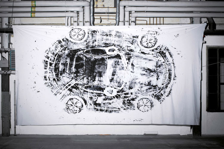
from the department of "Wow, like totally brilliant" are these innovative
prints by Berlin based designer Sarah Illenberger.

She covered some cars with finger-paint (really !) and then made these
huge prints with them, what a fantastic yet simple idea. Low tech for
the win !


Back in the days of yore when a computer’s interface was, well, less than “friendly” and only understood by the most entrenched computer programmers, a young Steve Jobs took a tour of Xerox PARC.

The company was developing a new graphical user interface (GUI) for computers marketed for corporations, but Jobs saw the future: user-friendly, personal computers that used GUI. He quickly licensed the technology so he could create a “democratic” personal computer.

Eventually, a young woman with a Ph.D. in fine arts came along and helped to create the fonts and icons that made people fall in love with the Apple interface.

That woman was Susan Kare. Back in the early 1980s, Kare was a recent graduate of New York University who had just moved to California’s Bay Area. But even securing a job as a curator at the Fine Arts Museums of San Francisco, the young artist felt like there was more she could be doing.

Specifically, her own art. So, while she was sculpting a steel razorback hog, a friend of hers, Hertzfeld, who was a lead software architect for Macintosh computers, told her that some computer guys were interested in her talent.


Not exactly what she had in mind, but sure. Kare started out designing fonts for the Mac OS, including the first ever proportionally spaced font


Jobs was satisfied with the literary-looking font, and Kare stuck around to start sketching ideas — on graph paper — for the navigational icons that first helped regular people use real, solid and fluent technology. You know the rest of the story .....

Saturday, November 19, 2011


Isaac Cruickshank

British Social critic and artist circa 1777
Published by S.W. Fores, 50 Piccadilly corner of Sachville St., London 1799 March 18.

This remarkable hand coloured political cartoon print shows Miss Hibernia seated at right wearing dress decorated with Irish harps; seated around the table are members of John Bull's family, identified as various taxes which are likely to be imposed on the Irish as a result of William Pitt's proposed Irish union.

A grotesque figure seated center and labeled "Isacc Income!!" is taking more than his share "Pr. An." He is admonished by "Abraham Hat Stamp" who says, "Dont be so boiseterous, there is enough for us all" and by Polly Powder Tax, "Really Brother I am quite ashamed of you." John Bull, raising a knife, adds, "Cant you take what comes to your share like the rest of the Family, why you swallow more than all the rest put togeather. Miss Hibernia will be frightened at your prodigious stomach and break off the connection!!" Miss Hibernia states, "Really Mr. Bull ... I fear I must decline all thoughts of the intended Union - your family is so very large...."

To better put this in context - Scot artist Cruickshank was working perilously close to the edge of civil survival. Whilst "the people" loved his work, Royalty, political radicals and those in power did not, and he was often threatened with violence or imprisonment.

He mercilessly skewered the Ruling Class, Napoleon et al. with his direct, scathing, and occasionally wonderful but quite crude illustrations. Those depicting the Royals "en flagrente delicto" were particularly popular for obvious reasons, and he was, along with contemporary Gillray - one of only a few now well known dissident cartoonists. He had an extraordinary wit and a relatively long career, dying at 55 of far too much dancing.
click on the image to enlarge it.

Friday, November 18, 2011


Sinead O'Connor
Fred Woodward, 1992 Editorial design
Magazine, Type design
Art director: Fred Woodward
Director of photography: Laurie Kratochvil
Photographer: Andrew Macpherson
Publisher: Straight Arrow Publishers
Client: Rolling Stone Magazine

Sunday, November 13, 2011

Fontalicious !


Friday, November 11, 2011


Remembrance Day is observed on 11 November to recall the official end of World War I on that date in 1918; hostilities formally ended "at the 11th hour of the 11th day of the 11th month" of 1918 with the German signing of the Armistice ("at the 11th hour" refers to the passing of the 11th hour, or 11:00 a.m.)

The day was specifically dedicated by King George V as a day of remembrance of members of the armed forces who were killed during World War I.

It was called, rather optimistically as " the war to end all wars". Ask me about it, my great grandfather told me many stories about it when I was a child, and so it became an object of imagination for me.

The soldiers who went and never came back, or came back and carried the terrible memories for life were called "the lost generation".

Perhaps, more than any other war earlier, largely due to advancements in weapons technologies and the way the war was reported daily to the home front - WW1 poignantly illustrated, the indifferent cruelty and ultimate pointlessness of war.

" I am young, I am twenty years old; yet I know nothing of life but despair, death, fear, and fatuous superficiality cast over an abyss of sorrow. I see how peoples are set against one another, and in silence, unknowingly, foolishly, obediently, innocently slay one another. I see that the keenest brains of the world invent weapons and words to make it yet more refined and enduring. And all men of my age, here and over there, throughout the whole world see these things; all my generation is experiencing these things with me. What would our fathers do if we suddenly stood up and came before them and proffered our account? What do they expect of us if a time ever comes when the war is over? Through the years our business has been killing; -- it was our first calling in life. Our knowledge of life is limited to death. What will happen afterwards? And what shall come out of us? "

(Erich Maria Remarque, All Quiet on the Western Front, 1929)

Thursday, November 10, 2011


On June 10th, 1947, SAAB showed the world the prototype, but the first run of 20 cars did not leave the Trollhättan factory until Summer 1949 and full scale production wasn't until December of that year.


The car was available in only one color - green !


Directional arrows standard, lights optional!


The 92 had a two cylinder, two stroke, 764 cm3, 25/28 hp engine based on a DKW design.


The aerodynamic shape gave the car a drag coefficient of 0.35. One odd thing was the absence of a boot lid. Access to the luggage compartment (which also contained the battery) was via the back seat. An improved model, the 92B was introduced in Autumn 1952. This is what I want for Christmas, so start saving now !