this is a private blog for my design students and assorted other survivors. Tro blemakers all
this is a private blog for my design students and assorted other survivors. Tro blemakers all.

Saturday, April 09, 2011

Cleek to make more bigs - A cool event and an opportunity
to see some interesting work by young, emerging designers
and former students. Check it out.

Wednesday, April 06, 2011


An important reminder: ! Don't Forget !

Digital 1 and 2, please remember that you must hand in at the beginning of the last class a "portfolio".

It should contain all of your work (graded or ungraded), all of the assignments for your particular class.

Such as, but not limited to: the Pollock assignment, the David Carson Project, The Blog, any/all layout typesetting assignments, le Magazine, the Sculptural letterform poster, the Street Sign assignment, the Onomatopoeia assignment, and the Film Titles assignment, etc. (note: not all projects apply to all sections, if you don't recognize a project relax.). Every section is, naturally, slightly different.

It can constitute anything you want really, the basic assignments or beyond - to infinity- it can contain a re-working or improvements of earlier projects, like the book or CD, or the product assignments or personal stuff you've done or just the assignments, as you wish.

Put your portfolio - your greatest hits, on a USB key (it will be returned next semester) or on a DVD (it will not be returned next semester), make sure that all the files are there, correctly.

If I open the portfolio and there are files missing, or fonts missing well you can guess what the result will be. Remember to always check your files on another computer, so as to ensure that it is universally openable and all the parts are there. Don't forget to " create outlines " in illustrator !

Make sure that the files are all saved as jpegs or pdf's, also ensure that you've handed in a copy, never ever hand in an original.

This is not an optional or negotiable part of the class, it is resolutely, absolute.

Due the beginning of our last class & complete. If you have questions, see me in class.
It's always about the idea, about the content. There's never really a substitute,
for it, even for things as innocuous as business cards. the cards be linked.
Thanks Qi.


Saturday, April 02, 2011

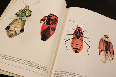
the extraordinary drawings of Cornelia Hesse-Honegger

Magazine of the Month


Underscore is created and self-published by Singapore-based design agency Hjgher. As such it is partly a show-case for the agency, but more importantly, according to editor Justin Long, it’s the magazine they felt should be out there but wasn’t.


Justin describes Underscore as ‘a magazine attuned to a simple rhythm,
quality of life’. And the physical manifestation certainly achieves quality –

this is a lovingly created, calmly paced magazine that sets it apart from
so much of todays media. The name has a double meaning – it underscores

the values it espouses but also, in a nice touch, refers to the other meaning
of the word, background music. So alongside
each issue the team prepare
a musical soundtrack to be listened while reading (available on the website
and signified alongside the related texts, below).


Book-like in design (and feel – 144pp of heavy matt paper bulk it out to

about 15mm thick), the magazine immerses the reader in a global trawl
of curiousities. Issue two (the top cover) is based on the theme ‘Constant’

while the first issue (the lower cover) was about emptiness.


Although based in Singapore the magazine has a global outlook, a quick flick yielding material about Japan, Switzerland, Berlin and Ireland. Only two issues into the project, the Hjgher team have already developed a community of like-minded collaborators around the magazine enabling the team to do things they would never have been able to achieve before launching the publication.


The colour palette, layout and typography (featuring a custom headline sans serif) are all subtle but establish a clear identity that shares some elements with Monocle in the way it refers to book design but has far more flexibility than that magazine.


The cover of issue two and the spread above feature artist Cornelia Hesse-Honegger’s drawings of insects genetically damaged by the Chernobyl radiation. The issue also carries a pull-out print of one of the insects.

Highly recommended for its design and content, the second issue of Underscore is currentlyavailable throughout Europe, the Middle East and China, and issue three is due June this year.
HOW A MAGAZINE GETS MADE

Tuesday, March 29, 2011

Breathless 1960, Typography by Emanuel Cohen

Breathless 1960, Typography from Emanuel Cohen on Vimeo.

/ school project (université du québec à montréal, UQÀM)
/ instructor : denis dulude
Brief: Create a 30 sec. kinetic typography animation, based on a movie part, or any kind of audio recording... I chose a part from the famous French movie "À Bout De Souffle" (Breathless) by Jean-Luc Godard, 1960. In that part, Jean-Paul Belmondo is driving alone in his car, talking to the camera... In my animation, I attempted to reproduce that "in a moving car" feeling, where everything is shaky, as well as the old film look and retro animation style... Enjoy!
*Type Directors Club : TDC Intro 2010 Winning Entry.
thanx TG

Why preserve Van Gogh's palette?
dig 1 und 2 read this or I will come to your house .....

Saturday, March 26, 2011

New Work: Vignelli Gala at the Architectural League

Pentagram designed the programs for a very Vignelli evening.
On the evening of Tuesday, March 8, The Architectural League gave its President’s Medal to Lella and Massimo Vignelli. The award (past recipients of which include John D. Rockefeller, Jr., Hugh Ferriss, Joseph Urban, Richard Meier, Robert A.M. Stern, and Robert Venturi and Denise Scott Brown) was given to the Vignellis “in recognition of a body of work so influential in its breadth that it has shaped the very way we see the world.” The setting was a gala evening in midtown Manhattan attended by nearly 300 colleagues, friends and admirers of the guests of honor. Pentagram’s Michael Bierut, an Architectural League vice president who began his career over 30 years ago as a junior designer at Vignelli Associates, designed the evening’s program. With five different covers featuring five different classic Vignelli quotes (in Helvetica, of course) printed in PMS Super Warm Red (the couple’s favorite color), the programs were the perfect table settings for a memorable evening.


Pino is a market place for unique, functional and innovative design objects. The idea for the concept camefrom the name of the shop, Pino, which means a ‘pile’ or ‘stack’ in Finnish.That is taken visually into the new logo and the design of the shop fixtures.The interior concept with a subtle colour palette works as a background for thefresh, colourful identity and products.

Thursday, March 24, 2011


Marcel Marien, L'introuvable, 1937 dav.

Wednesday, March 23, 2011

sculpture as fashion, the brilliant work of

Mary Katrantzou at London Fashion Week
Young designer Mary Katrantzou first standalone show
at London Fashion Week was stunning. The collection
was inspired by the stylized 70s photography of Helmut
Newton and Guy Bourdin, where the interiors became
as important as the models. Each garment was a work
of art; the patterns were inspired by old copies of
Architectural Digest and World of Interiors. Delicate
silk blouses were tucked into mini-crinolines imitating
lampshades while dresses with prints of window frames
had chiffon fluttering like drapes.

" With this collection, I wanted to put the room on the woman,
rather than the woman in the room."

---Mary Katrantzou


Monday, March 21, 2011

I have a query - that maybe one of you monsters can answer.

I've noticed that typesetting or type set in different browsers can appear differently in various browsers. In other words ( I hate doing that ) what appears to be well set, balanced, correctly leaded and kerned etc. in one browser, goes all screwy in an other.

The recent post regarding the football supporters graphic/map is a good example, in Safari it looks fine but in FireFox it looks as if typeset by a marmot. Any ideas ? Is there a universal typsetting method which is browser agnostic, and will work in all browsers, regardless of it's origin ? Or is that just ridiculous ? , an impossible thing to ask for - continuity .....

Sunday, March 20, 2011

Thursday, March 17, 2011

digital 2, vis a vis your product assignment - remember that
design isn't decoration, anymore than dj's are musicians ...

Tuesday, March 15, 2011


" Football isn't a matter of life and death," - it’s much more
important than that,” is a quote often attributed to Bill Shankly, the
legendary manager
of Liverpool FC.
As exaggerations go, this one gets
pretty close to the truth. Millions of fans identify intensely with the highs
and lows of their favourite
sports team, perhaps a modern substitute for
the tribal loyalties of bygone days.

Fandom is a bit more complicated than mere tribalism, though. Which
team you support is the result of an intricate compound of ancestral,
regional, social, and sometimes even religious loyalties. And, of course,
personal choice. However, this map of London seems to indicate that
geography is a major factor in fan loyalty.

check out
Frank Jacobs's facinating site, concerned with informatics

design and all manner of strange and wonderful maps that you might
imagine.

Monday, March 14, 2011

my friend Ani sent me a link today to a site of hauntingly beautiful - glass dry plate portraits of criminals from Australia during the 1920's and 30's.

Looking at them I am struck by their sad beauty, and remember reading a remarkable book by Robert Hughes - the notable art critic (the Shock of the New) and writer. The book is entitled The Fatal Shore - it's an epic account of Australia's founding, and seeing these tragic portraits, I can't think of a more accurate title.

Australia is a typical modern paradise - alive with industry, people and all the crude trappings of success, but it was for a very long time, in fact for most of its history by far, a truly unknown land.

Australia, or New South Wales as it was known then, was all the way on the other side of the world - it was as far away from home as anywhere could possibly be. Imagine that.

To those thousands of luckless souls who found themselves cruelly "transported" away from home - chained aboard Her Majesty's grotesque prison ships - it was a truly terrible fate, the stuff of real nightmares, shackled - in a vast, poisonous continental prison.


Thursday, March 10, 2011

Class Cancelled Today - Thursday
March 10th. Sick, acke.. ack.. urp.. gorrrlp .. ewww
back tomorrow.

Sunday, March 06, 2011

d1 and 2, visit this marvellous site devoted to
contemporary collage.Then, consider the work of
Raol Hausmann, Joseph Cornell and Man Ray,
do please procee
d beyond the shallow edges of the wiki...


click image = more bigger

Thursday, March 03, 2011


Hey, photo-contest !... of no known pedagogical value .. ..if you can
identify the chap in the boater, you'll win a prize, a brand new white
iPhone - shiny, expensive, cool ....

graciously donated by famed alumni Wesley Yendrys. Ok, you mumbly
hooligans ...Who is it ? and before you ask it's neither one of the
original Village People, nor is it my sister.

(I thought I was being real witty here, thinking there was no actual
white Iphone, hence, I was safe ... but today I was informed by my
students in that terrible tone that one reserves for complete idiots,
that there is in fact, much to my horror, a white Iphone .... You do realize you monkeys, there's no actual prize right ? and Wesley isn't going to actually donate one, you do get that right ? )


>Johnny - Christmas 1976, see ... nothing changes ... nothing.. he used to put cake mix in his hair, and yes, he then would put his head in the oven to harden it , a right nutter, our Johnny


1 und 2, please review this site - as it's full of fascinating
ideas during a time of stupefying mass/global similarity.
It's rather novel, which admittedly seems at least these
days to be, real adventure (no, it's not a novel, its novel)
anyway this is linked ... check it out

digital warriors 2, your product/ branding assignment is
due soon, btw. witty fish references will not be taken kindly

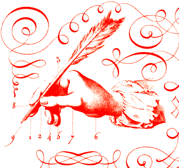
par exemple ... firmly set in the - "... see ... not that much ever really
changes category " .... the aesthetic concerns of the 16Th cent. French
scribe - whose lovely work we see below were essentially the same as
ours today as we typeset our pages. Continuity, legibility, form, balance,
structure, clarity, and line - all held tenuously together by a slavish
attention to the minutiae and the marginalia. two words you need to know, two words that separate the mutton from the lamb ....


Wednesday, March 02, 2011

here's two images which couldn't be more culturally
distinct or geographically opposed - one's from Sweden
and the other Thailand .... yet inexplicably they bear
such a striking visual sameness. hmmnn ...

I must admit dear reader that I'm perplexed, ... how
could two so diametrically distinct cultures arrive at
such aesthetically similar solutions ? any ideas ? If
anyone dare suggests Aliens, I'll smack you so hard
your dog will fall over !