this is a private blog for my design students and assorted other survivors. Tro blemakers all
this is a private blog for my design students and assorted other survivors. Tro blemakers all.

Wednesday, October 20, 2010


D1 & D2, please visit this linque

" This project stemmed from a discussion about designer’s inspirations, and how many creatives ( designer types ) found the V&A influential. We started planning an exhibition gathering pieces together, then realised that the logistics would be too daunting. Then we started to discuss other ways to show how the museum influenced people, and decided to create different maps of the museum, based on notable people’s favourite items."


Saturday, October 09, 2010

The inventive, remarkable world of graphic designer,
art director and illustrator Jean Paul Goude. Visit
his site and make sure you look at his work, in all it's
varied, controversial forms. his name is linked...
Notice, some of the work is Mature


Friday, October 08, 2010

David LaChapelle's return to fine art

The photographer known for his glossy, glamourised images reveals why he fell out of love with fashion and is now focusing on his art.

By William Oliver


Over a 20-year career, David LaChapelle has carved a name for himself as an enfant terrible of pop culture photography. The cutting, acerbic wit and layered symbolism in his celebrity portraiture, fashion and advertising images is seen as a bolt of honesty—albeit a glamourised and high-gloss one—in an industry known for its false vision of reality.

During the last few years, LaChapelle has moved away from commercial work to focus on fine art. While retaining his unique visual style, this new direction highlights his interest and understanding of both contemporary practice and art history.

While in London working on his current exhibition, “The Rape of Africa” at gallery Robilant + Voena (until 25 May), The Art Newspaper met up with the infamous photographer to discuss the show, falling out of love with fashion and the new path his work is taking.

The Art Newspaper: What is your interest in fine art photography?

David LaChapelle: The fact that so much contemporary work is conceptual. When you are looking at it you know that it can only be art because it couldn’t be anything else, but it can be difficult to unravel. That is something that activates me; I want to make work that that has a language people can read.

TAN: Although you have had a successful career shooting for advertising and magazines, you actually began in galleries. Why did you move into commercial work?

DLC: I started showing in galleries in the early 1980s in New York City. I felt successful because my friends liked the work, and some of my shows were well attended, but my last gallery show of that period, in 1991, really wasn’t. At that point, when you’re not reaching an audience, you have to look for other ways of getting your work seen.

TAN: Why do you think the show was not well received at that time?

DLC: To be honest I was naïve about the whole process back then, I didn’t even know that there was a hierarchy of galleries. I was showing in SoHo but the gallery itself was completely off the map. I became a little disillusioned, had met Warhol and was shooting for Interview. I began to treat the magazine as my gallery; if people ripped out the pictures to keep, that to me was like a collector or a museum taking the works.

TAN: After a long-standing career shooting celebrity portraits you have now moved back into fine art. Your latest exhibition centres on one image, The Rape of Africa. What was your idea behind that photograph?

DLC: I visited the National Gallery and began looking at Botticelli’s Venus and Mars. I wasn’t in love with Botticelli in the way I was in love with Michelangelo, but I saw this painting and was so excited by its personification of the gods in a figurative way. Having people represent war, greed, love and beauty, and the fact that they were post-coitus, seemed incredible. It occurred to me that the painting could be contemporary; the ideas in it still seemed so relevant today; as fast moving as our world is, we haven’t progressed with our morality or spirituality.

The use of Africa in my photograph is about it being the cradle of civilisation, the idea of Mother Earth and Mother Africa. The production of gold in Africa is destroying both the society and the country itself but continues because of our obsession in the West. The human suffering and the cost to the environment are incalculable. We are degrading our mother and we are raping Mother Earth in our quest for financial security, but while doing so we are ensuring our own insecurity.

TAN: Why did you choose Naomi Campbell as the model for Venus?

DLC: Botticelli used Simonetta Vespucci as his model for Venus. She was famous in Italy at that time for being a great beauty, and Naomi Campbell is a great beauty of our time. I wanted to twist the idea slightly and talk about greed and wealth etc. It was not just about Africa; Naomi in a way was the representation of Africa even though she is not actually from Africa. I looked at her and thought it didn’t matter, I didn’t need to have a woman from Africa to represent what I was trying to say.

TAN: Will The Rape of Africa form part of a series?

DLC: No, this picture is a stand-alone work. I am producing a lot of other pieces that are a series, but they are taking longer and longer to complete. Not because I am getting lazier with my production, but as I move forwards I am applying further layers to the narrative and symbolism in the imagery, and that process adds time.

TAN: Have you now fully made the move from fashion into fine art?

DLC: When I first left [fashion] there were a lot of reasons. I felt I had said all I could say within the format of the images I was making at that time and I had started to come up against a few problems from clients surrounding my ideas. I shot the series Jesus is my Homeboy for i-D, a hip contemporary style magazine, but they had issues with it because of the depiction of religion. I shot something for Italian Vogue that they had problems with because of the destruction in the pictures, and the fact that it was on newsstands around the time of hurricane Katrina. Also I wasn’t interested in the same things I was 25 years ago; I didn’t want to meet any new pop stars. It occurred to me I didn’t have the creative freedom I wanted. Fashion and magazines as a vehicle to reach a broader audience had reached an end for me, so I looked for other outlets.

When I first started the art pieces I said I would never go back to commercial but the studio became really quiet and I started to lose touch with my people. What I do is really collaborative, there is a huge amount of work that goes into the set building and designing. People think it is all done digitally but that is a fallacy. Really, because of this, I have done some commercial work recently but my real focus is now on my art.

Saturday, October 02, 2010

... Images - millions of images - That's what I eat
William S. Burroughs

Tuesday, September 28, 2010

Do yourself a favour, check out the astounding
work of Brad Holland. his name is linked.
Especially those of you uber-hipsters, who think
you're too cool for school .... dare you to look !

Sunday, September 26, 2010

From the Heatherwick Studio in England, the UK
Pavilion at the Shanghai Worlds Fair, 2010.


yes, it's a building. click the image to enlarge, it's amazing
D1 & D2 both, please watch this very short, interesting video
commemorating 40 years of editorial illustration at the, link

Wednesday, September 22, 2010

Palindrome


This new sign for the V&A is wonderful. The museum commissioned
Troika to make a sign for the tunnel connecting the museum and South
Kensington tube station, and it’s bloody gorgeous.

It’s a kinetic sculpture of rotating parts of the museum’s logo (in itself
a wonderful thing, by Alan Fletcher in 1989) so that it reads at first from one side, and then fromthe other. I did wonder at first whether the V& A on Fletcher’s original logo were actually rotationally symmetric, and no, of course they aren’t, but for a sculpture like this the alteration to make them work like that isn’t at all noticeable.

Go and watch the video (or of course, visit the museum instead of baking yourself in Cuba or Miami) to see it in action. It’s so simple and yet so clever, whoever came up with the idea must have been quite pleased with themselves, and justifiably so.

Tuesday, September 21, 2010

"Typografische Monatsblätter" is a Swiss
business magazine, dealing with questions of
printing and typography. Its frequency was
monthly formerly (hence the name!) and it is
still in print up to date – now on a bimonthly
basis.

"Typografische Monatsblätter" were founded
1933. Since 1952 they are published together
with "Schweizer Grafische Mitteilungen" and
"Revue Suisse de l’Imprimerie". TM discusses
questions of the developping printing technology,
also – and for designers all over the world even
more interesting: Swiss designers and especially
Swiss type designers were regularly writing in
the magazine.

The famous type-criticisms of Max Caflisch
were released here, Jan Tschichold or Adrian
Frutiger were repeatedly writing for TM. Best
known Swiss designers were contributing for
decades: Wolfgang Weingart, Jost Hochuli,
Helmut Schmidt, Hans Rudolf Lutz, Emil
Ruder – just to name a few.


Monday, September 20, 2010

D2, don't forget - Project One, Magazine layout/mockup, Project Two -
product design and branding, Next, project Three - Film Title design .....
get to work or start running...


Sunday, September 19, 2010

not your helvetica


Thursday, September 09, 2010

Design like your life depends on it.
Because if you're doing it right, it does. from http://twitter.com/AngryPaulRand

Wednesday, September 08, 2010

this weeks movie of de week. I'm workin on my own bass bike
as we speak. My hip hop buddy -DJ Wesley Bowtie Gansta is helping
me wit de tunes, big up Brooklyn.


Peter Saville designs new England football jersey


Given the team's pathetic performance over the summer it's perhaps not
the best time to be asking long-suffering fans to shell out £49.99 ($80cdn) for
yet another new kit. In the accompanying press blurb, manufacturers Umbro
say that the design "takes its inspiration from the more formal classic shirts
of England’s footballing past. Umbro has developed a new longer, more
open neckline for the shirt, building on the square neckline that was designed
for the away shirt but allowing additional movement across the chest,
keeping its shape especially when a player is running."

Saville's contribution is somewhat minimalist. A graphic of multicoloured
crosses sits on the shoulders which is, apparently, "evocative of the basting
stitches synonymous with bespoke tailoring". They are also meant to represent
the diverse nature of modern English society, which should give the Daily Mail
plenty to get its teeth into.

England's footballers will be wearing a new home shirt for their match against
Bulgaria on September 3, (4 -0) for UK ya ! ) won in their Saville sweats.


To those complaining that he "did nothing", Saville's brief from Umbro was
strictly confined. He was asked to suggest some ways in which colour could be
incorporated into the design of the shirt (the basic look and shape of which
had already been determined) while still keeping it predominantly white.

To those of you complaining that the design won't be visible from the stands
... that's kind of the point. It looks all white from a distance, then the detail is
revealed close-up.

Saville's proposal was that the pattern of crosses would cover the entire shirt
and not just the shoulders.

A number of different geometric forms were considered by Saville and Paul Barnes,
who worked with him on the project, based on the micro dots and other symbols
that some menswear designers have been incorporating into their fabrics. Among
the shapes considered was a plus sign, which Barnes then suggested could be
transformed into the St George's cross.
Digital II - this is why (see video & links) we are going to make a collage ....

Bewilderingly, it's commonly overlooked and viewed as a simplistic, or clumsy way of working - but in actual fact - it's a fantastically creative tool, and a great method to make images, just ask Raoul Hausmann or Kurt Schwitters.

Collage, unlike so many other ways of working today - has at at its heart - improvisation - a kind of visual jazz - where you don't really know which way it will go or where it will end.

Make sure you make an effort to bring interesting source materials to class, as I will notice.


Capitu - Abertura from Carlos Bêla on Vimeo.
Credit Where Credits Are Due: The Present

It’s hard to imagine why these and the other exceptional title sequences have never been recognized by the Oscars. We would like to urge the academy to create this much-needed category. In the meantime, we’ve gone ahead and selected the title sequences that should have been nominated for 2008. During the nomination process, we happened upon an interesting trend: filmmakers, more and more, are plunging viewers right into the action and then ending with elaborate title sequences, which serve as epilogues or bonus tracks. Without further ado — or a badly scripted joke — our nominees for Best Achievement in Film Title Design:


Monday, August 23, 2010

a wonderfully funny *- motion typography video - click on the X
for the link - courtesy of the divine Miss Z - warning *xrated language !

Wednesday, August 18, 2010

my new schedule and here's the
link to my class outlines should
you need it - and like everything
else in nature, click to enlarge


Tuesday, August 17, 2010

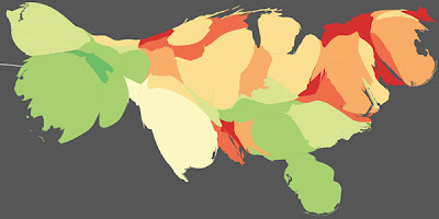
Pulse of the Nation: U.S. Mood throughout the Day Inferred from Twitter


The scientific study "Pulse of the Nation: U.S. Mood throughout the Day Inferred from Twitter" [ccs.neu.edu] illustrates the varying mood in the U.S., as inferred after analyzing over 300 million tweets that were created over the course of the day.

Various density-preserving cartograms and a time-animated video were produced to capture important large-scale trends.

The researchers analyzed all public tweets posted between September 2006 and August 2009, and filtered those whom orginated from a US location and those that contained words included in the psychological word-rating system called Affective Norms for English Words, resulting in a collection of 300 million tweets.

Through a natural language processing algorithm called Sentiment Analysis, each tweet was assigned a mood score based on the number of positive or negative words it contained. Out of the resulting data, they then calculated the average mood score of all the users living in a state hour by hour which formed the basis of a series of time-varying mood maps.

One of the interesting patterns shows how the West Coast mood follows the same pattern as the East, with a 3-hour time-zone delay, indicating that Each Coast experiences the same time-dependent swings. Weekends were observed to be happier than weekdays.

The peak in the overall tweet mood score is observed on Sunday mornings, and the trough occurs on Thursday evenings.

This is the nexus where informatics flourishes - where graphic design and statistical information collide. On a more philosophical note - is
there something here that is rather unsettling about all of this, something which is setting my radar off ? hmmmn ....


Wednesday, August 11, 2010

clique aux muy enlargo los imagio


Charles Joseph Minard’s famed carte figurative of Napoleon’s march to Moscow is considered by most to be one of the finest maps ever produced. It’s elegant, it’s clever, and it’s clear. Edward Tufte said that it “may well be the best statistical graphic ever drawn.” It's also a sad terrible glimpse of Napoleon's vanity and the indifferent, featureless cruelty of War if you can see inside the lines. Have a look, it's all there .....

Monday, August 09, 2010

Pencil sculptures: miniature masterpieces carved into graphite by Dalton Ghetti


There’s a boot. And a church. And a bust of Elvis. And “Chain,” in which the middle of a pencil has been transformed into a 23-link chain. He has about a dozen works that have been framed and almost as many waiting to be mounted for display. Last year, after two and half years, he finished a line of 26 pencils, with each letter of the alphabet carved into the tip. His current projects include a handsaw and a single rice-grain-sized teardrop for every victim of the Sept. 11 terrorist attacks.


Wednesday, July 14, 2010

src="http://www.youtube.com/v/PH6xCT2aTSo&rel=0&color1=0xb1b1b1&color2=0xd0d0d0&hl=en_US&feature=player_embedded&fs=1" type="application/x-shockwave-flash" allowfullscreen="true" " width="340" height="275">

Sunday, June 20, 2010

charmingly cheeky crisps - "like crisps but better !!"


Tuesday, June 15, 2010

For all of you suffering summer brain freeze -
John Cage tells us that not knowing where to
begin is a common form of paralysis.
His advice: begin anywhere !

Saturday, June 12, 2010

Thursday, June 10, 2010

another "wish I'd thought of that" design by Stéphane Massa-Bidel

Friday, June 04, 2010


Tobias Wong, Witty Designer and Conceptual Artist, Dies at 35 (sadly)

interesting work, do visit, this is linked